Fabric Data Days starts November 4th!
Advance your Data & AI career with 50 days of live learning, dataviz contests, hands-on challenges, study groups & certifications and more!
Get registered- Power BI forums
- Get Help with Power BI
- Desktop
- Service
- Report Server
- Power Query
- Mobile Apps
- Developer
- DAX Commands and Tips
- Custom Visuals Development Discussion
- Health and Life Sciences
- Power BI Spanish forums
- Translated Spanish Desktop
- Training and Consulting
- Instructor Led Training
- Dashboard in a Day for Women, by Women
- Galleries
- Data Stories Gallery
- Themes Gallery
- Contests Gallery
- QuickViz Gallery
- Quick Measures Gallery
- Visual Calculations Gallery
- Notebook Gallery
- Translytical Task Flow Gallery
- TMDL Gallery
- R Script Showcase
- Webinars and Video Gallery
- Ideas
- Custom Visuals Ideas (read-only)
- Issues
- Issues
- Events
- Upcoming Events
Get Fabric Certified for FREE during Fabric Data Days. Don't miss your chance! Request now
- Power BI forums
- Forums
- Get Help with Power BI
- Desktop
- Weekly sum divide by number of days and visualize ...
- Subscribe to RSS Feed
- Mark Topic as New
- Mark Topic as Read
- Float this Topic for Current User
- Bookmark
- Subscribe
- Printer Friendly Page
- Mark as New
- Bookmark
- Subscribe
- Mute
- Subscribe to RSS Feed
- Permalink
- Report Inappropriate Content
Weekly sum divide by number of days and visualize on a bar chart (repost)
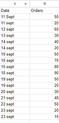
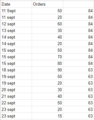
This is a very simplified version of my table. The actual one has like 20+ columns. I want to add up the orders for the whole week, divide by the number of days and visualize it on the bar chart. So, for each date, the value will look like this. For 11 to 15 sept week, the total 510 divided by 5days is 84. All the days are weekdays, monday to friday.
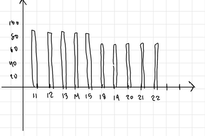
The graph will look like this. The orders by date.
How shall I achieve this?
thanks all.
- Mark as New
- Bookmark
- Subscribe
- Mute
- Subscribe to RSS Feed
- Permalink
- Report Inappropriate Content
Hi @katto16 ,
Try out the below steps
To achieve the desired visualization of the weekly sum of orders divided by the number of days (assuming weekdays) on a bar chart in Power BI, you can follow these steps:
Data Preparation:
- Ensure you have a date column in your data. If not, create one based on the existing date values.
- Create a calculated column to identify weekdays (Monday to Friday) using a formula. You can use the WEEKDAY function to achieve this. For example
- Weekday Flag = IF(AND(WEEKDAY([Date]) >= 2, WEEKDAY([Date]) <= 6), 1, 0)
- Now you should have a column called Weekday Flag with 1 for weekdays (Monday to Friday) and 0 for weekends.
Data Modeling:
- In Power BI Desktop, create a new measure to calculate the weekly sum of orders divided by the number of weekdays. Use the following DAX formula:
- Weekly Average Orders = DIVIDE(SUM(YourTable[Orders]), CALCULATE(COUNTROWS(YourTable), YourTable[Weekday Flag] = 1))
- Replace YourTable with the name of your table and Orders with the name of your order column.
Create a Bar Chart:
- Add a bar chart visual to your report canvas.
- In the Values section of the visual, drag and drop the Weekly Average Orders measure you created in step 2.
- In the Axis section of the visual, drag and drop the Date column.
Customize Your Chart:
- Format your chart as desired, adding labels, titles, and adjusting the colors.
Interactions:
- Ensure that the bar chart is set up to interact with other visuals on your report canvas if needed.
Refresh Data:
- If your data is not automatically refreshing, make sure to refresh the data source to see the updated chart.
- Mark as New
- Bookmark
- Subscribe
- Mute
- Subscribe to RSS Feed
- Permalink
- Report Inappropriate Content
Hi @Anonymous thanks for the reply. I have a few issues with this.
All my dates are weekdays so I do not need the flag.
Each of the date may have multiple rows so I can't use countrow function when I divide the sum. So how should I identify each week?
Helpful resources

Power BI Monthly Update - November 2025
Check out the November 2025 Power BI update to learn about new features.

Fabric Data Days
Advance your Data & AI career with 50 days of live learning, contests, hands-on challenges, study groups & certifications and more!

| User | Count |
|---|---|
| 97 | |
| 71 | |
| 50 | |
| 47 | |
| 44 |


