FabCon is coming to Atlanta
Join us at FabCon Atlanta from March 16 - 20, 2026, for the ultimate Fabric, Power BI, AI and SQL community-led event. Save $200 with code FABCOMM.
Register now!- Power BI forums
- Get Help with Power BI
- Desktop
- Service
- Report Server
- Power Query
- Mobile Apps
- Developer
- DAX Commands and Tips
- Custom Visuals Development Discussion
- Health and Life Sciences
- Power BI Spanish forums
- Translated Spanish Desktop
- Training and Consulting
- Instructor Led Training
- Dashboard in a Day for Women, by Women
- Galleries
- Data Stories Gallery
- Themes Gallery
- Contests Gallery
- QuickViz Gallery
- Quick Measures Gallery
- Visual Calculations Gallery
- Notebook Gallery
- Translytical Task Flow Gallery
- TMDL Gallery
- R Script Showcase
- Webinars and Video Gallery
- Ideas
- Custom Visuals Ideas (read-only)
- Issues
- Issues
- Events
- Upcoming Events
The Power BI Data Visualization World Championships is back! Get ahead of the game and start preparing now! Learn more
- Power BI forums
- Forums
- Get Help with Power BI
- Desktop
- Re: Weekly Data with Monthly X-Axis with a Line an...
- Subscribe to RSS Feed
- Mark Topic as New
- Mark Topic as Read
- Float this Topic for Current User
- Bookmark
- Subscribe
- Printer Friendly Page
- Mark as New
- Bookmark
- Subscribe
- Mute
- Subscribe to RSS Feed
- Permalink
- Report Inappropriate Content
Weekly Data with Monthly X-Axis with a Line and Clustered Column Chart
Hi All,
PBIX file.
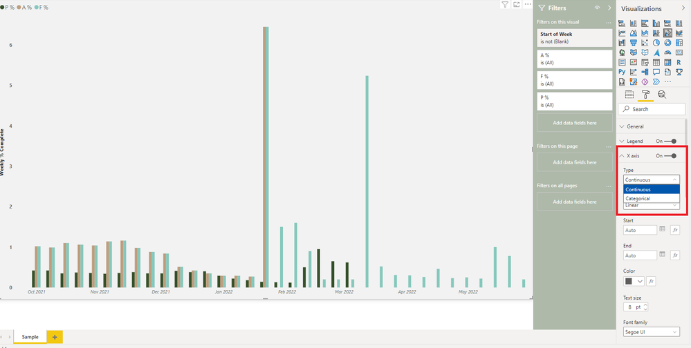
Below is an image of what I’m trying to replicate. Essentially, I want the granularity of the bars to be weekly but the x-axis to only show Monthly. As an example, I have highlighted the month of October in Power BI which is showing five different dates for each week. In excel you can show weekly bars but monthly dates on the x-axis. Is this possible?
Thank you.
Solved! Go to Solution.
- Mark as New
- Bookmark
- Subscribe
- Mute
- Subscribe to RSS Feed
- Permalink
- Report Inappropriate Content
Hi, @CaveOfWonders
Is that what you want?
https://www.dropbox.com/s/rzhdf7oidb46w1w/Sample%28allure-analytics.com%29.pbix?dl=0
Did I answer your question? Please Like and Mark my post as a solution if it solves your issue. Thanks.
Appreciate your Kudos !!!
https://www.youtube.com/channel/UCndD_QZVNB_JWYLEmP6KrpA
https://www.linkedin.com/company/77757292/
Did I answer your question? Mark my post as a solution!
https://allure-analytics.com/
https://www.youtube.com/channel/UCndD_QZVNB_JWYLEmP6KrpA
https://www.linkedin.com/company/77757292/
Proud to be a Super User!
- Mark as New
- Bookmark
- Subscribe
- Mute
- Subscribe to RSS Feed
- Permalink
- Report Inappropriate Content
Hey @CaveOfWonders ,
in addition to the solution @ALLUREAN provided you may find this article useful:
Improving timeline charts in Power BI with DAX - SQLBI
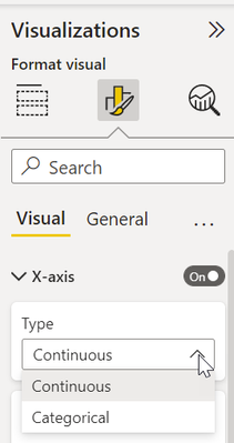
Basically, if the x-axis is considering the labels as categorical, it's not possible to use a different granularity for the data points and the axis labels. For this reason, it becomes necessary to use continuous values:
Hopefully, this adds additional insights.
Regards,
Tom
Did I answer your question? Mark my post as a solution, this will help others!
Proud to be a Super User!
I accept Kudos 😉
Hamburg, Germany
- Mark as New
- Bookmark
- Subscribe
- Mute
- Subscribe to RSS Feed
- Permalink
- Report Inappropriate Content
Hi, @CaveOfWonders
Is that what you want?
https://www.dropbox.com/s/rzhdf7oidb46w1w/Sample%28allure-analytics.com%29.pbix?dl=0
Did I answer your question? Please Like and Mark my post as a solution if it solves your issue. Thanks.
Appreciate your Kudos !!!
https://www.youtube.com/channel/UCndD_QZVNB_JWYLEmP6KrpA
https://www.linkedin.com/company/77757292/
Did I answer your question? Mark my post as a solution!
https://allure-analytics.com/
https://www.youtube.com/channel/UCndD_QZVNB_JWYLEmP6KrpA
https://www.linkedin.com/company/77757292/
Proud to be a Super User!
- Mark as New
- Bookmark
- Subscribe
- Mute
- Subscribe to RSS Feed
- Permalink
- Report Inappropriate Content
How did you create the Start of Week column in your Date table?
- Mark as New
- Bookmark
- Subscribe
- Mute
- Subscribe to RSS Feed
- Permalink
- Report Inappropriate Content
Can't believe how simple that was. Thank you 😊
Helpful resources

Power BI Dataviz World Championships
The Power BI Data Visualization World Championships is back! Get ahead of the game and start preparing now!

| User | Count |
|---|---|
| 41 | |
| 38 | |
| 36 | |
| 30 | |
| 28 |
| User | Count |
|---|---|
| 128 | |
| 88 | |
| 79 | |
| 67 | |
| 62 |


