Fabric Data Days starts November 4th!
Advance your Data & AI career with 50 days of live learning, dataviz contests, hands-on challenges, study groups & certifications and more!
Get registered- Power BI forums
- Get Help with Power BI
- Desktop
- Service
- Report Server
- Power Query
- Mobile Apps
- Developer
- DAX Commands and Tips
- Custom Visuals Development Discussion
- Health and Life Sciences
- Power BI Spanish forums
- Translated Spanish Desktop
- Training and Consulting
- Instructor Led Training
- Dashboard in a Day for Women, by Women
- Galleries
- Data Stories Gallery
- Themes Gallery
- Contests Gallery
- Quick Measures Gallery
- Visual Calculations Gallery
- Notebook Gallery
- Translytical Task Flow Gallery
- TMDL Gallery
- R Script Showcase
- Webinars and Video Gallery
- Ideas
- Custom Visuals Ideas (read-only)
- Issues
- Issues
- Events
- Upcoming Events
Join us at FabCon Atlanta from March 16 - 20, 2026, for the ultimate Fabric, Power BI, AI and SQL community-led event. Save $200 with code FABCOMM. Register now.
- Power BI forums
- Forums
- Get Help with Power BI
- Desktop
- Re: Week hierarchy not working
- Subscribe to RSS Feed
- Mark Topic as New
- Mark Topic as Read
- Float this Topic for Current User
- Bookmark
- Subscribe
- Printer Friendly Page
- Mark as New
- Bookmark
- Subscribe
- Mute
- Subscribe to RSS Feed
- Permalink
- Report Inappropriate Content
Week hierarchy not working
Hi,
I am using this DAX function to create week numbers:
"Uge", WEEKNUM([Date], 2),Everything works fine, yet when I put it into a graph, it simply doesn't look good:
You can see I have to use a scroll bar in order to see the whole graph. I tried changing the Week number into text, it doesn't help.
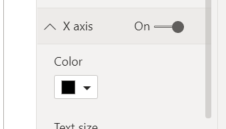
I can also see you can't change the data type from categorical to continuous, which I thought might be the problem initially:
Solved! Go to Solution.
- Mark as New
- Bookmark
- Subscribe
- Mute
- Subscribe to RSS Feed
- Permalink
- Report Inappropriate Content
Hi @Anonymous
From your statement, I think you have two kind of problems.
1. You want to see all values without using scroll bar in the visual.
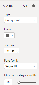
2. When you drill down to week hierarchy, you couldn't see Type in X axis format.
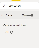
If you use Year- Month- Week hierarchy in X axis, and you want your X axis show as below, you need to turn off concatenate labels in X axis format.
If you turn this function off, Type in X axis Format will disappear.
When you turn on concatenate labels, Type will appear.
So If you want your X axis show in this format, you couldn't use type function in X axis.
And due to you drill down your visual to week hierarchy, there will be at least 3 weeks for one month. So the visual will expand and you will need to use scroll bar to see all values in your visual.
Best Regards,
Rico Zhou
If this post helps, then please consider Accept it as the solution to help the other members find it more quickly.
- Mark as New
- Bookmark
- Subscribe
- Mute
- Subscribe to RSS Feed
- Permalink
- Report Inappropriate Content
Hi @Anonymous ,
Comment is off topic but could you tell me how you structured the x-axis in the picture you are showing. I am struggling with that. I have data that is reported on a weekly basis, which I want to show in the same was as you are doing in your graph (the week number resets when a new year starts). In short, I am wondering how you structured the data you are showing on the x-axis of your graph.
Hope you can help me. Thanks in advance!
- Mark as New
- Bookmark
- Subscribe
- Mute
- Subscribe to RSS Feed
- Permalink
- Report Inappropriate Content
Hi @Anonymous
From your statement, I think you have two kind of problems.
1. You want to see all values without using scroll bar in the visual.
2. When you drill down to week hierarchy, you couldn't see Type in X axis format.
If you use Year- Month- Week hierarchy in X axis, and you want your X axis show as below, you need to turn off concatenate labels in X axis format.
If you turn this function off, Type in X axis Format will disappear.
When you turn on concatenate labels, Type will appear.
So If you want your X axis show in this format, you couldn't use type function in X axis.
And due to you drill down your visual to week hierarchy, there will be at least 3 weeks for one month. So the visual will expand and you will need to use scroll bar to see all values in your visual.
Best Regards,
Rico Zhou
If this post helps, then please consider Accept it as the solution to help the other members find it more quickly.
- Mark as New
- Bookmark
- Subscribe
- Mute
- Subscribe to RSS Feed
- Permalink
- Report Inappropriate Content
@Anonymous , if you create YYYYWW as a number you might get a continuous axis. You can get that with Date and numbers
Year week =[Year]*100 +[Week]
Helpful resources

FabCon Global Hackathon
Join the Fabric FabCon Global Hackathon—running virtually through Nov 3. Open to all skill levels. $10,000 in prizes!

Power BI Monthly Update - October 2025
Check out the October 2025 Power BI update to learn about new features.

| User | Count |
|---|---|
| 85 | |
| 42 | |
| 30 | |
| 27 | |
| 26 |


