FabCon is coming to Atlanta
Join us at FabCon Atlanta from March 16 - 20, 2026, for the ultimate Fabric, Power BI, AI and SQL community-led event. Save $200 with code FABCOMM.
Register now!- Power BI forums
- Get Help with Power BI
- Desktop
- Service
- Report Server
- Power Query
- Mobile Apps
- Developer
- DAX Commands and Tips
- Custom Visuals Development Discussion
- Health and Life Sciences
- Power BI Spanish forums
- Translated Spanish Desktop
- Training and Consulting
- Instructor Led Training
- Dashboard in a Day for Women, by Women
- Galleries
- Data Stories Gallery
- Themes Gallery
- Contests Gallery
- QuickViz Gallery
- Quick Measures Gallery
- Visual Calculations Gallery
- Notebook Gallery
- Translytical Task Flow Gallery
- TMDL Gallery
- R Script Showcase
- Webinars and Video Gallery
- Ideas
- Custom Visuals Ideas (read-only)
- Issues
- Issues
- Events
- Upcoming Events
Learn from the best! Meet the four finalists headed to the FINALS of the Power BI Dataviz World Championships! Register now
- Power BI forums
- Forums
- Get Help with Power BI
- Desktop
- Re: Week data graph for several values
- Subscribe to RSS Feed
- Mark Topic as New
- Mark Topic as Read
- Float this Topic for Current User
- Bookmark
- Subscribe
- Printer Friendly Page
- Mark as New
- Bookmark
- Subscribe
- Mute
- Subscribe to RSS Feed
- Permalink
- Report Inappropriate Content
Week data graph for several values
Hello Gurus,
Didnt managed to find a solution for the following:
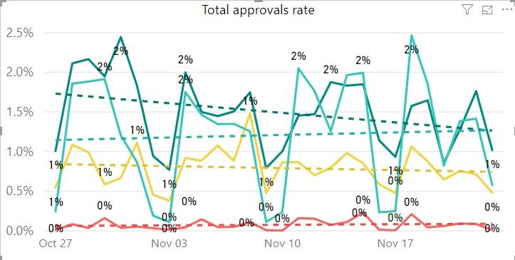
I am working with PBI and need to display weekly data on the line chart -> currently data is being displayed by day.
Using weeknum function is not really helpfull as when I look on the month overview it shows weekly data agregated by whole month.
I need to see data by week (on month graph) - where data for each week in independent from previous week...
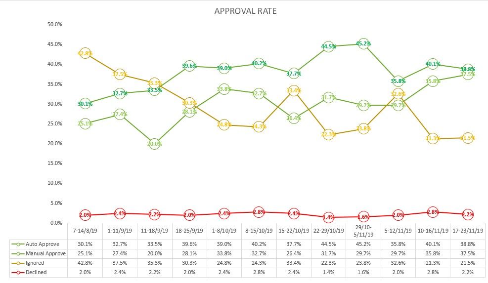
Currently I am using Excel table by a side, entring weekly data
Is there any way to achieve the same result in the PowerBI ?
Attaching screenshot for better understanding,
PowerBI:
Excel table:
- Mark as New
- Bookmark
- Subscribe
- Mute
- Subscribe to RSS Feed
- Permalink
- Report Inappropriate Content
- Mark as New
- Bookmark
- Subscribe
- Mute
- Subscribe to RSS Feed
- Permalink
- Report Inappropriate Content
- Mark as New
- Bookmark
- Subscribe
- Mute
- Subscribe to RSS Feed
- Permalink
- Report Inappropriate Content
- Mark as New
- Bookmark
- Subscribe
- Mute
- Subscribe to RSS Feed
- Permalink
- Report Inappropriate Content
@ml_andrew thanks, tried that but it is not really helps to the need....
Still need to use Excel charts...
I need ability to have an option to display data in graph per specific weeks as it shown in the Excel graph in hte beginning of the post...
Currently PowerBI agreggrades the data and shown data for whole chosen period... and not the data by the week chunks...
- Mark as New
- Bookmark
- Subscribe
- Mute
- Subscribe to RSS Feed
- Permalink
- Report Inappropriate Content
got confused, isn't this what you are looking for?
- Mark as New
- Bookmark
- Subscribe
- Mute
- Subscribe to RSS Feed
- Permalink
- Report Inappropriate Content
@ml_andrew not really... as mentioned in the beginning...
Currently I have to work with Excel table and PBI (that collects data from Kusto).
For my needs I collect results in PBI on weekly basis and manually put them to Excel and table looks like:
| 17-23/11/19 | 38.8% | 37.5% | 21.5% | 2.2% |
| 24-30/11/19 | 46.1% | 29.2% | 22.4% | 2.3% |
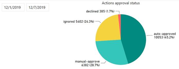
| 1-7/12/19 | 45.2% | 28.7% | 24.3% | 1.7% |
To get that data I set in PBI time slidet for these days (entire week) like that :
Hope it is bit clearer now...
Visual that I need to display is weekly results and not agregated data.
- Mark as New
- Bookmark
- Subscribe
- Mute
- Subscribe to RSS Feed
- Permalink
- Report Inappropriate Content
Any suggestion ?
- Mark as New
- Bookmark
- Subscribe
- Mute
- Subscribe to RSS Feed
- Permalink
- Report Inappropriate Content
It seems that you may take advantage of Drill down in a visualization in Power BI.
If this post helps, then please consider Accept it as the solution to help the other members find it more quickly.
- Mark as New
- Bookmark
- Subscribe
- Mute
- Subscribe to RSS Feed
- Permalink
- Report Inappropriate Content
- Mark as New
- Bookmark
- Subscribe
- Mute
- Subscribe to RSS Feed
- Permalink
- Report Inappropriate Content
Hi,
It doesnt work.. in a dril down there is no option to have weekly points
Helpful resources

Join our Fabric User Panel
Share feedback directly with Fabric product managers, participate in targeted research studies and influence the Fabric roadmap.

Power BI Monthly Update - February 2026
Check out the February 2026 Power BI update to learn about new features.

| User | Count |
|---|---|
| 52 | |
| 50 | |
| 34 | |
| 15 | |
| 14 |
| User | Count |
|---|---|
| 92 | |
| 77 | |
| 41 | |
| 26 | |
| 25 |


