FabCon is coming to Atlanta
Join us at FabCon Atlanta from March 16 - 20, 2026, for the ultimate Fabric, Power BI, AI and SQL community-led event. Save $200 with code FABCOMM.
Register now!- Power BI forums
- Get Help with Power BI
- Desktop
- Service
- Report Server
- Power Query
- Mobile Apps
- Developer
- DAX Commands and Tips
- Custom Visuals Development Discussion
- Health and Life Sciences
- Power BI Spanish forums
- Translated Spanish Desktop
- Training and Consulting
- Instructor Led Training
- Dashboard in a Day for Women, by Women
- Galleries
- Data Stories Gallery
- Themes Gallery
- Contests Gallery
- QuickViz Gallery
- Quick Measures Gallery
- Visual Calculations Gallery
- Notebook Gallery
- Translytical Task Flow Gallery
- TMDL Gallery
- R Script Showcase
- Webinars and Video Gallery
- Ideas
- Custom Visuals Ideas (read-only)
- Issues
- Issues
- Events
- Upcoming Events
The Power BI Data Visualization World Championships is back! Get ahead of the game and start preparing now! Learn more
- Power BI forums
- Forums
- Get Help with Power BI
- Desktop
- Waterfall negative values on Y axis
- Subscribe to RSS Feed
- Mark Topic as New
- Mark Topic as Read
- Float this Topic for Current User
- Bookmark
- Subscribe
- Printer Friendly Page
- Mark as New
- Bookmark
- Subscribe
- Mute
- Subscribe to RSS Feed
- Permalink
- Report Inappropriate Content
Waterfall negative values on Y axis
Hi Power BI community,
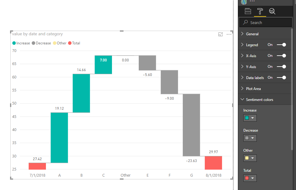
I am having a little trouble with my waterfall chart. As seen below, the negative values are not below the 0 line on the y axis, this is making the chart look rather strange.
Does anyone know how to format this?
Does anyone also know how to get rid of the "Other" category? I have already expanded my breakdowns to the maximum of 10, which should be sufficient for my chart.
Thanks!
Darren
- Mark as New
- Bookmark
- Subscribe
- Mute
- Subscribe to RSS Feed
- Permalink
- Report Inappropriate Content
As seen below, the negative values are not below the 0 line on the y axis, this is making the chart look rather strange.
By design, the negative values of the breakdown doesn't show below 0 line, it shows the what's contributing to the changes month to month (negative and positive, in waterfall chart)
To make the chart look more obviously, you could change the color of negative differenly from positive colors.
Does anyone also know how to get rid of the "Other" category? I have already expanded my breakdowns to the maximum of 10, which should be sufficient for my chart.
As tested with my data with 7 distinct category (this column added in the breakdown field), when i set breakdown to 7, it show all categories without "other" item, when i set to 6, it show an "other" item.
Please show me some example of your data added into this visual so i can anlyze better for you.
Best Regards
Maggie
Helpful resources

Power BI Dataviz World Championships
The Power BI Data Visualization World Championships is back! Get ahead of the game and start preparing now!

| User | Count |
|---|---|
| 38 | |
| 37 | |
| 33 | |
| 32 | |
| 29 |
| User | Count |
|---|---|
| 132 | |
| 88 | |
| 82 | |
| 68 | |
| 64 |


