FabCon is coming to Atlanta
Join us at FabCon Atlanta from March 16 - 20, 2026, for the ultimate Fabric, Power BI, AI and SQL community-led event. Save $200 with code FABCOMM.
Register now!- Power BI forums
- Get Help with Power BI
- Desktop
- Service
- Report Server
- Power Query
- Mobile Apps
- Developer
- DAX Commands and Tips
- Custom Visuals Development Discussion
- Health and Life Sciences
- Power BI Spanish forums
- Translated Spanish Desktop
- Training and Consulting
- Instructor Led Training
- Dashboard in a Day for Women, by Women
- Galleries
- Data Stories Gallery
- Themes Gallery
- Contests Gallery
- Quick Measures Gallery
- Notebook Gallery
- Translytical Task Flow Gallery
- TMDL Gallery
- R Script Showcase
- Webinars and Video Gallery
- Ideas
- Custom Visuals Ideas (read-only)
- Issues
- Issues
- Events
- Upcoming Events
Join the Fabric FabCon Global Hackathon—running virtually through Nov 3. Open to all skill levels. $10,000 in prizes! Register now.
- Power BI forums
- Forums
- Get Help with Power BI
- Desktop
- Re: Waterfall from columns
- Subscribe to RSS Feed
- Mark Topic as New
- Mark Topic as Read
- Float this Topic for Current User
- Bookmark
- Subscribe
- Printer Friendly Page
- Mark as New
- Bookmark
- Subscribe
- Mute
- Subscribe to RSS Feed
- Permalink
- Report Inappropriate Content
Waterfall from columns
Hi,
I'm pretty new to PowerBI in general and to Waterfall charts in particular, so sorry for this maybe "basic" question.
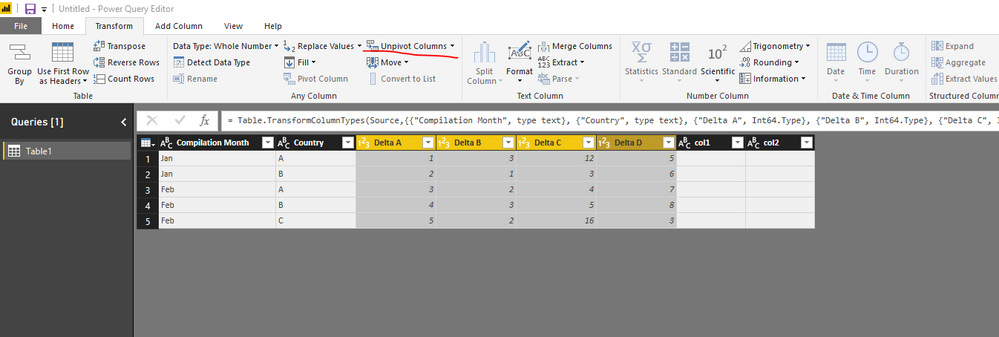
I have a table with the following columns (among the others):
- Compilation Month
- Country
- Delta A
- Delta B
- Delta C
- Delta D
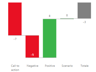
I would like to make a waterfall charts showing the Delta A, B, C, and D (sum of all countries and filtered for only one compilation month), just like this:
I managed to do this only by creating a separate table in Excel (and then imported in PowerBI) where using sumifs I have many lines with:
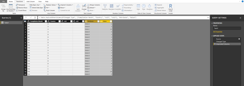
- Compilation Month, Country, Delta A, value
- Compilation Month, Country, Delta B, value
- Compilation Month, Country, Delta C, value
- Compilation Month, Country, Delta D, value
And then using "value" for my waterfall as Y axis and the column with Delta A/B/C/D as Category.
I expect there is a more elegant solution in PowerBI, can you help me?
Thanks in advance!
Solved! Go to Solution.
- Mark as New
- Bookmark
- Subscribe
- Mute
- Subscribe to RSS Feed
- Permalink
- Report Inappropriate Content
@MarioMazzoli,
You don't need to create a separate table in Excel using sumif.
Directly import your original table to Power BI, then in Query Editor of Power BI Desktop, select Delta A, B, C, and D columns, and unpivot columns. This way, you should be able to create expected Waterfall chart .
Regards,
Lydia


