Get Fabric certified for FREE!
Don't miss your chance to take exam DP-600 or DP-700 on us!
Request now- Power BI forums
- Get Help with Power BI
- Desktop
- Service
- Report Server
- Power Query
- Mobile Apps
- Developer
- DAX Commands and Tips
- Custom Visuals Development Discussion
- Health and Life Sciences
- Power BI Spanish forums
- Translated Spanish Desktop
- Training and Consulting
- Instructor Led Training
- Dashboard in a Day for Women, by Women
- Galleries
- Data Stories Gallery
- Themes Gallery
- Contests Gallery
- QuickViz Gallery
- Quick Measures Gallery
- Visual Calculations Gallery
- Notebook Gallery
- Translytical Task Flow Gallery
- TMDL Gallery
- R Script Showcase
- Webinars and Video Gallery
- Ideas
- Custom Visuals Ideas (read-only)
- Issues
- Issues
- Events
- Upcoming Events
Learn from the best! Meet the four finalists headed to the FINALS of the Power BI Dataviz World Championships! Register now
- Power BI forums
- Forums
- Get Help with Power BI
- Desktop
- Waterfall Visualization
- Subscribe to RSS Feed
- Mark Topic as New
- Mark Topic as Read
- Float this Topic for Current User
- Bookmark
- Subscribe
- Printer Friendly Page
- Mark as New
- Bookmark
- Subscribe
- Mute
- Subscribe to RSS Feed
- Permalink
- Report Inappropriate Content
Waterfall Visualization
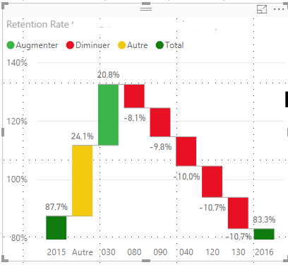
I'm trying to show why a retention figure dropped from 87.7% in 2015 to 83.3% in 2016. The waterfall chart below shows a breakdown of retention rate change by center (130, 120, 040, etc). The problem with this chart is that each center is given equal weight, when in reality, some centers have more students than others. For example, both 130 and 120 dropped 10.7%, but 120 has twice the number of students as 130, so 120 is a larger contributor to the overall drop. How can I account for the population size of each center? This may be more of a statistics question than a visualization one.
- Mark as New
- Bookmark
- Subscribe
- Mute
- Subscribe to RSS Feed
- Permalink
- Report Inappropriate Content
Hi @michaelccdf
“The problem with this chart is that each center is given equal weight, when in reality, some centers have more students than others.”
“How can I account for the population size of each center? “
I am confused by these sentence above, and not sure which column you add to the Y Axis field in waterfall visual and how you calculate this column.
Could you show me some example data or a screenshot?
Best Regards
Maggie
Helpful resources

Join our Fabric User Panel
Share feedback directly with Fabric product managers, participate in targeted research studies and influence the Fabric roadmap.

Power BI Monthly Update - February 2026
Check out the February 2026 Power BI update to learn about new features.

| User | Count |
|---|---|
| 49 | |
| 40 | |
| 37 | |
| 14 | |
| 14 |
| User | Count |
|---|---|
| 86 | |
| 69 | |
| 37 | |
| 29 | |
| 26 |

