Fabric Data Days starts November 4th!
Advance your Data & AI career with 50 days of live learning, dataviz contests, hands-on challenges, study groups & certifications and more!
Get registered- Power BI forums
- Get Help with Power BI
- Desktop
- Service
- Report Server
- Power Query
- Mobile Apps
- Developer
- DAX Commands and Tips
- Custom Visuals Development Discussion
- Health and Life Sciences
- Power BI Spanish forums
- Translated Spanish Desktop
- Training and Consulting
- Instructor Led Training
- Dashboard in a Day for Women, by Women
- Galleries
- Data Stories Gallery
- Themes Gallery
- Contests Gallery
- QuickViz Gallery
- Quick Measures Gallery
- Visual Calculations Gallery
- Notebook Gallery
- Translytical Task Flow Gallery
- TMDL Gallery
- R Script Showcase
- Webinars and Video Gallery
- Ideas
- Custom Visuals Ideas (read-only)
- Issues
- Issues
- Events
- Upcoming Events
Get Fabric Certified for FREE during Fabric Data Days. Don't miss your chance! Request now
- Power BI forums
- Forums
- Get Help with Power BI
- Desktop
- Re: Waterfall Chart not using dates
- Subscribe to RSS Feed
- Mark Topic as New
- Mark Topic as Read
- Float this Topic for Current User
- Bookmark
- Subscribe
- Printer Friendly Page
- Mark as New
- Bookmark
- Subscribe
- Mute
- Subscribe to RSS Feed
- Permalink
- Report Inappropriate Content
Waterfall Chart not using dates
Hi
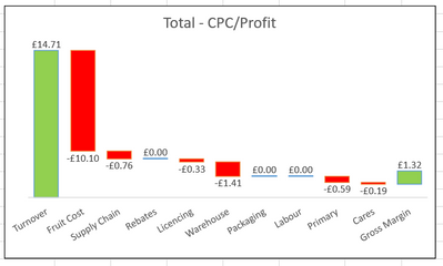
Im very new to Power BI, literally only started playing with it yesterday, and there is a chart i use to do in excel, that i would like to replicate in Power BI, but, im finding this difficult and every help page i search on Google just shows me that the X Axis is always in a date range, i have tried to create a Pie, Bar and Donut chart then swapping to Waterfall but it doesnt work, how can i create this chart below in Power BI?
Solved! Go to Solution.
- Mark as New
- Bookmark
- Subscribe
- Mute
- Subscribe to RSS Feed
- Permalink
- Report Inappropriate Content
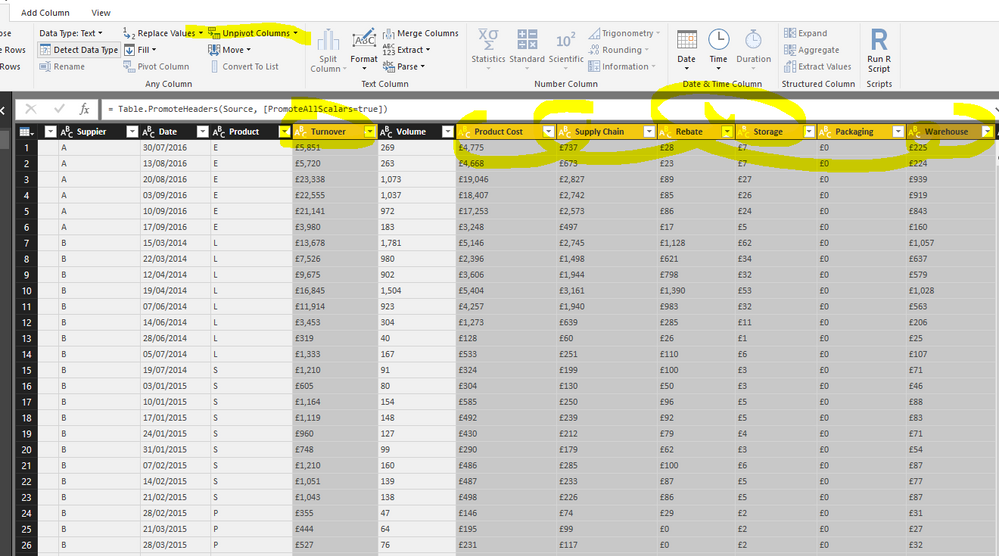
I see in your dataset, the first step should be doing a unpivot.
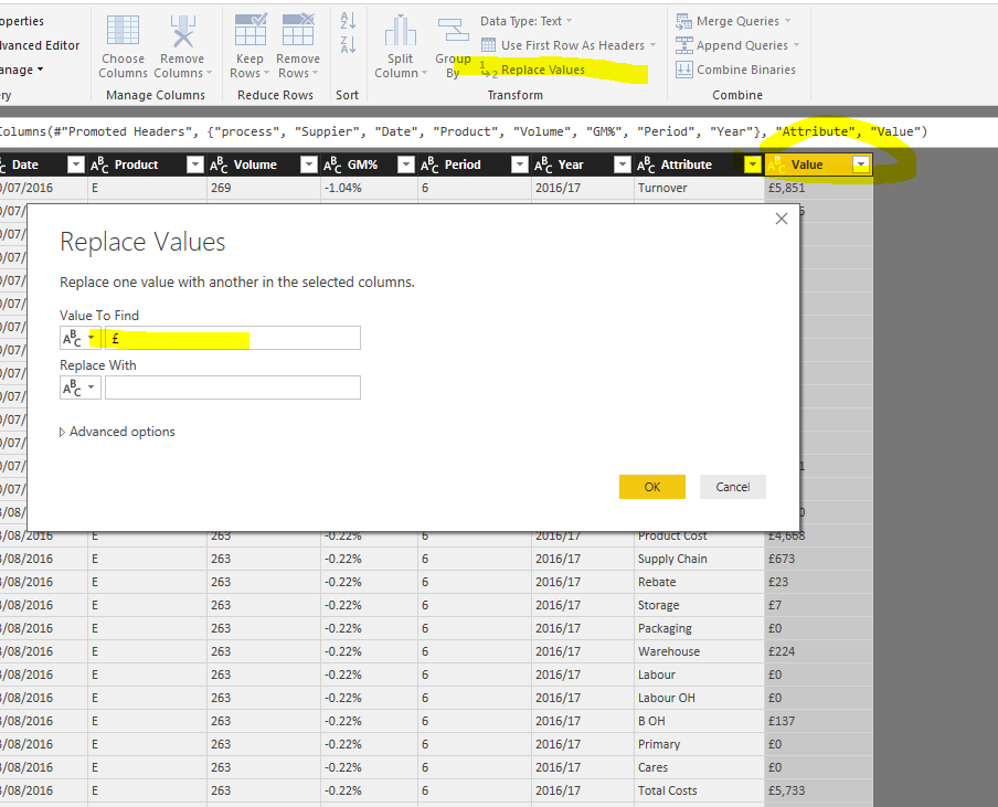
Then replace the currency symbol with blank and convert that column to whole number.
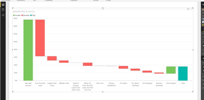
In the waterfall chart, use the attribute and value column.
As to the axis order in the waterfall chart, check this thread Sorting Data Manually.
Check more details in the attached pbix file.
- Mark as New
- Bookmark
- Subscribe
- Mute
- Subscribe to RSS Feed
- Permalink
- Report Inappropriate Content
Add columns through the query editor uses M language not DAX (click "Advanced Editor" in the query pane to see the M code)
If you instead create a calculated column on the report layout page, your code is accurate.
Hope this helps
David
- Mark as New
- Bookmark
- Subscribe
- Mute
- Subscribe to RSS Feed
- Permalink
- Report Inappropriate Content
To all of you @dedelman_clng @Eric_Zhang @Sean and @Phil_Seamark thank you all for your help its finally how i want it to look, all except the total bar, but im not stressing over that for now, thanks again
- Mark as New
- Bookmark
- Subscribe
- Mute
- Subscribe to RSS Feed
- Permalink
- Report Inappropriate Content
It is great to hear you finally figured it out. If no further questions, you can accept the replies making sensing as solution to close this thread. For any new questions, you can raise another thread.![]()
- Mark as New
- Bookmark
- Subscribe
- Mute
- Subscribe to RSS Feed
- Permalink
- Report Inappropriate Content
- Mark as New
- Bookmark
- Subscribe
- Mute
- Subscribe to RSS Feed
- Permalink
- Report Inappropriate Content
Hi Phil
How do i upload a data file? i can see how to upload photo/video
- Mark as New
- Bookmark
- Subscribe
- Mute
- Subscribe to RSS Feed
- Permalink
- Report Inappropriate Content
- Mark as New
- Bookmark
- Subscribe
- Mute
- Subscribe to RSS Feed
- Permalink
- Report Inappropriate Content
Almost too easy ![]() i thought there may be a attachent option like on excel forum, I have now uploaded an example data set into onedrive, im going to carry on trying in the desktop to see if i can build a data table to replicate Seans example, however im trying to run the chart straight from the data set as there is a lot of charts and tables that will be generated by this and linked to slicers, and dropdowns
i thought there may be a attachent option like on excel forum, I have now uploaded an example data set into onedrive, im going to carry on trying in the desktop to see if i can build a data table to replicate Seans example, however im trying to run the chart straight from the data set as there is a lot of charts and tables that will be generated by this and linked to slicers, and dropdowns
https://1drv.ms/u/s!AhMWRjYUcisAhAV7Nl_vgRU_q4yK
Thanks
- Mark as New
- Bookmark
- Subscribe
- Mute
- Subscribe to RSS Feed
- Permalink
- Report Inappropriate Content
I see in your dataset, the first step should be doing a unpivot.
Then replace the currency symbol with blank and convert that column to whole number.
In the waterfall chart, use the attribute and value column.
As to the axis order in the waterfall chart, check this thread Sorting Data Manually.
Check more details in the attached pbix file.
- Mark as New
- Bookmark
- Subscribe
- Mute
- Subscribe to RSS Feed
- Permalink
- Report Inappropriate Content
Ok so that works fine thank you all, except the cost elements should be minuses/decreases, so sales and margin should be positive the rest multiplied by -1
I tried to insert a column into the table using this formula
IF(AND([Attribute]="Net Sales Amount",[Attribute]="Gross Margin"),[Value],[Value]*-1)
but its telling me that "IF" wasnt recognized?
- Mark as New
- Bookmark
- Subscribe
- Mute
- Subscribe to RSS Feed
- Permalink
- Report Inappropriate Content
Add columns through the query editor uses M language not DAX (click "Advanced Editor" in the query pane to see the M code)
If you instead create a calculated column on the report layout page, your code is accurate.
Hope this helps
David
- Mark as New
- Bookmark
- Subscribe
- Mute
- Subscribe to RSS Feed
- Permalink
- Report Inappropriate Content
That was so much easier doing the formula in the report layout, took less than a minute, youre right i was trying to do that formula in the query editor
Thank you
- Mark as New
- Bookmark
- Subscribe
- Mute
- Subscribe to RSS Feed
- Permalink
- Report Inappropriate Content
Ok David thank you, im use to VBA and Excel formulas, am very new to Power BI and DAX, amd M and R, so am itrying to get my head around it, thank you for explaining the problem, i will give it a go see if i can get it done 🙂
- Mark as New
- Bookmark
- Subscribe
- Mute
- Subscribe to RSS Feed
- Permalink
- Report Inappropriate Content
- Mark as New
- Bookmark
- Subscribe
- Mute
- Subscribe to RSS Feed
- Permalink
- Report Inappropriate Content
EDIT: The one thing about this Chart in PBI if I recall there's no option to turn off the Total...
- Mark as New
- Bookmark
- Subscribe
- Mute
- Subscribe to RSS Feed
- Permalink
- Report Inappropriate Content
Hi Sean
Thats how i want it to look, obviously the total is a nuisance, was this done by creating a data table in the desktop? i can give that a go see if i can connect it it my main data set im using
Helpful resources

Fabric Data Days
Advance your Data & AI career with 50 days of live learning, contests, hands-on challenges, study groups & certifications and more!

Power BI Monthly Update - October 2025
Check out the October 2025 Power BI update to learn about new features.


