Join us at FabCon Vienna from September 15-18, 2025
The ultimate Fabric, Power BI, SQL, and AI community-led learning event. Save €200 with code FABCOMM.
Get registered- Power BI forums
- Get Help with Power BI
- Desktop
- Service
- Report Server
- Power Query
- Mobile Apps
- Developer
- DAX Commands and Tips
- Custom Visuals Development Discussion
- Health and Life Sciences
- Power BI Spanish forums
- Translated Spanish Desktop
- Training and Consulting
- Instructor Led Training
- Dashboard in a Day for Women, by Women
- Galleries
- Data Stories Gallery
- Themes Gallery
- Contests Gallery
- Quick Measures Gallery
- Notebook Gallery
- Translytical Task Flow Gallery
- TMDL Gallery
- R Script Showcase
- Webinars and Video Gallery
- Ideas
- Custom Visuals Ideas (read-only)
- Issues
- Issues
- Events
- Upcoming Events
Compete to become Power BI Data Viz World Champion! First round ends August 18th. Get started.
- Power BI forums
- Forums
- Get Help with Power BI
- Desktop
- Visuals with Parent-Child hierarchy
- Subscribe to RSS Feed
- Mark Topic as New
- Mark Topic as Read
- Float this Topic for Current User
- Bookmark
- Subscribe
- Printer Friendly Page
- Mark as New
- Bookmark
- Subscribe
- Mute
- Subscribe to RSS Feed
- Permalink
- Report Inappropriate Content
Visuals with Parent-Child hierarchy
Hello,
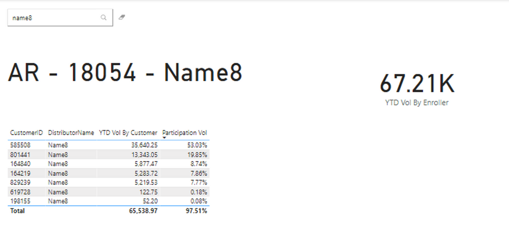
I've been stuck with this issue for days and I need some help. I think there is something wrong in the measures YTD Vol By Customer, Participation Vol, YTD Vol By Enroller and Avg Downline Vol so some fields are not displayed as desired.
What I want is:
Report1:
Error: Only shows the Parent (EnrollerName) for every child row.
Correct: Display the DistributorName (the child) in the Matrix.
Report2:
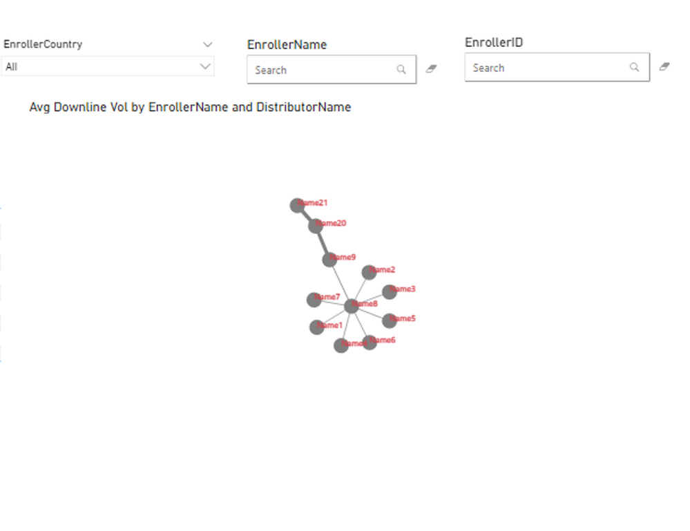
Error: Not showing all the childs to the deepest level.
Correct: When I select the country in the slicer, the enroller name in the text filter then the Network Navigator visual should display the nodes from a parent-child hierarchy to the deepest level. If the Childs belong to a different country, paint the node with a different color.
For example:
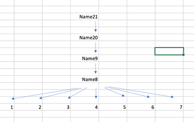
** If I select name21(PE) the visual will display
name21(1rst level)
name20(2nd level)
name9(3rd level) (color1-US)
name8(4th level) (color2-AR)
*(5th level)*
name1, name2(color2-AR), name3, name4, name5(color1-US), name6(color2-AR), name7 (color3-CL)
** If I select name9 the visual will display
name9(1rst level)
name8(2nd level)
*(3rd level)*
name1, name2, name3, name4, name5, name6, name7
Thanks for your help
Carlos
pbix file
https://drive.google.com/drive/folders/1NyodJ-pBQL2DQXk8XzChm4e0mimO4Nca
Reports
Report2
Report1
Model
- Mark as New
- Bookmark
- Subscribe
- Mute
- Subscribe to RSS Feed
- Permalink
- Report Inappropriate Content
Thanks for your response.
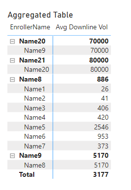
For Report1 The aggregated table shown could be one solution but should be hierarchical. The problem is you cannot move from a matrix to a pie chart. This report shows the most child contributors especially when you have in your raw data 15 levels and tens of childs.
For Report 2. What i feared, could you recommend another visual? This visual should be a way to track all the paths for a certain Parent. It is like when you look a parent in the text, it triggers a temporary table with all the rows where the parent is present in the PATH and displays them in the Network. Maybe I need some help to change the model and relationships.
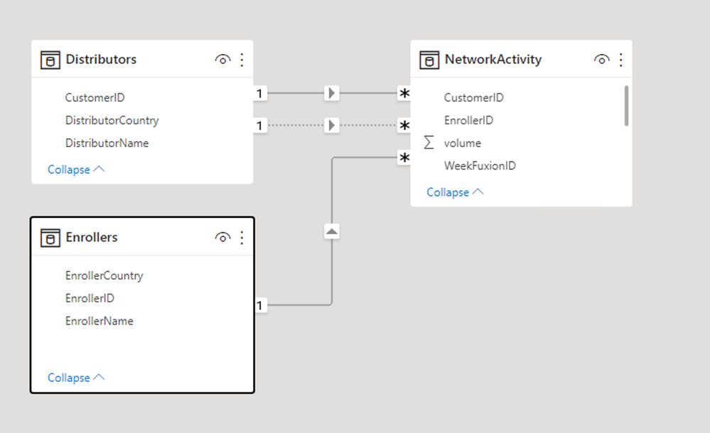
The model is hierarchical with 5 levels in the NetworkActivity. Here is a diagram
- Mark as New
- Bookmark
- Subscribe
- Mute
- Subscribe to RSS Feed
- Permalink
- Report Inappropriate Content
Sounds like you are looking for a Sankey Chart visual.
- Mark as New
- Bookmark
- Subscribe
- Mute
- Subscribe to RSS Feed
- Permalink
- Report Inappropriate Content
the Network Navigator visual should display the nodes from a parent-child hierarchy to the deepest level
That's not how graphs work (they treat nodes as source and target, not parent and child). Your data also does not seem to support a hierarchy with more than two levels.
For your first question - if you use a matrix visual then you can properly show the correlation
Use the PATH functions for true parent child hierarchies.
What are you ultimately trying to achieve?
