FabCon is coming to Atlanta
Join us at FabCon Atlanta from March 16 - 20, 2026, for the ultimate Fabric, Power BI, AI and SQL community-led event. Save $200 with code FABCOMM.
Register now!- Power BI forums
- Get Help with Power BI
- Desktop
- Service
- Report Server
- Power Query
- Mobile Apps
- Developer
- DAX Commands and Tips
- Custom Visuals Development Discussion
- Health and Life Sciences
- Power BI Spanish forums
- Translated Spanish Desktop
- Training and Consulting
- Instructor Led Training
- Dashboard in a Day for Women, by Women
- Galleries
- Data Stories Gallery
- Themes Gallery
- Contests Gallery
- QuickViz Gallery
- Quick Measures Gallery
- Visual Calculations Gallery
- Notebook Gallery
- Translytical Task Flow Gallery
- TMDL Gallery
- R Script Showcase
- Webinars and Video Gallery
- Ideas
- Custom Visuals Ideas (read-only)
- Issues
- Issues
- Events
- Upcoming Events
The Power BI Data Visualization World Championships is back! Get ahead of the game and start preparing now! Learn more
- Power BI forums
- Forums
- Get Help with Power BI
- Desktop
- Re: Visualizing workshifts starting and ending on ...
- Subscribe to RSS Feed
- Mark Topic as New
- Mark Topic as Read
- Float this Topic for Current User
- Bookmark
- Subscribe
- Printer Friendly Page
- Mark as New
- Bookmark
- Subscribe
- Mute
- Subscribe to RSS Feed
- Permalink
- Report Inappropriate Content
Visualizing workshifts starting and ending on different day in day-hour table
Hello!
I'm interested in showing in a table visualization the amount of workers working each hour of the day. I succesfully managed to map the shifts that happen within the same day with hours as rows and days as columns. I ran into into problems when trying to show shifts that spread over two or more days.
The way I'm visualizing is as follows
| Monday | Tuesday | Wednesday | |
| 06-07 | 2 | ||
| 07-08 | 1 | 3 | 1 |
| 08-09 | 2 | ||
| 09-10 | 1 | 1 |
and the sample data whch I haven't managed to visualized could be as follows
| Startdate | Starttime | Enddate | Endtime |
| 3.7.2017 | 22:00 | 6.7.2017 | 6:00 |
| 30.6.2017 | 8:00 | 30.6.2017 | 14:00 |
| 30.6.2017 | 18:00 | 2.7.2017 | 2:00 |
| 29.6.2017 | 10:00 | 30.6.2017 | 12:00 |
| 29.6.2017 | 20:00 | 3.7.2017 | 15:00 |
Any help would be greatly appreciated.
Solved! Go to Solution.
- Mark as New
- Bookmark
- Subscribe
- Mute
- Subscribe to RSS Feed
- Permalink
- Report Inappropriate Content
Hi @Kerma,
You can refer to below sample to get hour - weekday analysis visual:
Sample:
1. Add custom columns to convert columns to datetime.
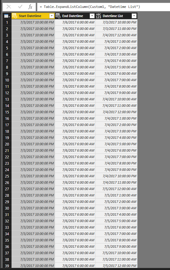
2. Add custom column to get datetime records between 'start datetime' and 'end datetime'.
#"Added Custom1"= Table.AddColumn(#"Changed Type1", "Datetime List", each List.DateTimes([Start Datetime],Duration.TotalHours(Duration.From([End Datetime]-[Start Datetime])), #duration(0, 1, 0, 0)))
3. Keep related columns and expand these records.
4. Save and return to report view.
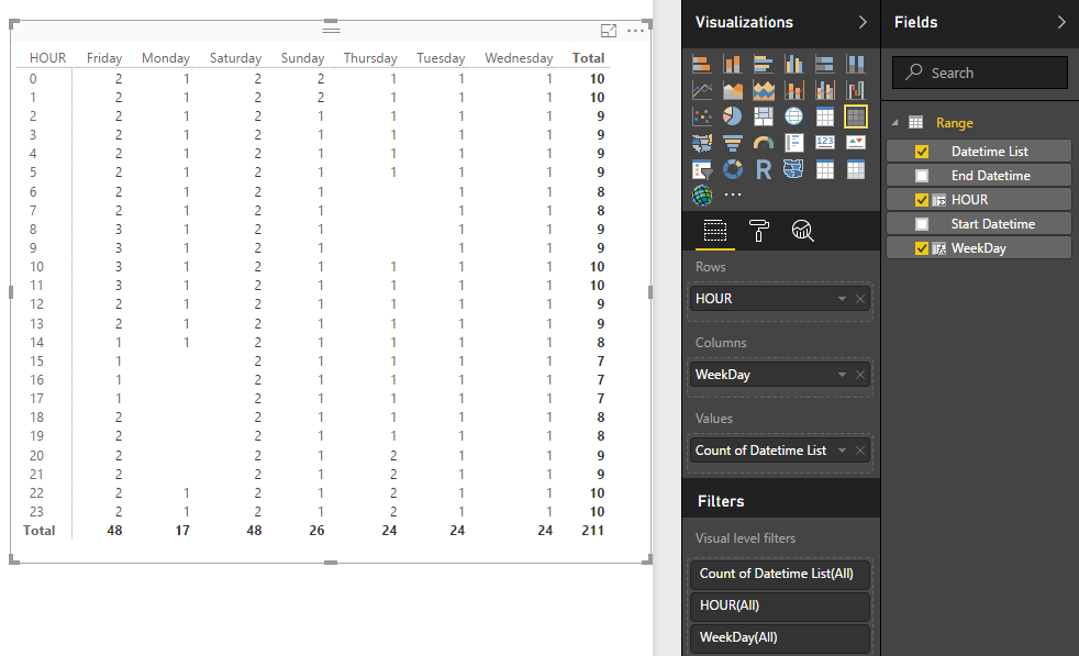
5. Add calculated columns to show weekday and hour.
HOUR = HOUR([Datetime List])

WeekDay = FORMAT([Datetime List],"dddd")
5. Create matrix visual with above calculate columns.
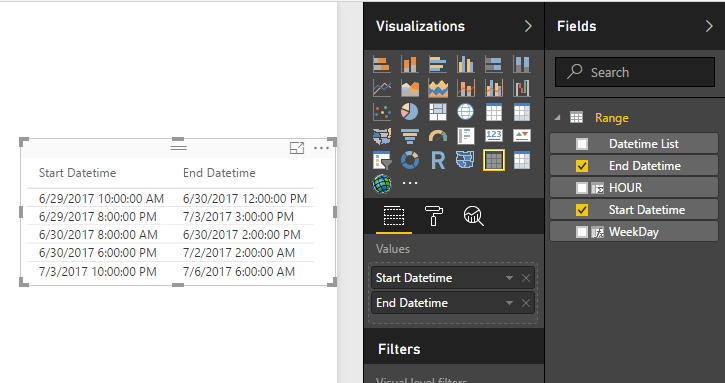
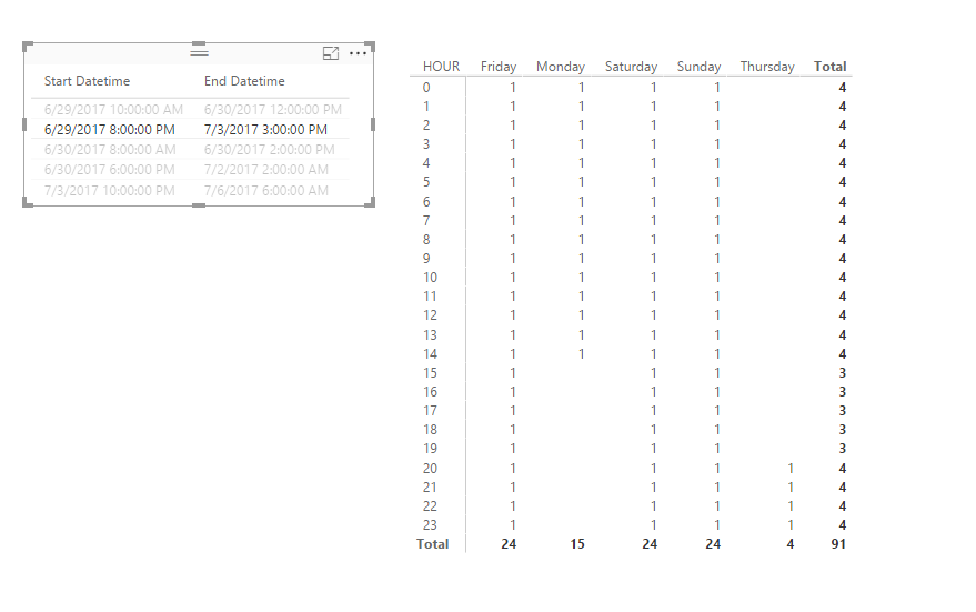
6. Add a table preview visual as the slicer.
After above steps, you can use table preview visual to choose the analysed records.
Notice: I also upload this sample file as the attachments.
Regards,
XXiaoxinSheng
- Mark as New
- Bookmark
- Subscribe
- Mute
- Subscribe to RSS Feed
- Permalink
- Report Inappropriate Content
@Kermayou could merge the date and hour column to obtain one type of start date and end date. After that, you can use:
DATEDIFF(<start_date>, <end_date>, <interval>)
- Mark as New
- Bookmark
- Subscribe
- Mute
- Subscribe to RSS Feed
- Permalink
- Report Inappropriate Content
I need to map the results in a day-hour visualization shown above. For example a shift from 3.7.2017 20:00 to 5.7.2017 08:00 would show 1 for each hour on 3.7.2017 after 20:00, 1 for each hour of 4.7.2017 and 1 for hours 00-08 on 5.7.2017.
- Mark as New
- Bookmark
- Subscribe
- Mute
- Subscribe to RSS Feed
- Permalink
- Report Inappropriate Content
Hi @Kerma,
You can refer to below sample to get hour - weekday analysis visual:
Sample:
1. Add custom columns to convert columns to datetime.
2. Add custom column to get datetime records between 'start datetime' and 'end datetime'.
#"Added Custom1"= Table.AddColumn(#"Changed Type1", "Datetime List", each List.DateTimes([Start Datetime],Duration.TotalHours(Duration.From([End Datetime]-[Start Datetime])), #duration(0, 1, 0, 0)))
3. Keep related columns and expand these records.
4. Save and return to report view.
5. Add calculated columns to show weekday and hour.
HOUR = HOUR([Datetime List])

WeekDay = FORMAT([Datetime List],"dddd")
5. Create matrix visual with above calculate columns.
6. Add a table preview visual as the slicer.
After above steps, you can use table preview visual to choose the analysed records.
Notice: I also upload this sample file as the attachments.
Regards,
XXiaoxinSheng
- Mark as New
- Bookmark
- Subscribe
- Mute
- Subscribe to RSS Feed
- Permalink
- Report Inappropriate Content
This looks very good, I will try this out! Thanks a lot 🙂
Helpful resources

Power BI Dataviz World Championships
The Power BI Data Visualization World Championships is back! Get ahead of the game and start preparing now!

Power BI Monthly Update - November 2025
Check out the November 2025 Power BI update to learn about new features.

| User | Count |
|---|---|
| 59 | |
| 43 | |
| 42 | |
| 23 | |
| 17 |
| User | Count |
|---|---|
| 190 | |
| 122 | |
| 96 | |
| 66 | |
| 47 |


