Join us at the 2025 Microsoft Fabric Community Conference
Microsoft Fabric Community Conference 2025, March 31 - April 2, Las Vegas, Nevada. Use code FABINSIDER for a $400 discount.
Register now- Power BI forums
- Get Help with Power BI
- Desktop
- Service
- Report Server
- Power Query
- Mobile Apps
- Developer
- DAX Commands and Tips
- Custom Visuals Development Discussion
- Health and Life Sciences
- Power BI Spanish forums
- Translated Spanish Desktop
- Training and Consulting
- Instructor Led Training
- Dashboard in a Day for Women, by Women
- Galleries
- Webinars and Video Gallery
- Data Stories Gallery
- Themes Gallery
- Power BI DataViz World Championships Gallery
- Quick Measures Gallery
- R Script Showcase
- COVID-19 Data Stories Gallery
- Community Connections & How-To Videos
- 2021 MSBizAppsSummit Gallery
- 2020 MSBizAppsSummit Gallery
- 2019 MSBizAppsSummit Gallery
- Events
- Ideas
- Custom Visuals Ideas
- Issues
- Issues
- Events
- Upcoming Events
The Power BI DataViz World Championships are on! With four chances to enter, you could win a spot in the LIVE Grand Finale in Las Vegas. Show off your skills.
- Power BI forums
- Forums
- Get Help with Power BI
- Desktop
- Re: Visualizing multiple true/false questions in O...
- Subscribe to RSS Feed
- Mark Topic as New
- Mark Topic as Read
- Float this Topic for Current User
- Bookmark
- Subscribe
- Printer Friendly Page
- Mark as New
- Bookmark
- Subscribe
- Mute
- Subscribe to RSS Feed
- Permalink
- Report Inappropriate Content
Visualizing multiple true/false questions in ONE stacked chart
Hi everybody
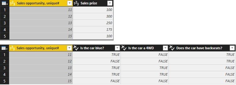
I'm new to Power BI and need some help visualizing multiple true/false questions in one chart as a percentage average of the sum sales prize. Here it goes:
| Sales opportunity, unique# | Sales prize | Is the car blue? | Is the car a 4WD | Does the car have backseats? |
| 11 | $ 100 | True | False | True |
| 12 | $ 300 | False | False | True |
| 13 | $ 250 | True | True | False |
| 14 | $ 175 | True | True | False |
| 15 | $ 100 | Fales | False | False |
Is it possible to display/visualize the true/false data in ONE stacked bar chart, where you get a percentage view.
Example:
Sum sales prize is: $925.
Percentage of cars that are blue: 60 %. Display: 60 % of sum sales price =$555
Percentage of cars that are 4WD: 40 %. Display: 40 % of sum sales price =$370
And so on... All in the same stacked bar chart.
I hope you're able to help.Thanks
BR
Anders
Solved! Go to Solution.
- Mark as New
- Bookmark
- Subscribe
- Mute
- Subscribe to RSS Feed
- Permalink
- Report Inappropriate Content
@Anonymous
In this scenario, you can first transform your table in Query Editor and then you can get the expected result with one measure. Please refer to following steps.
- In Query Editor, duplicate Table1 and rename it to Table2.
- Delete the three columns (blue, 4WD and backseats) of Table1. Delete one column (Sales prize) of Table2.
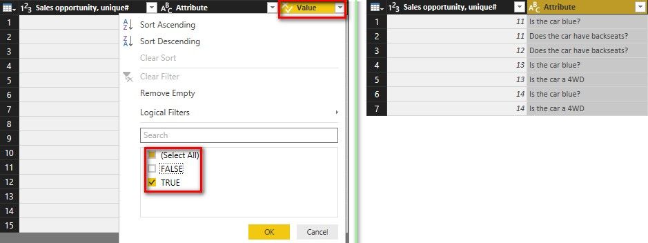
- Multiple select the three columns (blue, 4WD and backseats) of Table2, click “Unpivot Columns”.
- Filter the rows which “Value” = True in Table2. Then delete the “Value” column.
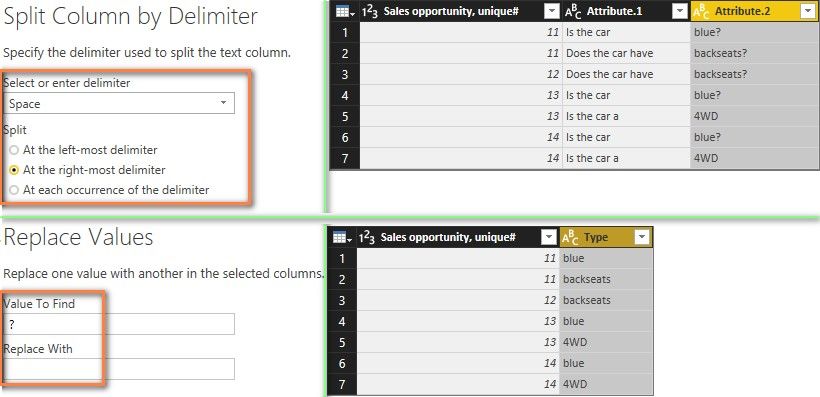
- Select the “Attribute” column in Table2, click “Split Column by Delimiter” of Space at the right-most delimiter as below. Replace ? with null in “Attribute.2” column. Rename “Attribute.2” to “Type” and delete “Attribute.1” column.
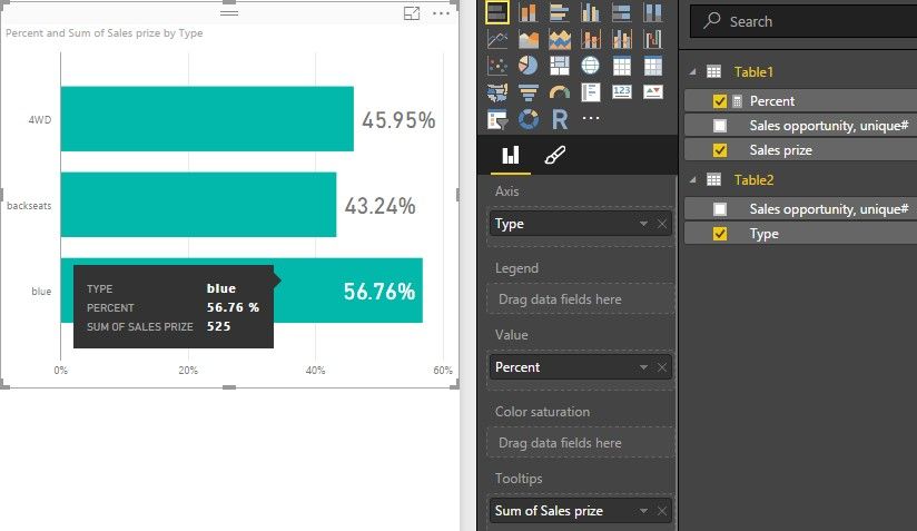
- Close and apply Query Editor. A 1:* relationship between Table1 and Table2 will be created automatically. Create a measure with following formula. Set its Format to “Percentage”.
Percent = DIVIDE ( SUM ( Table1[Sales prize] ), CALCULATE ( SUM ( Table1[Sales prize] ), ALL ( Table2 ) ) ) - Drag Stacked bar chart into your canvas. Select Type for Axis, Percent for Value, Sales prize (Quick Calc Sum) for Tooltips.
- Mark as New
- Bookmark
- Subscribe
- Mute
- Subscribe to RSS Feed
- Permalink
- Report Inappropriate Content
@Anonymous
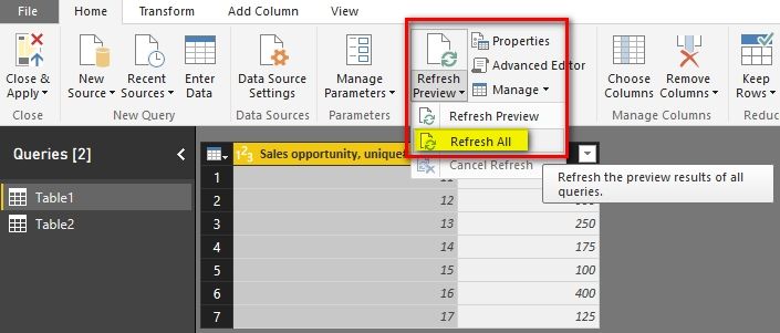
After you update the data tables, you only need to click “Refresh All” in Query Editor.
Best Regards,
Herbert
- Mark as New
- Bookmark
- Subscribe
- Mute
- Subscribe to RSS Feed
- Permalink
- Report Inappropriate Content
@Anonymous
In this scenario, you can first transform your table in Query Editor and then you can get the expected result with one measure. Please refer to following steps.
- In Query Editor, duplicate Table1 and rename it to Table2.
- Delete the three columns (blue, 4WD and backseats) of Table1. Delete one column (Sales prize) of Table2.
- Multiple select the three columns (blue, 4WD and backseats) of Table2, click “Unpivot Columns”.
- Filter the rows which “Value” = True in Table2. Then delete the “Value” column.
- Select the “Attribute” column in Table2, click “Split Column by Delimiter” of Space at the right-most delimiter as below. Replace ? with null in “Attribute.2” column. Rename “Attribute.2” to “Type” and delete “Attribute.1” column.
- Close and apply Query Editor. A 1:* relationship between Table1 and Table2 will be created automatically. Create a measure with following formula. Set its Format to “Percentage”.
Percent = DIVIDE ( SUM ( Table1[Sales prize] ), CALCULATE ( SUM ( Table1[Sales prize] ), ALL ( Table2 ) ) ) - Drag Stacked bar chart into your canvas. Select Type for Axis, Percent for Value, Sales prize (Quick Calc Sum) for Tooltips.
- Mark as New
- Bookmark
- Subscribe
- Mute
- Subscribe to RSS Feed
- Permalink
- Report Inappropriate Content
Thanks a lot, just what I needed! Seems like I have a lot "text editing" to do in the Query Editor, before I have the desired result.
Do you know if the table copying in the Query Editor is "remembered" or do I have to do this manually each time I update the data tables?
- Mark as New
- Bookmark
- Subscribe
- Mute
- Subscribe to RSS Feed
- Permalink
- Report Inappropriate Content
@Anonymous
After you update the data tables, you only need to click “Refresh All” in Query Editor.
Best Regards,
Herbert
- Mark as New
- Bookmark
- Subscribe
- Mute
- Subscribe to RSS Feed
- Permalink
- Report Inappropriate Content
- Mark as New
- Bookmark
- Subscribe
- Mute
- Subscribe to RSS Feed
- Permalink
- Report Inappropriate Content
Thaks a lot! Just what I neeeded - quite a workaround though 🙂
Seems like I'm going to do a lot of "text-work" in the Query Editor, since the real table of course has a lot more content/questions. Do you know if the Query Editor is able to "remember" the copying of tables if I need to update theese numbers each month?
Helpful resources

Join us at the Microsoft Fabric Community Conference
March 31 - April 2, 2025, in Las Vegas, Nevada. Use code MSCUST for a $150 discount!

Power BI Monthly Update - February 2025
Check out the February 2025 Power BI update to learn about new features.

Join our Community Sticker Challenge 2025
If you love stickers, then you will definitely want to check out our Community Sticker Challenge!

| User | Count |
|---|---|
| 84 | |
| 69 | |
| 68 | |
| 39 | |
| 37 |
