Get Fabric certified for FREE!
Don't miss your chance to take the Fabric Data Engineer (DP-700) exam on us!
Learn more- Power BI forums
- Get Help with Power BI
- Desktop
- Service
- Report Server
- Power Query
- Mobile Apps
- Developer
- DAX Commands and Tips
- Custom Visuals Development Discussion
- Health and Life Sciences
- Power BI Spanish forums
- Translated Spanish Desktop
- Training and Consulting
- Instructor Led Training
- Dashboard in a Day for Women, by Women
- Galleries
- Data Stories Gallery
- Themes Gallery
- Contests Gallery
- QuickViz Gallery
- Quick Measures Gallery
- Visual Calculations Gallery
- Notebook Gallery
- Translytical Task Flow Gallery
- TMDL Gallery
- R Script Showcase
- Webinars and Video Gallery
- Ideas
- Custom Visuals Ideas (read-only)
- Issues
- Issues
- Events
- Upcoming Events
The FabCon + SQLCon recap series starts April 14th at 8am Pacific. If you’re tracking where AI is going inside Fabric, this first session is a can't miss. Register now
- Power BI forums
- Forums
- Get Help with Power BI
- Desktop
- Visualization
- Subscribe to RSS Feed
- Mark Topic as New
- Mark Topic as Read
- Float this Topic for Current User
- Bookmark
- Subscribe
- Printer Friendly Page
- Mark as New
- Bookmark
- Subscribe
- Mute
- Subscribe to RSS Feed
- Permalink
- Report Inappropriate Content
Visualization
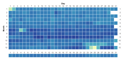
What type of visualization is this ? Is it a tree map?
- Mark as New
- Bookmark
- Subscribe
- Mute
- Subscribe to RSS Feed
- Permalink
- Report Inappropriate Content
Hi there!
As @mahoneypat said, that's a heatmap.
That particular heatmap you have a screenshot of was created with Vega-Lite using the Deneb custom visual that's in public preview. Though they can be made easily with the matrix visual per the example @mahoneypat provided.
More on heatmaps: A Complete Guide to Heatmaps | Tutorial by Chartio
More on Vega-Lite heatmaps can be found here: Annual Weather Heatmap | Vega-Lite
More on Deneb can be found here: Deneb - Declarative Visualization in Power BI (deneb-viz.github.io)
How I created that heatmap is here: Heatmap with marginal bars | EXPLORATIONS IN DATA STORYTELLING WITH POWER BI (kerrykolosko.com)
Did I answer your question? Mark my post as a solution!
Proud to be a Super User!
- Mark as New
- Bookmark
- Subscribe
- Mute
- Subscribe to RSS Feed
- Permalink
- Report Inappropriate Content
It's a heat map. With the right measure, you can make a matrix look like a heat map.
Power BI Heat Map: A Custom Visualization Tutorial - Enterprise DNA
Pat
Did I answer your question? Mark my post as a solution! Kudos are also appreciated!
To learn more about Power BI, follow me on Twitter or subscribe on YouTube.
@mahoneypa HoosierBI on YouTube
- Mark as New
- Bookmark
- Subscribe
- Mute
- Subscribe to RSS Feed
- Permalink
- Report Inappropriate Content
It is a correlation plot, which tells you the relationship between two attributes on a scale of 0 to 1. You can check the follow Power BI custom visual and also a blog written about how to use it:
https://appsource.microsoft.com/en-us/product/power-bi-visuals/wa104380814?tab=overview
Helpful resources

New to Fabric Survey
If you have recently started exploring Fabric, we'd love to hear how it's going. Your feedback can help with product improvements.

Power BI DataViz World Championships - June 2026
A new Power BI DataViz World Championship is coming this June! Don't miss out on submitting your entry.

Join our Fabric User Panel
Share feedback directly with Fabric product managers, participate in targeted research studies and influence the Fabric roadmap.

| User | Count |
|---|---|
| 53 | |
| 39 | |
| 37 | |
| 19 | |
| 18 |
| User | Count |
|---|---|
| 67 | |
| 66 | |
| 34 | |
| 32 | |
| 29 |

