FabCon is coming to Atlanta
Join us at FabCon Atlanta from March 16 - 20, 2026, for the ultimate Fabric, Power BI, AI and SQL community-led event. Save $200 with code FABCOMM.
Register now!- Power BI forums
- Get Help with Power BI
- Desktop
- Service
- Report Server
- Power Query
- Mobile Apps
- Developer
- DAX Commands and Tips
- Custom Visuals Development Discussion
- Health and Life Sciences
- Power BI Spanish forums
- Translated Spanish Desktop
- Training and Consulting
- Instructor Led Training
- Dashboard in a Day for Women, by Women
- Galleries
- Data Stories Gallery
- Themes Gallery
- Contests Gallery
- QuickViz Gallery
- Quick Measures Gallery
- Visual Calculations Gallery
- Notebook Gallery
- Translytical Task Flow Gallery
- TMDL Gallery
- R Script Showcase
- Webinars and Video Gallery
- Ideas
- Custom Visuals Ideas (read-only)
- Issues
- Issues
- Events
- Upcoming Events
The Power BI Data Visualization World Championships is back! Get ahead of the game and start preparing now! Learn more
- Power BI forums
- Forums
- Get Help with Power BI
- Desktop
- Visualization help
- Subscribe to RSS Feed
- Mark Topic as New
- Mark Topic as Read
- Float this Topic for Current User
- Bookmark
- Subscribe
- Printer Friendly Page
- Mark as New
- Bookmark
- Subscribe
- Mute
- Subscribe to RSS Feed
- Permalink
- Report Inappropriate Content
Visualization help
Hello all ,
some questions regarding visualization in powerBI desktop :
1. Can i add a total column to a graph ? for example show sales by region and the another graph for total ?
2.Can i sort a graph showing for example % growth by sales amount without presenting the sales amount?
3.is there option to set colors for specific values in all the report ? for example that Red will always be Western Europe in my report?
Thank you for your help
Shahar
Solved! Go to Solution.
- Mark as New
- Bookmark
- Subscribe
- Mute
- Subscribe to RSS Feed
- Permalink
- Report Inappropriate Content
Hi @shahar26,
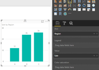
1. If mu understanding is right, you create a bar chart like the following shows. You want to add another bar in the chart to display the total sale, it's impossible to do it, because the y axis value based on the x-axis category(row value in resouce table).

You can create another chart only including total sum of sales, please see the screenshot below.
2. % growth is a column in your resource table? If it is, and the value is unique, you can the x-axis field, click the "Sort by column" under Modeling-> % growth, more details, please review this blog: Sort by column in Power BI Desktop.
3. Please turn on the "Show all" under data colors, you can set different color for specific value on different bars.
Best Regards,
Angelia
- Mark as New
- Bookmark
- Subscribe
- Mute
- Subscribe to RSS Feed
- Permalink
- Report Inappropriate Content
Hi @shahar26,
1. If mu understanding is right, you create a bar chart like the following shows. You want to add another bar in the chart to display the total sale, it's impossible to do it, because the y axis value based on the x-axis category(row value in resouce table).

You can create another chart only including total sum of sales, please see the screenshot below.
2. % growth is a column in your resource table? If it is, and the value is unique, you can the x-axis field, click the "Sort by column" under Modeling-> % growth, more details, please review this blog: Sort by column in Power BI Desktop.
3. Please turn on the "Show all" under data colors, you can set different color for specific value on different bars.
Best Regards,
Angelia
Helpful resources

Power BI Dataviz World Championships
The Power BI Data Visualization World Championships is back! Get ahead of the game and start preparing now!

| User | Count |
|---|---|
| 46 | |
| 42 | |
| 34 | |
| 31 | |
| 21 |
| User | Count |
|---|---|
| 143 | |
| 125 | |
| 100 | |
| 81 | |
| 63 |


