FabCon is coming to Atlanta
Join us at FabCon Atlanta from March 16 - 20, 2026, for the ultimate Fabric, Power BI, AI and SQL community-led event. Save $200 with code FABCOMM.
Register now!- Power BI forums
- Get Help with Power BI
- Desktop
- Service
- Report Server
- Power Query
- Mobile Apps
- Developer
- DAX Commands and Tips
- Custom Visuals Development Discussion
- Health and Life Sciences
- Power BI Spanish forums
- Translated Spanish Desktop
- Training and Consulting
- Instructor Led Training
- Dashboard in a Day for Women, by Women
- Galleries
- Data Stories Gallery
- Themes Gallery
- Contests Gallery
- QuickViz Gallery
- Quick Measures Gallery
- Visual Calculations Gallery
- Notebook Gallery
- Translytical Task Flow Gallery
- TMDL Gallery
- R Script Showcase
- Webinars and Video Gallery
- Ideas
- Custom Visuals Ideas (read-only)
- Issues
- Issues
- Events
- Upcoming Events
Get Fabric Certified for FREE during Fabric Data Days. Don't miss your chance! Request now
- Power BI forums
- Forums
- Get Help with Power BI
- Desktop
- Re: Visualization: Two Bar charts attached to one ...
- Subscribe to RSS Feed
- Mark Topic as New
- Mark Topic as Read
- Float this Topic for Current User
- Bookmark
- Subscribe
- Printer Friendly Page
- Mark as New
- Bookmark
- Subscribe
- Mute
- Subscribe to RSS Feed
- Permalink
- Report Inappropriate Content
Visualization: Two Bar charts attached to one asset
Dear community,
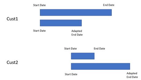
I'd like to ask for your support how the following visualization can be achieved with Power BI. I think the images attached describe best how it should look like: One customer shall receive exactly two bars, located next to each other, one pointing from "Start Date to "End Date", the other from "Start Date" to "Adapted End Date" (which can be earlier or later than the "End Date").
Of course it's fine when Cust1 / Cust2 appear not just once, but behind each of their respective bars.
Any ideas would be highly appreciated!
Thanks a lot and a great weekend to all of you!
Olifer
Solved! Go to Solution.
- Mark as New
- Bookmark
- Subscribe
- Mute
- Subscribe to RSS Feed
- Permalink
- Report Inappropriate Content
Hi @Olifer ,
You can search for a custom visualizaition of gant charts however since you have the need to have two dates not sure if you can find anything.
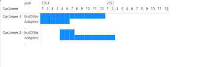
What I did was to create a calendar table and the added the following measures:
EndDAte = IF(MAX('Table'[Start Date]) <= MIN(dimCalendar[Date]) && MAX('Table'[End Date]) >= MAX(dimCalendar[Date]), 1)

Adaptive = IF(MAX('Table'[Start Date]) <= MIN(dimCalendar[Date]) && MAX('Table'[Adapted End Date]) >= MAX(dimCalendar[Date]), 1)
Now created a matrix visualizaiton and place the measures on the values and formatted the conditional formatting.
Result below and in attach PBIX file.
Regards
Miguel Félix
Did I answer your question? Mark my post as a solution!
Proud to be a Super User!
Check out my blog: Power BI em Português- Mark as New
- Bookmark
- Subscribe
- Mute
- Subscribe to RSS Feed
- Permalink
- Report Inappropriate Content
Dear Miguel,
highly appreciated - thanks a lot! I will spend some time to try to get it up and running, and I will also check the input data once more. In case I still don't manage, I would be glad to come back to your kind offer.
Best regards
Olifer
- Mark as New
- Bookmark
- Subscribe
- Mute
- Subscribe to RSS Feed
- Permalink
- Report Inappropriate Content
Dear Miguel,
thanks a lot for this innovative and tricky solution! Since my real input data is unfortunately far more complex than the data I provided, I am still struggling in getting it set up correctly. I'll continue to work on it and see how far I come.
Best regards
Olifer
- Mark as New
- Bookmark
- Subscribe
- Mute
- Subscribe to RSS Feed
- Permalink
- Report Inappropriate Content
Hi @Olifer ,
If you need you can send a private message with additional information about your model and I can try to assist you to get the solution implemented.
Regards
Miguel Félix
Did I answer your question? Mark my post as a solution!
Proud to be a Super User!
Check out my blog: Power BI em Português- Mark as New
- Bookmark
- Subscribe
- Mute
- Subscribe to RSS Feed
- Permalink
- Report Inappropriate Content
Hi @Olifer ,
You can search for a custom visualizaition of gant charts however since you have the need to have two dates not sure if you can find anything.
What I did was to create a calendar table and the added the following measures:
EndDAte = IF(MAX('Table'[Start Date]) <= MIN(dimCalendar[Date]) && MAX('Table'[End Date]) >= MAX(dimCalendar[Date]), 1)

Adaptive = IF(MAX('Table'[Start Date]) <= MIN(dimCalendar[Date]) && MAX('Table'[Adapted End Date]) >= MAX(dimCalendar[Date]), 1)
Now created a matrix visualizaiton and place the measures on the values and formatted the conditional formatting.
Result below and in attach PBIX file.
Regards
Miguel Félix
Did I answer your question? Mark my post as a solution!
Proud to be a Super User!
Check out my blog: Power BI em PortuguêsHelpful resources

Power BI Monthly Update - November 2025
Check out the November 2025 Power BI update to learn about new features.

Fabric Data Days
Advance your Data & AI career with 50 days of live learning, contests, hands-on challenges, study groups & certifications and more!


