FabCon is coming to Atlanta
Join us at FabCon Atlanta from March 16 - 20, 2026, for the ultimate Fabric, Power BI, AI and SQL community-led event. Save $200 with code FABCOMM.
Register now!- Power BI forums
- Get Help with Power BI
- Desktop
- Service
- Report Server
- Power Query
- Mobile Apps
- Developer
- DAX Commands and Tips
- Custom Visuals Development Discussion
- Health and Life Sciences
- Power BI Spanish forums
- Translated Spanish Desktop
- Training and Consulting
- Instructor Led Training
- Dashboard in a Day for Women, by Women
- Galleries
- Data Stories Gallery
- Themes Gallery
- Contests Gallery
- QuickViz Gallery
- Quick Measures Gallery
- Visual Calculations Gallery
- Notebook Gallery
- Translytical Task Flow Gallery
- TMDL Gallery
- R Script Showcase
- Webinars and Video Gallery
- Ideas
- Custom Visuals Ideas (read-only)
- Issues
- Issues
- Events
- Upcoming Events
The Power BI Data Visualization World Championships is back! Get ahead of the game and start preparing now! Learn more
- Power BI forums
- Forums
- Get Help with Power BI
- Desktop
- Re: Visualisation for multi layered qualitative da...
- Subscribe to RSS Feed
- Mark Topic as New
- Mark Topic as Read
- Float this Topic for Current User
- Bookmark
- Subscribe
- Printer Friendly Page
- Mark as New
- Bookmark
- Subscribe
- Mute
- Subscribe to RSS Feed
- Permalink
- Report Inappropriate Content
Visualisation for multi layered qualitative data
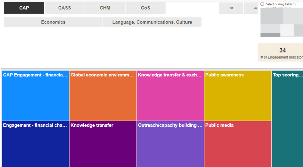
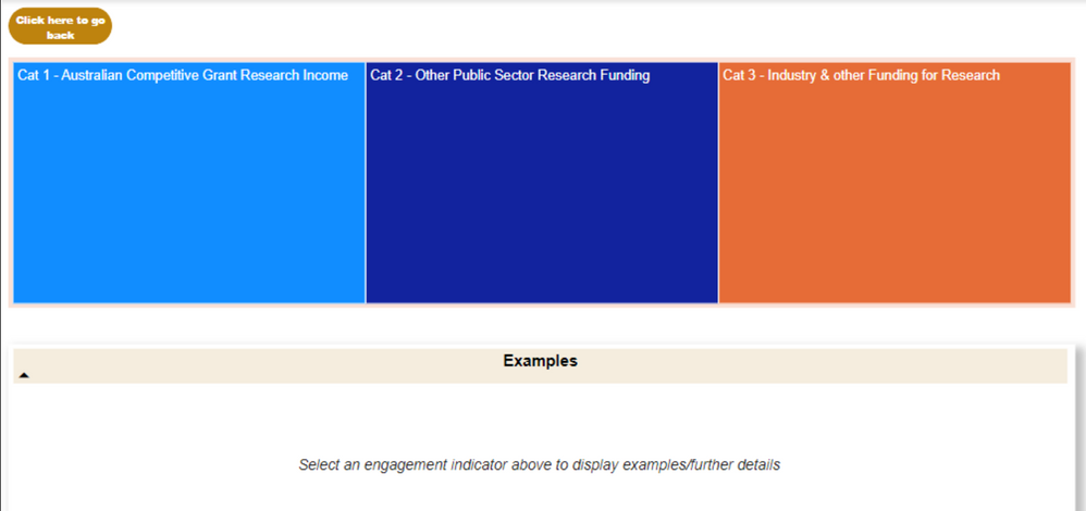
Hi all. I am facing extreme difficulty in producing a visualization for my need. My requirements are: 1. My filters are by college and by field of research code 2. the user needs to select the college and then the relevant field of research code 3. A list of parent indicators appears under that field of research code 4. When the user selects a parent indicator, it drills through further to a list of indicators 5. when the user selects that indicator, it displays examples under that indicator. So my data is very qualitative and layered and currently I am using a treemap visual and I have tried using card/multi level row card, but it is just not working. Can someone please provide some insights?
Solved! Go to Solution.
- Mark as New
- Bookmark
- Subscribe
- Mute
- Subscribe to RSS Feed
- Permalink
- Report Inappropriate Content
Hi @Anonymous ,
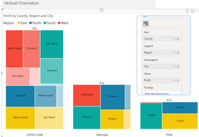
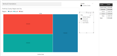
First, you can create a martix visual, which visualizes the hierarchical structure between data. Then use the Treemap Bar Chart to create a view of the hierarchy. The slicer can represent the changes in the different hierarchies.
Also, you can refer to below blog:
Hierarchical Tree/Advanced Decomposition Tree for Power BI - Features (xviz.com)
If the problem is still not resolved, please provide detailed error information and test data. Looking forward to your reply.
Best Regards,
Henry
If this post helps, then please consider Accept it as the solution to help the other members find it more quickly.
- Mark as New
- Bookmark
- Subscribe
- Mute
- Subscribe to RSS Feed
- Permalink
- Report Inappropriate Content
Hi @v-henryk-mstf I have used the zoomchart pie chart drill visualisation for now which serves my purpose. Thank you for the reply.
- Mark as New
- Bookmark
- Subscribe
- Mute
- Subscribe to RSS Feed
- Permalink
- Report Inappropriate Content
Hi @Anonymous ,
Thanks for your feedback.
Best regrads,
Henry
- Mark as New
- Bookmark
- Subscribe
- Mute
- Subscribe to RSS Feed
- Permalink
- Report Inappropriate Content
Hi @Anonymous,
My suggestion is that you use a donut or pie as your visual of choice and add the fields in the required heirarchy like College->Research->Indicator. That way every time you click on a sector it will drill down one level.
Did I answer your question? Mark this post as a solution if I did!
Consider taking a look at my blog: Forecast Period - Previous Forecasts
Helpful resources

Power BI Dataviz World Championships
The Power BI Data Visualization World Championships is back! Get ahead of the game and start preparing now!

| User | Count |
|---|---|
| 37 | |
| 37 | |
| 33 | |
| 32 | |
| 29 |
| User | Count |
|---|---|
| 130 | |
| 88 | |
| 82 | |
| 68 | |
| 64 |


