- Power BI forums
- Get Help with Power BI
- Desktop
- Service
- Report Server
- Power Query
- Mobile Apps
- Developer
- DAX Commands and Tips
- Custom Visuals Development Discussion
- Health and Life Sciences
- Power BI Spanish forums
- Translated Spanish Desktop
- Training and Consulting
- Instructor Led Training
- Dashboard in a Day for Women, by Women
- Galleries
- Data Stories Gallery
- Themes Gallery
- Contests Gallery
- QuickViz Gallery
- Quick Measures Gallery
- Visual Calculations Gallery
- Notebook Gallery
- Translytical Task Flow Gallery
- TMDL Gallery
- R Script Showcase
- Webinars and Video Gallery
- Ideas
- Custom Visuals Ideas (read-only)
- Issues
- Issues
- Events
- Upcoming Events
Learn from the best! Meet the four finalists headed to the FINALS of the Power BI Dataviz World Championships! Register now
- Subscribe to RSS Feed
- Mark Topic as New
- Mark Topic as Read
- Float this Topic for Current User
- Bookmark
- Subscribe
- Printer Friendly Page
- Mark as New
- Bookmark
- Subscribe
- Mute
- Subscribe to RSS Feed
- Permalink
- Report Inappropriate Content
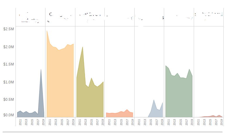
Visual
Hi I would like to show exactly same visual in my report, i would highly appreciate if anyone could help me?
Solved! Go to Solution.
- Mark as New
- Bookmark
- Subscribe
- Mute
- Subscribe to RSS Feed
- Permalink
- Report Inappropriate Content
@mohammedkhan , I think this a tableau visual. I tried the same stuff with bar visual in my series Tableau vs Power bi- Check this out https://www.youtube.com/watch?v=2P5BBRN853c
I tried changing it to Area. It only gives, marker as colored not area.
You can check some custom visual https://appsource.microsoft.com/en-us/marketplace/apps?product=power-bi-visuals
Helpful resources
| User | Count |
|---|---|
| 50 | |
| 37 | |
| 29 | |
| 16 | |
| 16 |
| User | Count |
|---|---|
| 73 | |
| 59 | |
| 39 | |
| 22 | |
| 21 |


