Fabric Data Days starts November 4th!
Advance your Data & AI career with 50 days of live learning, dataviz contests, hands-on challenges, study groups & certifications and more!
Get registered- Power BI forums
- Get Help with Power BI
- Desktop
- Service
- Report Server
- Power Query
- Mobile Apps
- Developer
- DAX Commands and Tips
- Custom Visuals Development Discussion
- Health and Life Sciences
- Power BI Spanish forums
- Translated Spanish Desktop
- Training and Consulting
- Instructor Led Training
- Dashboard in a Day for Women, by Women
- Galleries
- Data Stories Gallery
- Themes Gallery
- Contests Gallery
- QuickViz Gallery
- Quick Measures Gallery
- Visual Calculations Gallery
- Notebook Gallery
- Translytical Task Flow Gallery
- TMDL Gallery
- R Script Showcase
- Webinars and Video Gallery
- Ideas
- Custom Visuals Ideas (read-only)
- Issues
- Issues
- Events
- Upcoming Events
Get Fabric Certified for FREE during Fabric Data Days. Don't miss your chance! Request now
- Power BI forums
- Forums
- Get Help with Power BI
- Desktop
- Re: Visual chart to show price range
- Subscribe to RSS Feed
- Mark Topic as New
- Mark Topic as Read
- Float this Topic for Current User
- Bookmark
- Subscribe
- Printer Friendly Page
- Mark as New
- Bookmark
- Subscribe
- Mute
- Subscribe to RSS Feed
- Permalink
- Report Inappropriate Content
Visual chart to show price range
Hello,
I need to show a chart showing price ranges accross multiple companies. For each company I have a minimum and maximum value to show. I was trying to use the trading chart, but it seems I need a date value for the X-axis instead of company.
Any ideas?
Thank you.
Solved! Go to Solution.
- Mark as New
- Bookmark
- Subscribe
- Mute
- Subscribe to RSS Feed
- Permalink
- Report Inappropriate Content
Hi @Elisa_E,
Current power bi not support to setting start point of chart.
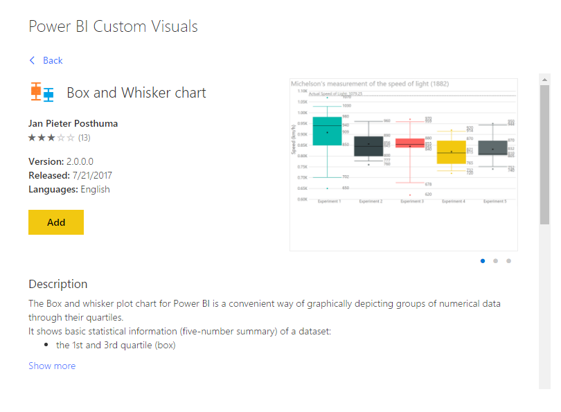
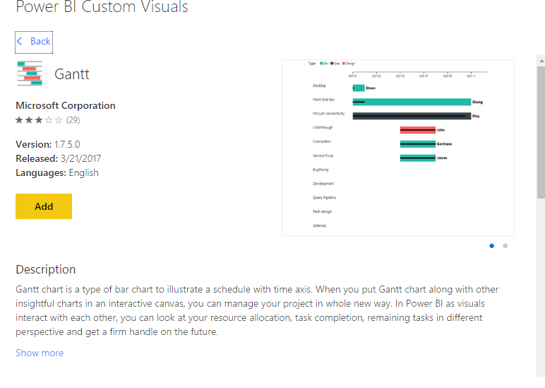
For your requirement, I'd like to suggest to you to take a look at 'gantt' and 'box and wisker chart', they seems suitable for your requirement.
In addition, you can also submit this to ideas forum.
Regards,
XIaoxin Sheng
- Mark as New
- Bookmark
- Subscribe
- Mute
- Subscribe to RSS Feed
- Permalink
- Report Inappropriate Content
Hi @Elisa_E,
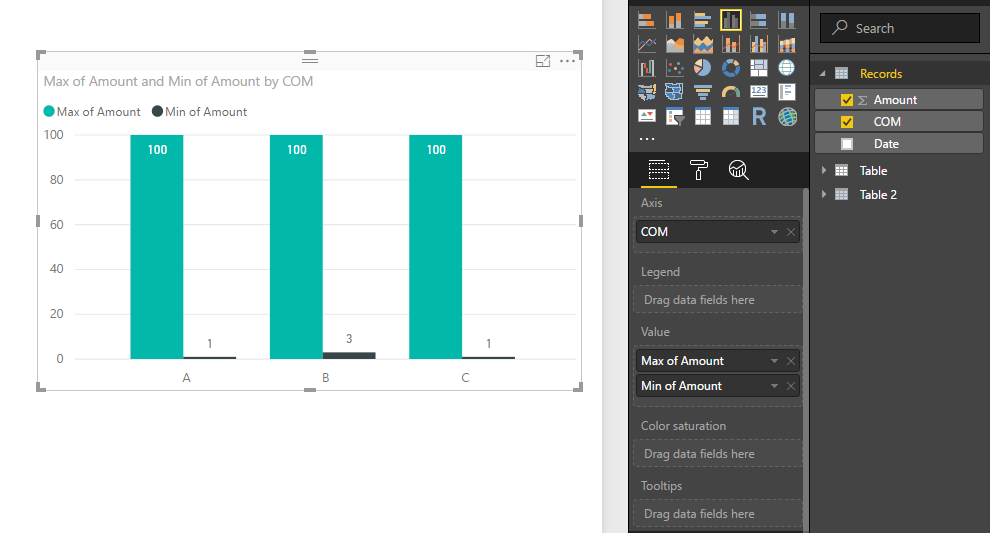
You can try to use clustered column chart to achieve your requirement.
Sample:
Company to axis field, amount columns to value fields with different summary mode.(max and min value)
Regards,
Xiaoxin Sheng
- Mark as New
- Bookmark
- Subscribe
- Mute
- Subscribe to RSS Feed
- Permalink
- Report Inappropriate Content
Thanks for the reply. Ideally what I needed was for column to represent the range (like floating columns), with start point at the minimum and end point at the maximum, accross the different companies (like the image below).
Maybe there is an easy way to format this from using a stacked column, but I haven't been able to see it as of yet.
- Mark as New
- Bookmark
- Subscribe
- Mute
- Subscribe to RSS Feed
- Permalink
- Report Inappropriate Content
Hi @Elisa_E,
Current power bi not support to setting start point of chart.
For your requirement, I'd like to suggest to you to take a look at 'gantt' and 'box and wisker chart', they seems suitable for your requirement.
In addition, you can also submit this to ideas forum.
Regards,
XIaoxin Sheng
- Mark as New
- Bookmark
- Subscribe
- Mute
- Subscribe to RSS Feed
- Permalink
- Report Inappropriate Content
Many thanks for the suggestions. I will give these a try.
- Mark as New
- Bookmark
- Subscribe
- Mute
- Subscribe to RSS Feed
- Permalink
- Report Inappropriate Content
Hi,
I am wondering if it is possible to add a dot or somehow highlight the most recent value in the time series on a box and whisker plot? Instead of the mean dot, could I use the latest value instead? Can I change the definition of the mean possible?
Alternatively, are there other charts which would show a price where I could also highlight the current value?
Thanks
Helpful resources

Power BI Monthly Update - November 2025
Check out the November 2025 Power BI update to learn about new features.

Fabric Data Days
Advance your Data & AI career with 50 days of live learning, contests, hands-on challenges, study groups & certifications and more!

| User | Count |
|---|---|
| 97 | |
| 73 | |
| 50 | |
| 46 | |
| 44 |


