Get Fabric certified for FREE!
Don't miss your chance to take the Fabric Data Engineer (DP-600) exam for FREE! Find out how by watching the DP-600 session on-demand now through April 28th.
Learn more- Power BI forums
- Get Help with Power BI
- Desktop
- Service
- Report Server
- Power Query
- Mobile Apps
- Developer
- DAX Commands and Tips
- Custom Visuals Development Discussion
- Health and Life Sciences
- Power BI Spanish forums
- Translated Spanish Desktop
- Training and Consulting
- Instructor Led Training
- Dashboard in a Day for Women, by Women
- Galleries
- Data Stories Gallery
- Themes Gallery
- Contests Gallery
- QuickViz Gallery
- Quick Measures Gallery
- Visual Calculations Gallery
- Notebook Gallery
- Translytical Task Flow Gallery
- TMDL Gallery
- R Script Showcase
- Webinars and Video Gallery
- Ideas
- Custom Visuals Ideas (read-only)
- Issues
- Issues
- Events
- Upcoming Events
Join the FabCon + SQLCon recap series. Up next: Power BI, Real-Time Intelligence, IQ and AI, and Data Factory take center stage. All sessions are available on-demand after the live show. Register now
- Power BI forums
- Forums
- Get Help with Power BI
- Desktop
- Re: Visual Axes gets double formatted when using c...
- Subscribe to RSS Feed
- Mark Topic as New
- Mark Topic as Read
- Float this Topic for Current User
- Bookmark
- Subscribe
- Printer Friendly Page
- Mark as New
- Bookmark
- Subscribe
- Mute
- Subscribe to RSS Feed
- Permalink
- Report Inappropriate Content
Visual Axes gets double formatted when using calculation groups
My client had a requirement where the numbers in the tooltips should be beautified - so a number like 3,493,380 should show as 3.49M.
To solve this I used the following custom string expression in a calculation group.
var val = SELECTEDMEASURE()
var digits = IF(ISNUMBER(val), LEN(ROUND(val, 0)), -1)
var prefix = IF(digits > 0 && val < 0, "-", "")

RETURN

IF(
    digits < 5, SELECTEDMEASUREFORMATSTRING(),

    SWITCH(
        digits,
        5, prefix & "0,.00K",
        6, prefix & "0,.00K",
        7, prefix & "0,,.00M",
        8, prefix & "0,,.00M",
        9, prefix & "0,,.00M",
        10, prefix & "0,,,.00B",
        11, prefix & "0,,,.00B",
        12, prefix & "0,,,.00B",
        13, prefix & "0,,,,.00T",
        14, prefix & "0,,,,.00T",
        15, prefix & "0,,,,.00T",
        SELECTEDMEASUREFORMATSTRING()
    )

)
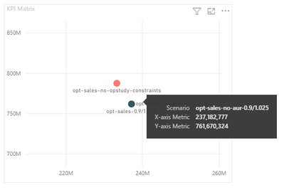
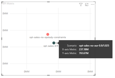
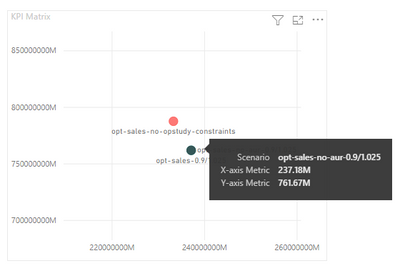
The above works, but when I use it in a Visual the X / Y Axis Numbers gets messed up, as Power BI does double formatting. Please see the before and after images below.
Without Calculation Group adjustment:
With Calculation Group adjustment:
As can be seen, in charts like the above where Power BI already has intelligence to show values in M, adding my custom format basically appends on top of what Power BI has already done.
Perhaps, I need to not trigger the formatting for values plotted in the Axes.
Can someone suggest what I can do in this situation.
- Mark as New
- Bookmark
- Subscribe
- Mute
- Subscribe to RSS Feed
- Permalink
- Report Inappropriate Content
@dpc_development since @OwenAuger already tested it, but I will try to test at my end.
Subscribe to the @PowerBIHowTo YT channel for an upcoming video on List and Record functions in Power Query!!
Learn Power BI and Fabric - subscribe to our YT channel - Click here: @PowerBIHowTo
If my solution proved useful, I'd be delighted to receive Kudos. When you put effort into asking a question, it's equally thoughtful to acknowledge and give Kudos to the individual who helped you solve the problem. It's a small gesture that shows appreciation and encouragement! ❤
Did I answer your question? Mark my post as a solution. Proud to be a Super User! Appreciate your Kudos 🙂
Feel free to email me with any of your BI needs.
- Mark as New
- Bookmark
- Subscribe
- Mute
- Subscribe to RSS Feed
- Permalink
- Report Inappropriate Content
Sorry, I meant to ask whether you know how to detect whether the formatting is done within the axes section or have another alternative, as this is most likely a bug.
- Mark as New
- Bookmark
- Subscribe
- Mute
- Subscribe to RSS Feed
- Permalink
- Report Inappropriate Content
Hi @dpc_development ,
Please review the content in the following links, hope they can help you.
Dynamic Formatting of Switch Measures in Power BI
Finally! Format $ or % For the Same Measure On the Same Chart (..the Calculation Group bug fixed!)
Best Regards
- Mark as New
- Bookmark
- Subscribe
- Mute
- Subscribe to RSS Feed
- Permalink
- Report Inappropriate Content
Hi @Anonymous I had gone through those documents/videos, but they don't address the issue I am facing. I am already able to switch measures based on slicer selection and change the format using calculation groups. However, when using the measure in a chart, while the axis numbers show in a short neat manner - in millions or billions, the tooltip still shows in a full absolute manner.
I tried to avoid this by using formats such as '0,,.00', but that makes the visual format the axis numbers twice. So earlier when it showed 800mn on the left, now it shows 0.08mnM.
This seems to be a bug with Power BI.
Hence, I was hoping to find a solution to not format the calculation group when it is plotting numbers on the axes.
- Mark as New
- Bookmark
- Subscribe
- Mute
- Subscribe to RSS Feed
- Permalink
- Report Inappropriate Content
Hi again,
Quite right, I see it's not actually working (I had misinterpreted what was happening in my test model) 😞
I will continue testing at my end.
Someone else out there may have some ideas...
Paging @tenfingers 🙂
- Mark as New
- Bookmark
- Subscribe
- Mute
- Subscribe to RSS Feed
- Permalink
- Report Inappropriate Content
It appears that the conflict in axis number formats can come about if you have both a format defined by a Calculation Group and the axis Display Units set to anything other than None. (i.e Auto, Millions, etc).
Try changing the axis Display Units setting to None. It seems to work for me in a test model.
Does that work for you?
Regards,
Owen
- Mark as New
- Bookmark
- Subscribe
- Mute
- Subscribe to RSS Feed
- Permalink
- Report Inappropriate Content
@amitchandak @parry2k have you faced something similar before?
Should this be reported as a bug instead?
- Mark as New
- Bookmark
- Subscribe
- Mute
- Subscribe to RSS Feed
- Permalink
- Report Inappropriate Content
@OwenAuger When I set the axes display units to 'None', it removes my calculation group formatting as well. I am using a Scatter Plot visual.
Helpful resources

Power BI Monthly Update - April 2026
Check out the April 2026 Power BI update to learn about new features.

New to Fabric Survey
If you have recently started exploring Fabric, we'd love to hear how it's going. Your feedback can help with product improvements.

Power BI DataViz World Championships - June 2026
A new Power BI DataViz World Championship is coming this June! Don't miss out on submitting your entry.

| User | Count |
|---|---|
| 42 | |
| 37 | |
| 34 | |
| 21 | |
| 16 |
| User | Count |
|---|---|
| 65 | |
| 62 | |
| 31 | |
| 26 | |
| 25 |


