Party with Power BI’s own Guy in a Cube
Power BI is turning 10! Tune in for a special live episode on July 24 with behind-the-scenes stories, product evolution highlights, and a sneak peek at what’s in store for the future.
Save the date- Power BI forums
- Get Help with Power BI
- Desktop
- Service
- Report Server
- Power Query
- Mobile Apps
- Developer
- DAX Commands and Tips
- Custom Visuals Development Discussion
- Health and Life Sciences
- Power BI Spanish forums
- Translated Spanish Desktop
- Training and Consulting
- Instructor Led Training
- Dashboard in a Day for Women, by Women
- Galleries
- Data Stories Gallery
- Themes Gallery
- Contests Gallery
- Quick Measures Gallery
- Notebook Gallery
- Translytical Task Flow Gallery
- TMDL Gallery
- R Script Showcase
- Webinars and Video Gallery
- Ideas
- Custom Visuals Ideas (read-only)
- Issues
- Issues
- Events
- Upcoming Events
Enhance your career with this limited time 50% discount on Fabric and Power BI exams. Ends August 31st. Request your voucher.
- Power BI forums
- Forums
- Get Help with Power BI
- Desktop
- Violin Plot: why does the density plot extend past...
- Subscribe to RSS Feed
- Mark Topic as New
- Mark Topic as Read
- Float this Topic for Current User
- Bookmark
- Subscribe
- Printer Friendly Page
- Mark as New
- Bookmark
- Subscribe
- Mute
- Subscribe to RSS Feed
- Permalink
- Report Inappropriate Content
Violin Plot: why does the density plot extend past the values?
I'm using the violin plot and I like it a lot.
https://appsource.microsoft.com/en-us/product/power-bi-visuals/WA104381947?tab=Overview
However, I see that the density plot extends well beyond the actual range of the data points.
That is not something I've experienced with other violin plots, but, perhaps I do not understand the purpose of this?
Thanks!
Solved! Go to Solution.
- Mark as New
- Bookmark
- Subscribe
- Mute
- Subscribe to RSS Feed
- Permalink
- Report Inappropriate Content
Hi there (and thanks for liking the visual!),
I got an email from someone with a similar question around the same time as this post and we've discussed offline. I assume you're this person, but I'll fill this out for anyone else who might come across the question and wonder the same thing.
Firstly, there's a good post on Stack Overflow that explains the issue. Whilst this question is for the Seaborn library, the concepts still apply.
The run-off is due to the Kernel Density Estimation (KDE) plot used to smooth your distribution. If we just stop at the end of the min/max, we run the risk of miscommunicating the modality of your data, so the KDE is projected outwards, based on the trajectory of your data to a convergence point. Sometimes, the KDE doesn't fully resolve to this point due to floating-point issues in Javascript and we choose a sensible cut-off point to stop. Sometimes this produces a straighter line than intended in the tail-off but still lets the halves converge (I'm continually looking into this).
Some other things to consider (bearing in mind that everyone's data is going to be specific to their individual use cases):
- By default, the visual uses Silverman's rule of thumb to calculate a bandwidth it thinks is reasonable. This is not always great, depending on the modality of your data but gives us somewhere to start when trying to produce a 'one size fits all' visual in these cases.
- In cases where this doesn't do a great job, it can pay to look at the bandwidth applied. The default setting applies the same bandwidth to all categories based on the entire data set. In 1.1.0 we introduced the ability to apply the bandwidth to individual categories, if you are using them (either using the rule of thumb calculation or allowing you to specify manual values). This will 'tighten-up' each category appropriately, but might not be the right fit for your data as a whole.
- Beyond the auto-calculation, you can opt to manually specify the bandwidth for the entire visual or on a category-by-category basis. Typically, the lower the bandwidth, the more peaks you'll get in your data.
- It can pay to take the default bandwidth (you can obtain by selecting KDE Bandwidth in the Tooltip menu and hovering over the violin) and modifying it to see how the plot responds for your data.
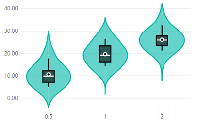
For example, here's the tooth-growth dataset with the default bandwidth across all categories (this gives a bandwidth of 7.9):
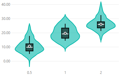
If I apply this by category, this will calculate bandwidths of 4.8, 5.69 and 4.11 respectively, e.g.:
You can see this looks a little better for this particular use case, but I'd still consider what tihs might do for a different set of data if I'm splitting into categories.
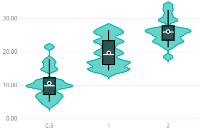
If I really want to tighten-up the chart, I can reduce the bandwidth for all categories to 1, e.g.:
So, my plots converge a little closer to the ends, but it's harder (but not impossible) to discern the modality of each category. For visuals with more data points (these only have 20 or so in them for each category), the plot can get a bit busy and may not serve the story you're trying to tell.
I have considered a 'clamping' option but have chosen not to implement at this time. I've also had this issue raised today, which I assume has sprung from this post/email discussion. I'll take a look at and consider for a future version as well.
Anyway, I hope that this clarifies things a bit and possibly offers some additional options for anyone using the visual.
Did I answer your question? Mark my post as a solution!
Proud to be a Super User!
On how to ask a technical question, if you really want an answer (courtesy of SQLBI)
Helpful resources
| User | Count |
|---|---|
| 76 | |
| 74 | |
| 45 | |
| 31 | |
| 27 |
| User | Count |
|---|---|
| 99 | |
| 91 | |
| 51 | |
| 48 | |
| 47 |


