Get Fabric certified for FREE!
Don't miss your chance to take the Fabric Data Engineer (DP-600) exam for FREE! Find out how by watching the DP-600 session on-demand now through April 28th.
Learn more- Power BI forums
- Get Help with Power BI
- Desktop
- Service
- Report Server
- Power Query
- Mobile Apps
- Developer
- DAX Commands and Tips
- Custom Visuals Development Discussion
- Health and Life Sciences
- Power BI Spanish forums
- Translated Spanish Desktop
- Training and Consulting
- Instructor Led Training
- Dashboard in a Day for Women, by Women
- Galleries
- Data Stories Gallery
- Themes Gallery
- Contests Gallery
- QuickViz Gallery
- Quick Measures Gallery
- Visual Calculations Gallery
- Notebook Gallery
- Translytical Task Flow Gallery
- TMDL Gallery
- R Script Showcase
- Webinars and Video Gallery
- Ideas
- Custom Visuals Ideas (read-only)
- Issues
- Issues
- Events
- Upcoming Events
Join the FabCon + SQLCon recap series. Up next: Power BI, Real-Time Intelligence, IQ and AI, and Data Factory take center stage. All sessions are available on-demand after the live show. Register now
- Power BI forums
- Forums
- Get Help with Power BI
- Desktop
- View Data Colors
- Subscribe to RSS Feed
- Mark Topic as New
- Mark Topic as Read
- Float this Topic for Current User
- Bookmark
- Subscribe
- Printer Friendly Page
- Mark as New
- Bookmark
- Subscribe
- Mute
- Subscribe to RSS Feed
- Permalink
- Report Inappropriate Content
View Data Colors
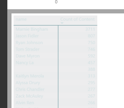
When I click "View Data" on a plot in Power BI I see this:
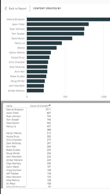
The colors are totally illegible! When what I want to see is this:
What is super strange is that I see this problem in Desktop intermittently (even on the same plot!), but for all plots in Premium. I am using a custom theme
{
"name": "cjemmott",
"dataColors": ["#263c42", "#f1592a", "#739ca2", "#dfaf26", "#1ca2dc"],
"background":"#ededee",
"foreground":"#d5e3e5",
"tableAccent": "#739ca2"
}
Is there a way to control these colors? Why are they acting differently in Power BI desktop and Power BI Premium?
Solved! Go to Solution.
- Mark as New
- Bookmark
- Subscribe
- Mute
- Subscribe to RSS Feed
- Permalink
- Report Inappropriate Content
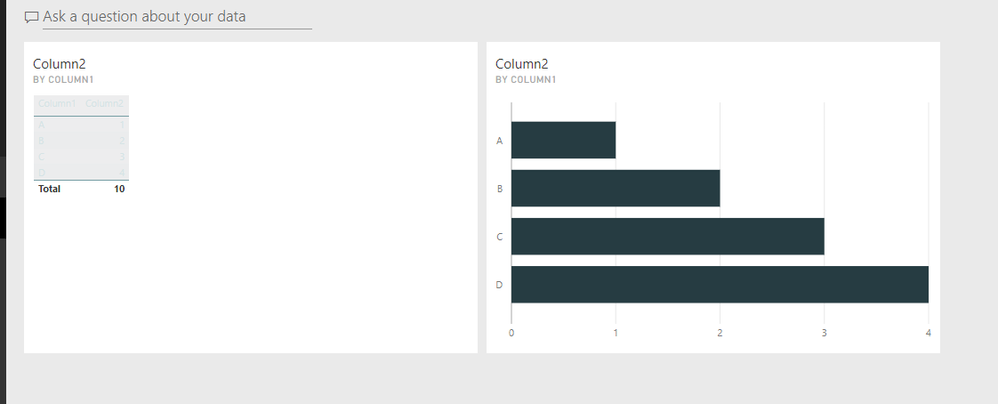
As I tested with your JSON, it shows same "greyed" table visual in both Power BI Desktop.
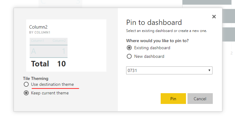
I think this is your expected style from your JSON. And I guess you selected "keep destination theme" when pinning dashboard tiles.
Regards,
- Mark as New
- Bookmark
- Subscribe
- Mute
- Subscribe to RSS Feed
- Permalink
- Report Inappropriate Content
Got it!
I think I may have figured out whay I was confused.
In Desktop I right click on a bar chart in a report and select "see data". This opens a split screen with the bar plot on the top and a black and white table of the data below that (even with the theme).
I then publish this report to Power BI Premium. In Premium through the browser do the same thing, right click on the bar chart and select "see data". The layout is the same, but now the table is the illegible color scheme.
My issue is that desktop and premium are giving different results. But I did modify the JSON to work around this problem - thanks for the help.
Helpful resources

Power BI Monthly Update - April 2026
Check out the April 2026 Power BI update to learn about new features.

New to Fabric Survey
If you have recently started exploring Fabric, we'd love to hear how it's going. Your feedback can help with product improvements.

Power BI DataViz World Championships - June 2026
A new Power BI DataViz World Championship is coming this June! Don't miss out on submitting your entry.

| User | Count |
|---|---|
| 41 | |
| 37 | |
| 34 | |
| 21 | |
| 16 |
| User | Count |
|---|---|
| 64 | |
| 58 | |
| 31 | |
| 25 | |
| 25 |


