FabCon is coming to Atlanta
Join us at FabCon Atlanta from March 16 - 20, 2026, for the ultimate Fabric, Power BI, AI and SQL community-led event. Save $200 with code FABCOMM.
Register now!- Power BI forums
- Get Help with Power BI
- Desktop
- Service
- Report Server
- Power Query
- Mobile Apps
- Developer
- DAX Commands and Tips
- Custom Visuals Development Discussion
- Health and Life Sciences
- Power BI Spanish forums
- Translated Spanish Desktop
- Training and Consulting
- Instructor Led Training
- Dashboard in a Day for Women, by Women
- Galleries
- Data Stories Gallery
- Themes Gallery
- Contests Gallery
- QuickViz Gallery
- Quick Measures Gallery
- Visual Calculations Gallery
- Notebook Gallery
- Translytical Task Flow Gallery
- TMDL Gallery
- R Script Showcase
- Webinars and Video Gallery
- Ideas
- Custom Visuals Ideas (read-only)
- Issues
- Issues
- Events
- Upcoming Events
Get Fabric Certified for FREE during Fabric Data Days. Don't miss your chance! Request now
- Power BI forums
- Forums
- Get Help with Power BI
- Desktop
- Re: View Categorical Data Type in a Line Chart Con...
- Subscribe to RSS Feed
- Mark Topic as New
- Mark Topic as Read
- Float this Topic for Current User
- Bookmark
- Subscribe
- Printer Friendly Page
- Mark as New
- Bookmark
- Subscribe
- Mute
- Subscribe to RSS Feed
- Permalink
- Report Inappropriate Content
View Categorical Data Type in a Line Chart Condensed
Hello,
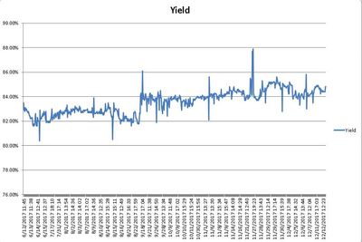
I am trying to show the trend of a test result of a manufactured product over time. I am using the Line Chart, and my problem is that I want to use Categorical Type on the X-axis, not Continuous Type. It may be days or weeks before the same product is run, and Continuous interpolates in between. Categorical will show each test result with a timestamp, but for hundreds of data points this can cause quite a long scroll bar. I want it condensed so I can see months of data and analyze the trend.
The data is being stored as a Quantity (53.5), and Date/Time (2017-12-11 15:54:06.957).
Is this possible?
Thanks, Nate
- Mark as New
- Bookmark
- Subscribe
- Mute
- Subscribe to RSS Feed
- Permalink
- Report Inappropriate Content
Hi Nate,
If you want a monthly graph, you can drill down to month as the picture shows.
If you want more help, please provide a dummy sample.
Best Regards,
Dale
If this post helps, then please consider Accept it as the solution to help the other members find it more quickly.
- Mark as New
- Bookmark
- Subscribe
- Mute
- Subscribe to RSS Feed
- Permalink
- Report Inappropriate Content
Oops this accidentally got posted twice. Here is the original post.
https://community.powerbi.com/t5/Desktop/Show-Categorical-Data-Trend-Condensed/td-p/322289
This one can be deleted. Thanks.
- Mark as New
- Bookmark
- Subscribe
- Mute
- Subscribe to RSS Feed
- Permalink
- Report Inappropriate Content
Hi @natemarshall,
The link is invalid.
Best Regards,
Dale
If this post helps, then please consider Accept it as the solution to help the other members find it more quickly.
- Mark as New
- Bookmark
- Subscribe
- Mute
- Subscribe to RSS Feed
- Permalink
- Report Inappropriate Content
That is confusing, apologies. Here is my follow up from the other thread.
Thank you for the response. I am not looking to drill down into a time heirarchy. I would like to show all entries on the X-axis, but responsive to window size of the chart. I pulled the data into Excel, and was able to achieve my result.
When I resize the Excel chart, it will still show me all the data points. Perhaps not as granular, but I am only interested in the trend. In Power BI, the chart does not "condense" the results. It adds a scroll bar and I must scroll to see all results.
Does this help?
Thanks,
- Nate
- Mark as New
- Bookmark
- Subscribe
- Mute
- Subscribe to RSS Feed
- Permalink
- Report Inappropriate Content
Hi Nate,
If you are only interest in the trend. Why not changing the type of X-axis to Continuous and the visual will be condensed.
If you still want this feature, please create an idea here.
Best Regards,
Dale
If this post helps, then please consider Accept it as the solution to help the other members find it more quickly.
- Mark as New
- Bookmark
- Subscribe
- Mute
- Subscribe to RSS Feed
- Permalink
- Report Inappropriate Content
I am not interested in Continuous because it interpolates. It sounds like Power BI is not able to have a responsive line chart in the "Categorical" X-Axis Type yet, and that's fine. I can pull my data into Excel and get my result with the "Text Axis" type in Excel.
Thanks.
- Mark as New
- Bookmark
- Subscribe
- Mute
- Subscribe to RSS Feed
- Permalink
- Report Inappropriate Content
Hi @natemarshall,
If you want this feature, please create an idea here.
Best Regards,
Dale
If this post helps, then please consider Accept it as the solution to help the other members find it more quickly.
Helpful resources

Power BI Monthly Update - November 2025
Check out the November 2025 Power BI update to learn about new features.

Fabric Data Days
Advance your Data & AI career with 50 days of live learning, contests, hands-on challenges, study groups & certifications and more!


