FabCon is coming to Atlanta
Join us at FabCon Atlanta from March 16 - 20, 2026, for the ultimate Fabric, Power BI, AI and SQL community-led event. Save $200 with code FABCOMM.
Register now!- Power BI forums
- Get Help with Power BI
- Desktop
- Service
- Report Server
- Power Query
- Mobile Apps
- Developer
- DAX Commands and Tips
- Custom Visuals Development Discussion
- Health and Life Sciences
- Power BI Spanish forums
- Translated Spanish Desktop
- Training and Consulting
- Instructor Led Training
- Dashboard in a Day for Women, by Women
- Galleries
- Data Stories Gallery
- Themes Gallery
- Contests Gallery
- QuickViz Gallery
- Quick Measures Gallery
- Visual Calculations Gallery
- Notebook Gallery
- Translytical Task Flow Gallery
- TMDL Gallery
- R Script Showcase
- Webinars and Video Gallery
- Ideas
- Custom Visuals Ideas (read-only)
- Issues
- Issues
- Events
- Upcoming Events
Get Fabric Certified for FREE during Fabric Data Days. Don't miss your chance! Request now
- Power BI forums
- Forums
- Get Help with Power BI
- Desktop
- Re: Vertical Tracks for time-based data plots
- Subscribe to RSS Feed
- Mark Topic as New
- Mark Topic as Read
- Float this Topic for Current User
- Bookmark
- Subscribe
- Printer Friendly Page
- Mark as New
- Bookmark
- Subscribe
- Mute
- Subscribe to RSS Feed
- Permalink
- Report Inappropriate Content
Vertical Tracks for time-based data plots
Guys,
I have a large dataset 900,000+rows where all data is indexed by time with 1 second resolution.
The requirement I have is to plot the data on Vertical tracks with simple line charts: time would be the y axis and x would be the chosen parameter.
I have not found any solution that allows to do that. PBIVizEdit.com have a published visual called "Multiple Vertical Line Chart", which is the closest thing to what I need except that it is limited with the time range that it can display (~1000 data points).
Any suggestions?
Thanks
- Mark as New
- Bookmark
- Subscribe
- Mute
- Subscribe to RSS Feed
- Permalink
- Report Inappropriate Content
Can you share some sample data and a depiction of the expected outcome?
Did I answer your question? Mark my post as a solution!
In doing so, you are also helping me. Thank you!
Proud to be a Super User!
Paul on Linkedin.
- Mark as New
- Bookmark
- Subscribe
- Mute
- Subscribe to RSS Feed
- Permalink
- Report Inappropriate Content
Paul,
Thanks for your response. Sample data can be found on the following link Sample Dataset
A sketch of the required visualization can be found on the following link Sketch . It is simply the standard "LINE CHART" or "AREA CHART" visualizations but inverted, i.e. Y-Axis represents time and the X-Axis represents features.
Regards
- Mark as New
- Bookmark
- Subscribe
- Mute
- Subscribe to RSS Feed
- Permalink
- Report Inappropriate Content
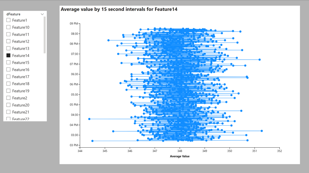
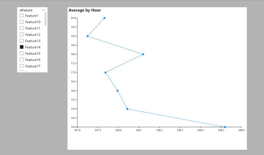
So I've given this a shot with Charticulator, but my pc really struggles when I try to plot the full set of data points for any particular feature, and the result does not appear to be particularly useful (even when I try to add an option for scrolling the y-axis, my PC really struggles and I cannot seem to tweak the axis to any useful settings. This is what it looks like:
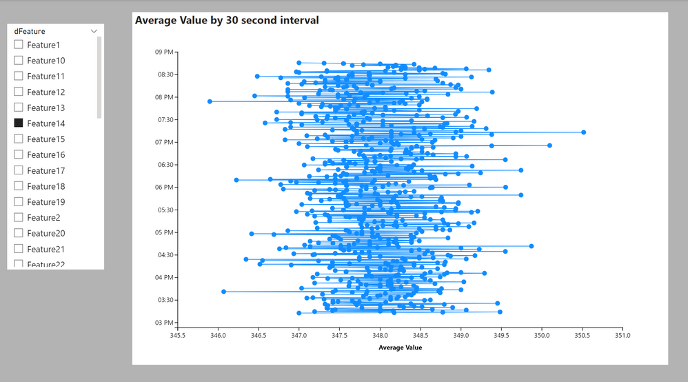
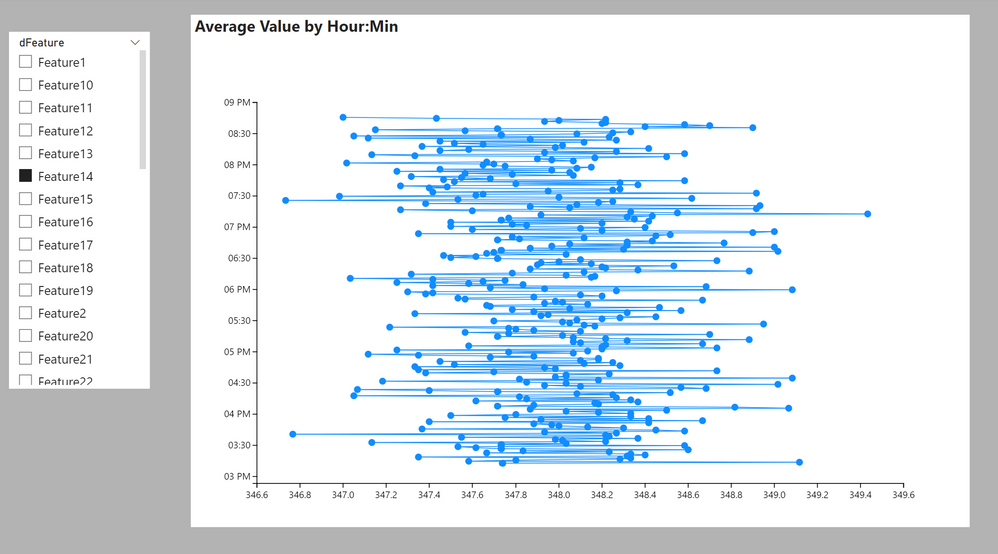
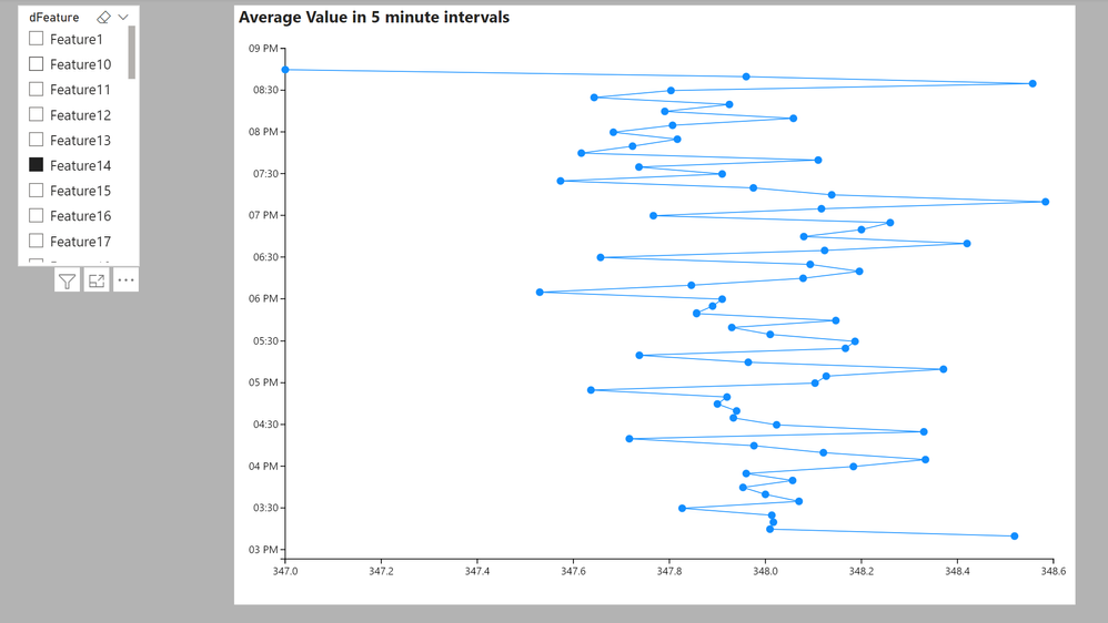
I tried using a measure for average and different time intervals, in case you think any will fit the bill:
I've attached a sample PBIX file
Did I answer your question? Mark my post as a solution!
In doing so, you are also helping me. Thank you!
Proud to be a Super User!
Paul on Linkedin.
- Mark as New
- Bookmark
- Subscribe
- Mute
- Subscribe to RSS Feed
- Permalink
- Report Inappropriate Content
Paul,
Thanks, this is pretty close and it has a many details that I can use elsewhere, and from a functional perspective it kinda does the job but won't work with my data model.
Apparently I missed some details and I apologize for that:
1-This is ultimately intended to work with SQL Direct Query data source, which means I cannot do any subsequent steps in PowerQuery
2- The chart is supposed to fit 3 or 4 features at a time
3- There should be ability to customize colors, line shapes, line...
I'm basically looking for same capabilities as a line/plot area chart.
I wish there was just a rotate button somewhere.
If you're out of ideas, I'd like to know if the source codes for Line and Plot Area charts available anywhere for download. I'll just swap the code sections between x and y following these tutorials
https://learn.microsoft.com/en-us/power-bi/developer/visuals/
Thanks
- Mark as New
- Bookmark
- Subscribe
- Mute
- Subscribe to RSS Feed
- Permalink
- Report Inappropriate Content
Sorry... can't help any further. That level of development is waaaaay beyond my scope of "expertise"...
It might, however, be worth trying the Developer forum?
https://community.powerbi.com/t5/Developer/bd-p/Developer
Did I answer your question? Mark my post as a solution!
In doing so, you are also helping me. Thank you!
Proud to be a Super User!
Paul on Linkedin.
Helpful resources

Power BI Monthly Update - November 2025
Check out the November 2025 Power BI update to learn about new features.

Fabric Data Days
Advance your Data & AI career with 50 days of live learning, contests, hands-on challenges, study groups & certifications and more!


