FabCon is coming to Atlanta
Join us at FabCon Atlanta from March 16 - 20, 2026, for the ultimate Fabric, Power BI, AI and SQL community-led event. Save $200 with code FABCOMM.
Register now!- Power BI forums
- Get Help with Power BI
- Desktop
- Service
- Report Server
- Power Query
- Mobile Apps
- Developer
- DAX Commands and Tips
- Custom Visuals Development Discussion
- Health and Life Sciences
- Power BI Spanish forums
- Translated Spanish Desktop
- Training and Consulting
- Instructor Led Training
- Dashboard in a Day for Women, by Women
- Galleries
- Data Stories Gallery
- Themes Gallery
- Contests Gallery
- QuickViz Gallery
- Quick Measures Gallery
- Visual Calculations Gallery
- Notebook Gallery
- Translytical Task Flow Gallery
- TMDL Gallery
- R Script Showcase
- Webinars and Video Gallery
- Ideas
- Custom Visuals Ideas (read-only)
- Issues
- Issues
- Events
- Upcoming Events
The Power BI Data Visualization World Championships is back! Get ahead of the game and start preparing now! Learn more
- Power BI forums
- Forums
- Get Help with Power BI
- Desktop
- Vega Lite - scatter plot
- Subscribe to RSS Feed
- Mark Topic as New
- Mark Topic as Read
- Float this Topic for Current User
- Bookmark
- Subscribe
- Printer Friendly Page
- Mark as New
- Bookmark
- Subscribe
- Mute
- Subscribe to RSS Feed
- Permalink
- Report Inappropriate Content
Vega Lite - scatter plot
Hi Everyone.
Simple question 😉
How in Vega Lite draw line/rule (x=y) on scatterplot chart (basically line in 45 degrees)
- Mark as New
- Bookmark
- Subscribe
- Mute
- Subscribe to RSS Feed
- Permalink
- Report Inappropriate Content
haha.
Thanks @lbendlin
I have it already. The biggest problem for me is to find max and put it as field.
- Mark as New
- Bookmark
- Subscribe
- Mute
- Subscribe to RSS Feed
- Permalink
- Report Inappropriate Content
Hi @AdamMG,
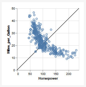
If you just want to draw a line across the width/height of the visible view, you can do something like this, where you create a layer with a simple, empty dataset (like the fixed line example) :
{
  "$schema": "https://vega.github.io/schema/vega-lite/v5.json",
  "data": {"url": "data/cars.json"},
  "layer": [
    {
      "data": {"values": [{}]},
      "mark": "rule",
      "encoding": {
        "x": {"value": 0},
        "x2": {"value": "width"},
        "y": {"value": "height"},
        "y2": {"value": 0}
      }
    },
    {
      "mark": "point",
      "encoding": {
        "x": {"field": "Horsepower"},
        "y": {"field": "Miles_per_Gallon"}
      }
    }
  ],
  "encoding": {"x": {"type": "quantitative"}, "y": {"type": "quantitative"}}
}
You could also use the expression language to interrogate the assigned scale domains, e.g.:
{
  "$schema": "https://vega.github.io/schema/vega-lite/v5.json",
  "data": {"url": "data/cars.json"},
  "layer": [
    {
      "data": {"values": [{}]},
      "mark": "rule",
      "encoding": {
        "x": {"datum": {"expr": "domain('x')[0]"}},
        "x2": {"datum": {"expr": "domain('x')[1]"}},
        "y": {"datum": {"expr": "domain('y')[0]"}},
        "y2": {"datum": {"expr": "domain('y')[1]"}}
      }
    },
    {
      "mark": "point",
      "encoding": {
        "x": {"field": "Horsepower"},
        "y": {"field": "Miles_per_Gallon"}
      }
    }
  ],
  "encoding": {"x": {"type": "quantitative"}, "y": {"type": "quantitative"}}
}
If you want to do something fancier with the range of data for each encoding channel, this may be possible but would require a sample of your dataset to ensure that I could come up with an optimal approach. If you're not able to share, you might be able to consider an aggregate transform, to find the min/max of each series and plot based on those, or possibly a regression transform may be an option.
Hopefully, some of this may help you come up with more ideas. And thanks very much for trying Deneb!
Regards,
Daniel
Did I answer your question? Mark my post as a solution!
Proud to be a Super User!
On how to ask a technical question, if you really want an answer (courtesy of SQLBI)
- Mark as New
- Bookmark
- Subscribe
- Mute
- Subscribe to RSS Feed
- Permalink
- Report Inappropriate Content
Hi @dm-p
Thank you very much.
Your solution is very good but not good for my chart.
I need to pan and zoom the scatterplot and your solution does not reflect this.
- Mark as New
- Bookmark
- Subscribe
- Mute
- Subscribe to RSS Feed
- Permalink
- Report Inappropriate Content
You can do that in DAX, and add it as a column in the Deneb visual.
- Mark as New
- Bookmark
- Subscribe
- Mute
- Subscribe to RSS Feed
- Permalink
- Report Inappropriate Content
I can but I have like 150k points on the chart. Any additional data will have a huge impact on the performance
- Mark as New
- Bookmark
- Subscribe
- Mute
- Subscribe to RSS Feed
- Permalink
- Report Inappropriate Content
There's no meaningful way to show more than 5000 data points on a scatter plot.
- Mark as New
- Bookmark
- Subscribe
- Mute
- Subscribe to RSS Feed
- Permalink
- Report Inappropriate Content
You can pan and zoom...
I need to put all data on the chart.
I have also regression line so I need all data.
- Mark as New
- Bookmark
- Subscribe
- Mute
- Subscribe to RSS Feed
- Permalink
- Report Inappropriate Content
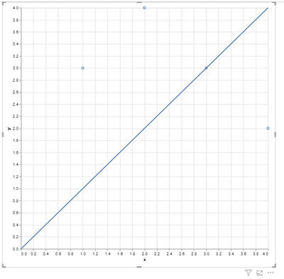
Find the max x and y values in your data, take the largest, and then add a layer that draws from 0 to that point.
Here is a simplified version:
{
  "layer": [
    {
      "data": {"name": "dataset"},
      "mark": "point",
      "encoding": {
        "y": {
          "field": "y",
          "type": "quantitative"
        },
        "x": {
          "field": "x",
          "type": "quantitative"
        }
      }
    },
    {
      "data": {
        "values": [
          {"x": 0, "y": 0},
          {"x": 4, "y": 4}
        ]
      },
      "mark": {
        "type": "line",
        "from": {"data": "data2"}
      },
      "encoding": {
        "y": {
          "field": "y",
          "type": "quantitative"
        },
        "x": {
          "field": "x",
          "type": "quantitative"
        }
      }
    }
  ]
}Helpful resources

Power BI Dataviz World Championships
The Power BI Data Visualization World Championships is back! Get ahead of the game and start preparing now!

| User | Count |
|---|---|
| 37 | |
| 37 | |
| 33 | |
| 32 | |
| 29 |
| User | Count |
|---|---|
| 130 | |
| 88 | |
| 82 | |
| 68 | |
| 64 |


