FabCon is coming to Atlanta
Join us at FabCon Atlanta from March 16 - 20, 2026, for the ultimate Fabric, Power BI, AI and SQL community-led event. Save $200 with code FABCOMM.
Register now!- Power BI forums
- Get Help with Power BI
- Desktop
- Service
- Report Server
- Power Query
- Mobile Apps
- Developer
- DAX Commands and Tips
- Custom Visuals Development Discussion
- Health and Life Sciences
- Power BI Spanish forums
- Translated Spanish Desktop
- Training and Consulting
- Instructor Led Training
- Dashboard in a Day for Women, by Women
- Galleries
- Data Stories Gallery
- Themes Gallery
- Contests Gallery
- QuickViz Gallery
- Quick Measures Gallery
- Visual Calculations Gallery
- Notebook Gallery
- Translytical Task Flow Gallery
- TMDL Gallery
- R Script Showcase
- Webinars and Video Gallery
- Ideas
- Custom Visuals Ideas (read-only)
- Issues
- Issues
- Events
- Upcoming Events
The Power BI Data Visualization World Championships is back! Get ahead of the game and start preparing now! Learn more
- Power BI forums
- Forums
- Get Help with Power BI
- Desktop
- Variable values fields required in column chart
- Subscribe to RSS Feed
- Mark Topic as New
- Mark Topic as Read
- Float this Topic for Current User
- Bookmark
- Subscribe
- Printer Friendly Page
- Mark as New
- Bookmark
- Subscribe
- Mute
- Subscribe to RSS Feed
- Permalink
- Report Inappropriate Content
Variable values fields required in column chart
Hi,
I want to have variable value fields in column chart instead of fixing them. For example, I have overtime data of cost and hrs.
I want to create ONE single clustered column chart where month should be in x-axis (fixed) and in values area I want variable values.
Like if I click on a button / slicer for overtime cost, the column chart should give me cost and if I select overtime Hrs, i t should show Hrs.
ONE CHART FOR TWO FIELDS (COST & HRS)
Please see my sample data and advise.
https://www.dropbox.com/sh/1zrdlchzcfmwzcs/AADAvy5zk9ifpzzFnImEVHfEa?dl=0
Regards,
Imran
Solved! Go to Solution.
- Mark as New
- Bookmark
- Subscribe
- Mute
- Subscribe to RSS Feed
- Permalink
- Report Inappropriate Content
Hi, @Anonymous
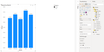
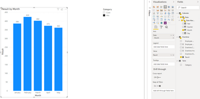
You may create a table and a measure as below.
Table:
Measure:

Result =
IF(
    ISFILTERED('Table'[Category]),
    IF(
        SELECTEDVALUE('Table'[Category])="Cost",
        SUM(Overtime[Overtime Cost]),
        IF(
            SELECTEDVALUE('Table'[Category])="Hrs",
            SUM('Overtime'[Overtime Hrs])
        )
    )
)
Result:
Best Regards
Allan
If this post helps, then please consider Accept it as the solution to help the other members find it more quickly.
- Mark as New
- Bookmark
- Subscribe
- Mute
- Subscribe to RSS Feed
- Permalink
- Report Inappropriate Content
@Anonymous , Refer if this can help
- Mark as New
- Bookmark
- Subscribe
- Mute
- Subscribe to RSS Feed
- Permalink
- Report Inappropriate Content
I saw the post you share but actually this is not the case I am looking for. I need to have;
fix "x-axis" -- that is month, and;
variable "y-axis" --that is either cost or Hrs
Both cost and hrs are two seprate columns of my table. What is the solution of this problem.
Regards,
Helpful resources

Power BI Dataviz World Championships
The Power BI Data Visualization World Championships is back! Get ahead of the game and start preparing now!

| User | Count |
|---|---|
| 40 | |
| 35 | |
| 34 | |
| 31 | |
| 27 |
| User | Count |
|---|---|
| 135 | |
| 102 | |
| 67 | |
| 65 | |
| 56 |


