FabCon is coming to Atlanta
Join us at FabCon Atlanta from March 16 - 20, 2026, for the ultimate Fabric, Power BI, AI and SQL community-led event. Save $200 with code FABCOMM.
Register now!- Power BI forums
- Get Help with Power BI
- Desktop
- Service
- Report Server
- Power Query
- Mobile Apps
- Developer
- DAX Commands and Tips
- Custom Visuals Development Discussion
- Health and Life Sciences
- Power BI Spanish forums
- Translated Spanish Desktop
- Training and Consulting
- Instructor Led Training
- Dashboard in a Day for Women, by Women
- Galleries
- Data Stories Gallery
- Themes Gallery
- Contests Gallery
- QuickViz Gallery
- Quick Measures Gallery
- Visual Calculations Gallery
- Notebook Gallery
- Translytical Task Flow Gallery
- TMDL Gallery
- R Script Showcase
- Webinars and Video Gallery
- Ideas
- Custom Visuals Ideas (read-only)
- Issues
- Issues
- Events
- Upcoming Events
The Power BI Data Visualization World Championships is back! Get ahead of the game and start preparing now! Learn more
- Power BI forums
- Forums
- Get Help with Power BI
- Desktop
- Re: Value summation by date
- Subscribe to RSS Feed
- Mark Topic as New
- Mark Topic as Read
- Float this Topic for Current User
- Bookmark
- Subscribe
- Printer Friendly Page
- Mark as New
- Bookmark
- Subscribe
- Mute
- Subscribe to RSS Feed
- Permalink
- Report Inappropriate Content
Value summation by date
Hello,
I have a table as follows:
| Date | Department | Received | Within 24 hrs | Within 48 hrs |
| 07-11-16 | Cornea | 7 | 2 | 3 |
| 07-11-16 | Glaucoma | 10 | 3 | 2 |
| 07-11-16 | Retina | 8 | 4 | 3 |
| 07-11-16 | Cataract | 8 | 1 | 2 |
| 14-11-16 | Cornea | 10 | 5 | 1 |
| 14-11-16 | Glaucoma | 10 | 3 | 3 |
| 14-11-16 | Retina | 7 | 4 | 1 |
| 14-11-16 | Cataract | 8 | 2 | 2 |
The need is to have % of requests resolved within 24 hrs and 48 hrs, by department and date. For example:
For date 07-11-16 and Cornea department, 29% requests are resolved within 24hrs (2 divided by 7) and 43% requests are resolved within 48hrs (3 divided by 7).
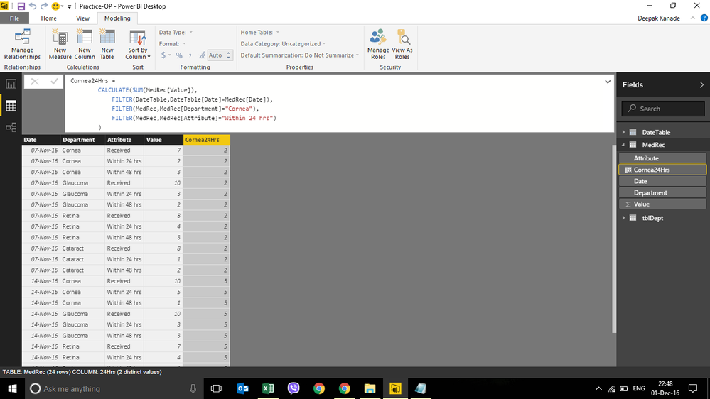
I have imported the table in PBI and have unpivoted the columns, which looks as follows:
I am also trying to create a column "Cornea24hrs" as seen in the figure, which is not successful.
Your help by way of detailed steps would be much appreciated.
Thanks a ton.
Solved! Go to Solution.
- Mark as New
- Bookmark
- Subscribe
- Mute
- Subscribe to RSS Feed
- Permalink
- Report Inappropriate Content
Hi @deepvibha
Just change the measures as follows and rest remaining the same as my previous reply
Create Measures - SumReceived, Sum24Hrs, Sum48Hrs as follows
SumReceived = Calculate(sum (FactTable[Received]),FactTable[Attribute] = "Received")
Sum24Hrs = Calculate(sum (FactTable[Received]),FactTable[Attribute] = "Within 24 Hrs")
Sum48Hrs = Calculate(sum (FactTable[Received]),FactTable[Attribute] = "Within 48 Hrs")
This should work.
If this works please accept it as a solution and also give KUDOS.
Cheers
CheenuSing
- Mark as New
- Bookmark
- Subscribe
- Mute
- Subscribe to RSS Feed
- Permalink
- Report Inappropriate Content
Hi @deepvibha
You will not be ablt to expactly replicate the excel output in Power BI.
There are two approaches possible.
1. Create a column called DateByDepartment = Format([TransDate],"DD/MM/YYYY") & "-" & [Department]
2. Use this as a x-axis and then the measures 24hrs% and 48hrs% as Y-axis.
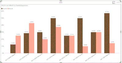
The out put will look like
The x-axis will look like
Very close to Excel
The second approach is to create a hierarchy
1. Right click on the Date column of your table and select NewHierarchy
2. Drag the Department also under this.
3. Rename this hierarchy as TransDateDepartment
4. Use this as x-axis and the measures as y-axis.
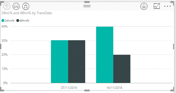
5. The chart will initially look like
6. Click on the weighing scale like icon you will see the output as
When you click on the two down arrows icon you will get it at Department level.
If this works give additonal KUDOS.
Cheers
CheenuSing
- Mark as New
- Bookmark
- Subscribe
- Mute
- Subscribe to RSS Feed
- Permalink
- Report Inappropriate Content
Hi @deepvibha
Please try the following steps :
1. Create Measures - SumReceived, Sum24Hrs, Sum48Hrs as follows
SumReceived = Sum(FactTable[Received])
Sum24Hrs = sum (FactTable[Within 24 hrs])
Sum48Hrs = sum (FactTable[Within 48 hrs])
2. Now create the measure %24Hrs, %48Hrs
%24hrs = divide ([Sum24Hrs],[SumReceived])
%48hrs = divide ([Sum48Hrs],[SumReceived])
3. Make these two % measures as data type perccentage.
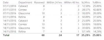
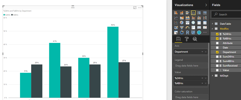
4. You should get what you wanted, see the screen shot.
If this works for you please accept it as a solution and also give KUDOS.
Cheers
CheenuSing
- Mark as New
- Bookmark
- Subscribe
- Mute
- Subscribe to RSS Feed
- Permalink
- Report Inappropriate Content
Thanks @Anonymous
The solution given is for pivoted table.
I am looking for a solution for an unpivoted table.
Regards,
Deepak
- Mark as New
- Bookmark
- Subscribe
- Mute
- Subscribe to RSS Feed
- Permalink
- Report Inappropriate Content
Hi @deepvibha
Can you explain what you mean by unpivoted table and the output you desire.
Cheers
CheenuSing
- Mark as New
- Bookmark
- Subscribe
- Mute
- Subscribe to RSS Feed
- Permalink
- Report Inappropriate Content
Thanks for a spontenous reply @Anonymous
As I understand, the pivoted table is as under:
| Date | Department | Received | Within 24 hrs | Within 48 hrs |
| 07-11-16 | Cornea | 7 | 2 | 3 |
| 07-11-16 | Glaucoma | 10 | 3 | 2 |
| 07-11-16 | Retina | 8 | 4 | 3 |
| 07-11-16 | Cataract | 8 | 1 | 2 |
| 14-11-16 | Cornea | 10 | 5 | 1 |
| 14-11-16 | Glaucoma | 10 | 3 | 3 |
| 14-11-16 | Retina | 7 | 4 | 1 |
| 14-11-16 | Cataract | 8 | 2 | 2 |
Whereas an unpivoted table is as under, which is the format for a database :
| Date | Department | Attribute | Received |
| 07-11-16 | Cornea | Received | 7 |
| 07-11-16 | Cornea | Within 24 hrs | 2 |
| 07-11-16 | Cornea | Within 48 hrs | 3 |
| 07-11-16 | Glaucoma | Received | 10 |
| 07-11-16 | Glaucoma | Within 24 hrs | 3 |
| 07-11-16 | Glaucoma | Within 48 hrs | 2 |
| 07-11-16 | Retina | Received | 8 |
| 07-11-16 | Retina | Within 24 hrs | 4 |
| 07-11-16 | Retina | Within 48 hrs | 3 |
| 07-11-16 | Cataract | Received | 8 |
| 07-11-16 | Cataract | Within 24 hrs | 1 |
| 07-11-16 | Cataract | Within 48 hrs | 2 |
| 14-11-16 | Cornea | Received | 10 |
| 14-11-16 | Cornea | Within 24 hrs | 5 |
| 14-11-16 | Cornea | Within 48 hrs | 1 |
| 14-11-16 | Glaucoma | Received | 10 |
| 14-11-16 | Glaucoma | Within 24 hrs | 3 |
| 14-11-16 | Glaucoma | Within 48 hrs | 3 |
| 14-11-16 | Retina | Received | 7 |
| 14-11-16 | Retina | Within 24 hrs | 4 |
| 14-11-16 | Retina | Within 48 hrs | 1 |
| 14-11-16 | Cataract | Received | 8 |
| 14-11-16 | Cataract | Within 24 hrs | 2 |
| 14-11-16 | Cataract | Within 48 hrs | 2 |
So far as the data is pulled from Excel, we can have the % in Excel columns and there is no need of calculating it in PBI. But what is the same data is pulled from Database?
My requirement is to have the % of patients requests resolved within 24 hrs and 48 hrs, by date & department.
For example, on "Date" 07-11-16 I have received 7 requests for "Cornea" department of which 2 were resolved withing 24 hrs ( 29%, 2 divided by 7) and 3 were resolved within 48 hrs (43%, 3 divided by 7)
Similarly, for all departments for 07-11-16 and for 14-11-16.
I hope I have put in my requirement more elaboratly.
Regards,
Deepak
- Mark as New
- Bookmark
- Subscribe
- Mute
- Subscribe to RSS Feed
- Permalink
- Report Inappropriate Content
Hi @deepvibha
Just change the measures as follows and rest remaining the same as my previous reply
Create Measures - SumReceived, Sum24Hrs, Sum48Hrs as follows
SumReceived = Calculate(sum (FactTable[Received]),FactTable[Attribute] = "Received")
Sum24Hrs = Calculate(sum (FactTable[Received]),FactTable[Attribute] = "Within 24 Hrs")
Sum48Hrs = Calculate(sum (FactTable[Received]),FactTable[Attribute] = "Within 48 Hrs")
This should work.
If this works please accept it as a solution and also give KUDOS.
Cheers
CheenuSing
- Mark as New
- Bookmark
- Subscribe
- Mute
- Subscribe to RSS Feed
- Permalink
- Report Inappropriate Content
Thanks a Ton @Anonymous,
The solution worked.....
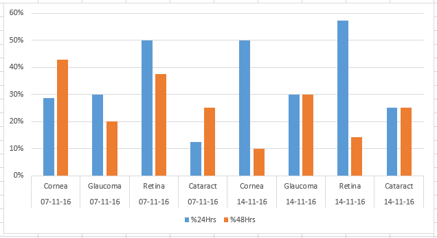
The next challenge is to have both "Department" by "Date". The graph should reflect all the departments against the given dates. Like the chart below, which is plotted in MS Excel.
But when doing it in PBI, I am unable achieve the same results.
Would appreciate help on this...
Regards,
Deepak
- Mark as New
- Bookmark
- Subscribe
- Mute
- Subscribe to RSS Feed
- Permalink
- Report Inappropriate Content
Hi @deepvibha
You will not be ablt to expactly replicate the excel output in Power BI.
There are two approaches possible.
1. Create a column called DateByDepartment = Format([TransDate],"DD/MM/YYYY") & "-" & [Department]
2. Use this as a x-axis and then the measures 24hrs% and 48hrs% as Y-axis.
The out put will look like
The x-axis will look like
Very close to Excel
The second approach is to create a hierarchy
1. Right click on the Date column of your table and select NewHierarchy
2. Drag the Department also under this.
3. Rename this hierarchy as TransDateDepartment
4. Use this as x-axis and the measures as y-axis.
5. The chart will initially look like
6. Click on the weighing scale like icon you will see the output as
When you click on the two down arrows icon you will get it at Department level.
If this works give additonal KUDOS.
Cheers
CheenuSing
- Mark as New
- Bookmark
- Subscribe
- Mute
- Subscribe to RSS Feed
- Permalink
- Report Inappropriate Content
That worked @Anonymous
Thanks...
Regards,
Deepak
Helpful resources

Power BI Monthly Update - November 2025
Check out the November 2025 Power BI update to learn about new features.

Fabric Data Days
Advance your Data & AI career with 50 days of live learning, contests, hands-on challenges, study groups & certifications and more!

