- Power BI forums
- Get Help with Power BI
- Desktop
- Service
- Report Server
- Power Query
- Mobile Apps
- Developer
- DAX Commands and Tips
- Custom Visuals Development Discussion
- Health and Life Sciences
- Power BI Spanish forums
- Translated Spanish Desktop
- Training and Consulting
- Instructor Led Training
- Dashboard in a Day for Women, by Women
- Galleries
- Data Stories Gallery
- Themes Gallery
- Contests Gallery
- QuickViz Gallery
- Quick Measures Gallery
- Visual Calculations Gallery
- Notebook Gallery
- Translytical Task Flow Gallery
- TMDL Gallery
- R Script Showcase
- Webinars and Video Gallery
- Ideas
- Custom Visuals Ideas (read-only)
- Issues
- Issues
- Events
- Upcoming Events
Learn from the best! Meet the four finalists headed to the FINALS of the Power BI Dataviz World Championships! Register now
- Power BI forums
- Forums
- Get Help with Power BI
- Desktop
- Re: Value Headers
- Subscribe to RSS Feed
- Mark Topic as New
- Mark Topic as Read
- Float this Topic for Current User
- Bookmark
- Subscribe
- Printer Friendly Page
- Mark as New
- Bookmark
- Subscribe
- Mute
- Subscribe to RSS Feed
- Permalink
- Report Inappropriate Content
Value Headers
Hello,
I am creating a table that shows YoY revenue for different lines of business. I have set each LOB to have their own column of revenue information and I want to show that information with 2015 and 2016 next to each other, rather than the buckets sitting under seperate year buckets. I am explaining it poorly so here is the functionality with pivot tables.
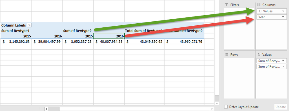
Currently my Power BI matrix looks like the pivot table below. My revenue type value headers are below the year, which makes YoY comparisson difficult.
Within pivot tables, I can simply move the order of the column headers so that my years are below the value headers. Is there a similar functionality within Power BI that allows me to put this year header below my value headers?
- Mark as New
- Bookmark
- Subscribe
- Mute
- Subscribe to RSS Feed
- Permalink
- Report Inappropriate Content
In Power BI, the measure name always appear under the field you put in Column Pane. We can't have it measure names appear above the column group like pivot table. This behavior is by design.
Regards,
- Mark as New
- Bookmark
- Subscribe
- Mute
- Subscribe to RSS Feed
- Permalink
- Report Inappropriate Content
@v-sihou-msft Are there plans to add this function to Power BI? It seems that if anything this design limits the tool.
- Mark as New
- Bookmark
- Subscribe
- Mute
- Subscribe to RSS Feed
- Permalink
- Report Inappropriate Content
I don't know if this kind of feature is on roadmap. I suggest you submit a feature request on Ideas: https://ideas.powerbi.com/forums/265200-power-bi
- Mark as New
- Bookmark
- Subscribe
- Mute
- Subscribe to RSS Feed
- Permalink
- Report Inappropriate Content
@Treyson Using matrix visual for power bi you can swap around fields for columns which will give you what you're after.
Helpful resources

New to Fabric Survey
If you have recently started exploring Fabric, we'd love to hear how it's going. Your feedback can help with product improvements.

Power BI DataViz World Championships - June 2026
A new Power BI DataViz World Championship is coming this June! Don't miss out on submitting your entry.

Join our Fabric User Panel
Share feedback directly with Fabric product managers, participate in targeted research studies and influence the Fabric roadmap.

| User | Count |
|---|---|
| 57 | |
| 34 | |
| 33 | |
| 18 | |
| 16 |
| User | Count |
|---|---|
| 67 | |
| 65 | |
| 44 | |
| 30 | |
| 28 |


