Fabric Data Days starts November 4th!
Advance your Data & AI career with 50 days of live learning, dataviz contests, hands-on challenges, study groups & certifications and more!
Get registered- Power BI forums
- Get Help with Power BI
- Desktop
- Service
- Report Server
- Power Query
- Mobile Apps
- Developer
- DAX Commands and Tips
- Custom Visuals Development Discussion
- Health and Life Sciences
- Power BI Spanish forums
- Translated Spanish Desktop
- Training and Consulting
- Instructor Led Training
- Dashboard in a Day for Women, by Women
- Galleries
- Data Stories Gallery
- Themes Gallery
- Contests Gallery
- Quick Measures Gallery
- Visual Calculations Gallery
- Notebook Gallery
- Translytical Task Flow Gallery
- TMDL Gallery
- R Script Showcase
- Webinars and Video Gallery
- Ideas
- Custom Visuals Ideas (read-only)
- Issues
- Issues
- Events
- Upcoming Events
Join us at FabCon Atlanta from March 16 - 20, 2026, for the ultimate Fabric, Power BI, AI and SQL community-led event. Save $200 with code FABCOMM. Register now.
- Power BI forums
- Forums
- Get Help with Power BI
- Desktop
- Using a scatter chart correctly
- Subscribe to RSS Feed
- Mark Topic as New
- Mark Topic as Read
- Float this Topic for Current User
- Bookmark
- Subscribe
- Printer Friendly Page
- Mark as New
- Bookmark
- Subscribe
- Mute
- Subscribe to RSS Feed
- Permalink
- Report Inappropriate Content
Using a scatter chart correctly
Hi,
I feel like this is a simple problem that I just can't seem to work out.
Here's the current situation I have:
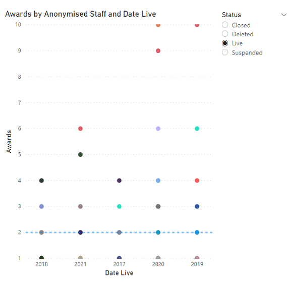
A researcher may get a number of grant awards each year. There are many researchers all receiving awards each year and the number varies a lot. If I am a researcher I would like to load up the scatter chart and see where I sit compared to other (anonymised) researchers.
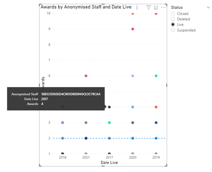
What I have at the moment is is a scatter chart that shows this, but it has grouped all the researchers together for each of the Awards they have done (see image below).
When I hover over a dot it shows the top 1:
What I would like ideally is a cluster of dots or maybe some extra info when you hover over as to how many people have that amount of awards.
For example, I hover over a dot and see that 5 of my colleagues have also submitted 6 publications in 2020
Thanks,
Tom
- Mark as New
- Bookmark
- Subscribe
- Mute
- Subscribe to RSS Feed
- Permalink
- Report Inappropriate Content
Hi. @tom_cowling
If your problem has been solved,you could accept the helpful answer as solution to close this thread.
For now, there is no content of description in the thread. If you still need help, please share more details.
Best Regards,
Community Support Team _ Eason
- Mark as New
- Bookmark
- Subscribe
- Mute
- Subscribe to RSS Feed
- Permalink
- Report Inappropriate Content
It isn't solved and I'm not sure how to progress with it really. I don't want the number of researchers on the x-axis as this doesn't represent the data properly.
Building a report as a tooltip looks cool, but seems very overkill.
- Mark as New
- Bookmark
- Subscribe
- Mute
- Subscribe to RSS Feed
- Permalink
- Report Inappropriate Content
Hi,
A scatter chart should have numerical values on both axis - you do not have that. You may want to create a simple bar/column chart. If you wish to create a scatter chart, then on the X-axis you should have number of researchers.
Regards,
Ashish Mathur
http://www.ashishmathur.com
https://www.linkedin.com/in/excelenthusiasts/
- Mark as New
- Bookmark
- Subscribe
- Mute
- Subscribe to RSS Feed
- Permalink
- Report Inappropriate Content
Hi Ashish,
I should have posted my setup too. I currently have year on my x axis:
- Mark as New
- Bookmark
- Subscribe
- Mute
- Subscribe to RSS Feed
- Permalink
- Report Inappropriate Content
Hi,
As mentioned in my previous message, on the X-axis should be another numeric field.
Regards,
Ashish Mathur
http://www.ashishmathur.com
https://www.linkedin.com/in/excelenthusiasts/
- Mark as New
- Bookmark
- Subscribe
- Mute
- Subscribe to RSS Feed
- Permalink
- Report Inappropriate Content
@tom_cowling you can create a tooltip page and put whatever information you want to see on hover over the data point. Read here on how to add a tooltip page Using report tooltip pages in Power BI - Power BI | Microsoft Docs
✨ Follow us on LinkedIn
Check my latest blog post The Power of Using Calculation Groups with Inactive Relationships (Part 1) (perytus.com) I would ❤ Kudos if my solution helped. 👉 If you can spend time posting the question, you can also make efforts to give Kudos to whoever helped to solve your problem. It is a token of appreciation!
⚡ Visit us at https://perytus.com, your one-stop-shop for Power BI-related projects/training/consultancy.⚡
Subscribe to the @PowerBIHowTo YT channel for an upcoming video on List and Record functions in Power Query!!
Learn Power BI and Fabric - subscribe to our YT channel - Click here: @PowerBIHowTo
If my solution proved useful, I'd be delighted to receive Kudos. When you put effort into asking a question, it's equally thoughtful to acknowledge and give Kudos to the individual who helped you solve the problem. It's a small gesture that shows appreciation and encouragement! ❤
Did I answer your question? Mark my post as a solution. Proud to be a Super User! Appreciate your Kudos 🙂
Feel free to email me with any of your BI needs.
- Mark as New
- Bookmark
- Subscribe
- Mute
- Subscribe to RSS Feed
- Permalink
- Report Inappropriate Content
That looks really good - thanks for the tip (no pun intended). I'll take a proper look tomorrow.
Helpful resources

FabCon Global Hackathon
Join the Fabric FabCon Global Hackathon—running virtually through Nov 3. Open to all skill levels. $10,000 in prizes!

Power BI Monthly Update - October 2025
Check out the October 2025 Power BI update to learn about new features.

| User | Count |
|---|---|
| 79 | |
| 38 | |
| 31 | |
| 27 | |
| 27 |


