A new Data Days event is coming soon!
This time we’re going bigger than ever. Fabric, Power BI, SQL, AI and more. We're covering it all. You won't want to miss it.
Learn more- Power BI forums
- Get Help with Power BI
- Desktop
- Service
- Report Server
- Power Query
- Mobile Apps
- Developer
- DAX Commands and Tips
- Custom Visuals Development Discussion
- Health and Life Sciences
- Power BI Spanish forums
- Translated Spanish Desktop
- Training and Consulting
- Instructor Led Training
- Dashboard in a Day for Women, by Women
- Galleries
- Data Stories Gallery
- Themes Gallery
- Contests Gallery
- QuickViz Gallery
- Quick Measures Gallery
- Visual Calculations Gallery
- Notebook Gallery
- Translytical Task Flow Gallery
- TMDL Gallery
- R Script Showcase
- Webinars and Video Gallery
- Ideas
- Custom Visuals Ideas (read-only)
- Issues
- Issues
- Events
- Upcoming Events
Level up your Power BI skills this month - build one visual each week and tell better stories with data! Get started
- Power BI forums
- Forums
- Get Help with Power BI
- Desktop
- Re: Using R Visuals with a Measure
- Subscribe to RSS Feed
- Mark Topic as New
- Mark Topic as Read
- Float this Topic for Current User
- Bookmark
- Subscribe
- Printer Friendly Page
- Mark as New
- Bookmark
- Subscribe
- Mute
- Subscribe to RSS Feed
- Permalink
- Report Inappropriate Content
Using R Visuals with a Measure
I'm creating a histogram using R (specifically, ggplot). The three columns I'm feeding the visual are:
- reportDate (type Date)
- id (type text)
- class (type text; can only be "Wired" or "Wireless")
The data source contains a row for every single connection that occurred for all devices whose ID is stored in the id column. I just want to create a histogram that tells me the number of days each ID had a connection. The code to accomplish this is:
##### Below added by Power BI; cannot be modified #####
# Create dataframe
# dataset <- data.frame(reportDate, id, class)

# Remove duplicated rows
# dataset <- unique(dataset
##### Above added by Power BI; cannot be modified #####

library(ggplot2)
library(plyr)

# Group by ID and count how many reportDates each one has
DateCount <- ddply(dataset, .(id), summarise, Count = length(unique(reportDate)))

# Plot
ggplot(DateCount, aes(x=Count)) + geom_histogram(binwidth = 1, color="black", fill=rgb(1, 184, 170, maxColorValue=255)) + theme_bw() + xlab("Days Seen")
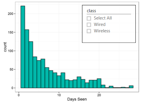
This works well, and produces the following result (I added a slicer so I can filter by a particular class):
Now let's say I add a measure to my report that's just a string:
Measure = "test"
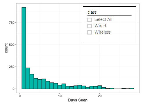
If I add this column to the R visual, my intuition is that a column called Measure will be added to the dataset variable, but the rest of the columns should not change in any way, since the Measure column will just contain "test" for every row. However, once I add the Measure, the visual changes drastically:
Why is my intuition wrong? If I let the visual print how many rows dataset has, the values differ between both graphs. Without Measure it's 8740, and with Measure it's 14341. Why are these values different?
Thanks!
- Mark as New
- Bookmark
- Subscribe
- Mute
- Subscribe to RSS Feed
- Permalink
- Report Inappropriate Content
Thank you for the responses. I've found the issue, and it appears to be a bug. I have successfully replicated it and linked to a file with the repro.
I have an additonal fact table with an individual row per ID. I have a Report-level filter set in place for one of the columns in this table. It seems that the filter is completely ignored when I add this measure. This only occurs if the filter is in another table (if it's in the same one, it works fine). In addition to Slicers, Visual-level, Page-level, and Report-level face this issue.
This is a sample .pbix file that replicates this issue. This file has two tables: BugTable and AdditionalTable. BugTable has the reportDate, id, and class. AdditionalTable classifies each ID to a different group (the data is filtered to display only the first group). The filter works fine, but if you add the AddToRVisual measure to the R visual, the filter will be ignored.
Is there any location where I can report this (internally or externally), besides just hoping this post gets noticed by the appropriate people?
- Mark as New
- Bookmark
- Subscribe
- Mute
- Subscribe to RSS Feed
- Permalink
- Report Inappropriate Content
Yes, I also noticed the same issue.
In my case, all attribute of which I want to make Histogram are in single column and I filter them by a slicer (select just one attribute at a time), it works fine.
Then I want to create dynamic binning, so I created a Calculated table with generate series function and use a single number with the help of a measure (selectvalues function).
As soon as I add this measure to the R Visual, graph takes long time to load. Upon investigation, I found that number of rows visible to the R visual increases dramatically, later found that no filter/slicer works on main column of data used for histgram and exposing complete table to R, instead of filtering single attribute. I think its becuase of no relationship with the measure or some bug.
The alternate solution might be to not use the attribute slicer and unpivot the attribute column, but thats not practical for me, so I need another solution.
- Mark as New
- Bookmark
- Subscribe
- Mute
- Subscribe to RSS Feed
- Permalink
- Report Inappropriate Content
and it is not the case with R visual, but can be seen with a table/any visual. So it is most likely a relationship issue.
- Mark as New
- Bookmark
- Subscribe
- Mute
- Subscribe to RSS Feed
- Permalink
- Report Inappropriate Content
Hi,
You can go to https://ideas.powerbi.com/forums/265200-power-bi to provide a feature request.
Best Regards
Alex
- Mark as New
- Bookmark
- Subscribe
- Mute
- Subscribe to RSS Feed
- Permalink
- Report Inappropriate Content
Hi,
I can’t reproduce your error. It works fine for me.
Before adding Measure = “test”
After adding Measure = “test”
Graphs above looks the same. Add after adding “write.csv(dataset, file = "filepath/MyData.csv")”, I can see that the both result are the same. Please verify your r script if there are other codes that influenced the result of “count”. Also please test with other chart visuals to see if value changes after adding that measure.
Best Regards
Alex
- Mark as New
- Bookmark
- Subscribe
- Mute
- Subscribe to RSS Feed
- Permalink
- Report Inappropriate Content
@fedpar i think easiest way to find out what's going on is to export out dataframe that R visuals create by default. So I would suggest you create two R visuals one with measure and one without and then in R script editor type in code as below which will export out dataframe to csv file and then check.
write.csv(dataset, file = "filepath\MyData.csv")
When you run this in R script editor it will create csv file and then you can check the contents.
Helpful resources

Power BI Monthly Update - April 2026
Check out the April 2026 Power BI update to learn about new features.

Data Days 2026 coming soon!
Sign up to receive a private message when registration opens and key events begin.

New to Fabric Survey
If you have recently started exploring Fabric, we'd love to hear how it's going. Your feedback can help with product improvements.

| User | Count |
|---|---|
| 34 | |
| 26 | |
| 25 | |
| 22 | |
| 18 |
| User | Count |
|---|---|
| 65 | |
| 35 | |
| 32 | |
| 25 | |
| 23 |


