Join us at FabCon Vienna from September 15-18, 2025
The ultimate Fabric, Power BI, SQL, and AI community-led learning event. Save €200 with code FABCOMM.
Get registered- Power BI forums
- Get Help with Power BI
- Desktop
- Service
- Report Server
- Power Query
- Mobile Apps
- Developer
- DAX Commands and Tips
- Custom Visuals Development Discussion
- Health and Life Sciences
- Power BI Spanish forums
- Translated Spanish Desktop
- Training and Consulting
- Instructor Led Training
- Dashboard in a Day for Women, by Women
- Galleries
- Data Stories Gallery
- Themes Gallery
- Contests Gallery
- Quick Measures Gallery
- Notebook Gallery
- Translytical Task Flow Gallery
- TMDL Gallery
- R Script Showcase
- Webinars and Video Gallery
- Ideas
- Custom Visuals Ideas (read-only)
- Issues
- Issues
- Events
- Upcoming Events
Enhance your career with this limited time 50% discount on Fabric and Power BI exams. Ends August 31st. Request your voucher.
- Power BI forums
- Forums
- Get Help with Power BI
- Desktop
- Using Parameters in Measures that are then used in...
- Subscribe to RSS Feed
- Mark Topic as New
- Mark Topic as Read
- Float this Topic for Current User
- Bookmark
- Subscribe
- Printer Friendly Page
- Mark as New
- Bookmark
- Subscribe
- Mute
- Subscribe to RSS Feed
- Permalink
- Report Inappropriate Content
Using Parameters in Measures that are then used in a Legend
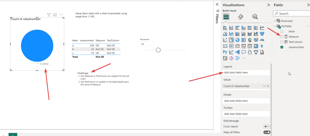
We have a measure that uses the values of a parameter in its calculation of OK/not OK. This works great in our table. However, we want to show this in a visual using that measure as the legend. We can't get this to work.
I have created a sample Power BI report showing this exact problem. Does anyone have a way to get this to work?
Solved! Go to Solution.
- Mark as New
- Bookmark
- Subscribe
- Mute
- Subscribe to RSS Feed
- Permalink
- Report Inappropriate Content
Another working solution that avoids using the legend field is by creating a measure for each of the ok and no ok. Then, you just add them both to the dataset for the visual. Power BI then adds them to the legend area of the visual.
- Mark as New
- Bookmark
- Subscribe
- Mute
- Subscribe to RSS Feed
- Permalink
- Report Inappropriate Content
Hi @Norwaychris ,
Thank you for sharing your solution with us.
I am so glad to hear that your problem has been solved . Please consider Accept it as the solution to help the other members find it more quickly.
Best regards,
Yadong Fang
If this post helps, then please consider Accept it as the solution to help the other members find it more quickly.
- Mark as New
- Bookmark
- Subscribe
- Mute
- Subscribe to RSS Feed
- Permalink
- Report Inappropriate Content
Hi, I still didn't get a solution as to whether it is possible to solve the issue with the legend. Though, if someone can tell me this isn't possible, I can mark that is the correct answer. I have only found workarounds so far, but haven't had anyone say straight forward this isn't possible. Thanks.
- Mark as New
- Bookmark
- Subscribe
- Mute
- Subscribe to RSS Feed
- Permalink
- Report Inappropriate Content
Another working solution that avoids using the legend field is by creating a measure for each of the ok and no ok. Then, you just add them both to the dataset for the visual. Power BI then adds them to the legend area of the visual.
- Mark as New
- Bookmark
- Subscribe
- Mute
- Subscribe to RSS Feed
- Permalink
- Report Inappropriate Content
I had one developer show me a solution using a cartesian product done in Power Query and then using the parameter to filter the result and then using that for legend. This won't work in my case, but it is a solution.


