Join the #PBI10 DataViz contest
Power BI is turning 10, and we’re marking the occasion with a special community challenge. Use your creativity to tell a story, uncover trends, or highlight something unexpected.
Get started- Power BI forums
- Get Help with Power BI
- Desktop
- Service
- Report Server
- Power Query
- Mobile Apps
- Developer
- DAX Commands and Tips
- Custom Visuals Development Discussion
- Health and Life Sciences
- Power BI Spanish forums
- Translated Spanish Desktop
- Training and Consulting
- Instructor Led Training
- Dashboard in a Day for Women, by Women
- Galleries
- Webinars and Video Gallery
- Data Stories Gallery
- Themes Gallery
- Contests Gallery
- Quick Measures Gallery
- Notebook Gallery
- Translytical Task Flow Gallery
- R Script Showcase
- Ideas
- Custom Visuals Ideas (read-only)
- Issues
- Issues
- Events
- Upcoming Events
Join us for an expert-led overview of the tools and concepts you'll need to become a Certified Power BI Data Analyst and pass exam PL-300. Register now.
- Power BI forums
- Forums
- Get Help with Power BI
- Desktop
- Using GENERATE with conditional columns
- Subscribe to RSS Feed
- Mark Topic as New
- Mark Topic as Read
- Float this Topic for Current User
- Bookmark
- Subscribe
- Printer Friendly Page
- Mark as New
- Bookmark
- Subscribe
- Mute
- Subscribe to RSS Feed
- Permalink
- Report Inappropriate Content
Using GENERATE with conditional columns
Hi experts,
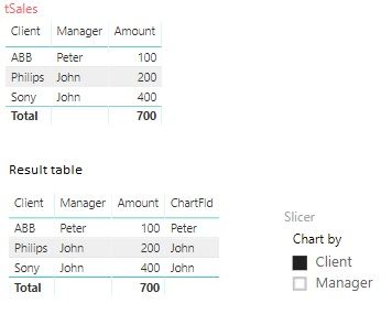
I am trying to put up a chart that displays Amount by different category, which is selected in a slicer. For example, if user selects Client in the slicer, the chart displays sales by client. If Manager is selected - accordingly the same chart displays sales by manager. For that reason I thought I'd build a new table with additional field ChartFld, that will be used as category in a pie chart. But for some reason I can't get it work. For some reason IF results in False even if value "Client" is selected in the slicer.
Here is my tSales table, result table and the slicer:
Here's my table definition:
ChartTable = GENERATE(tSales,ROW("ChartFld",IF(SELECTEDVALUE(mySlicer[Column1])="Client",[Client],[Manager])))
What am I doing wrong here?
Solved! Go to Solution.
- Mark as New
- Bookmark
- Subscribe
- Mute
- Subscribe to RSS Feed
- Permalink
- Report Inappropriate Content
It looks like it is impossible to build a table like that as, according to Marco Ruso, calculated tables ignore any filter selections.
- Mark as New
- Bookmark
- Subscribe
- Mute
- Subscribe to RSS Feed
- Permalink
- Report Inappropriate Content
Can you post some sample/example data that can be easily copied of your source data and perhaps a diagram of relationships. Please see this post regarding How to Get Your Question Answered Quickly: https://community.powerbi.com/t5/Community-Blog/How-to-Get-Your-Question-Answered-Quickly/ba-p/38490
Follow on LinkedIn
@ me in replies or I'll lose your thread!!!
Instead of a Kudo, please vote for this idea
Become an expert!: Enterprise DNA
External Tools: MSHGQM
YouTube Channel!: Microsoft Hates Greg
Latest book!: DAX For Humans
DAX is easy, CALCULATE makes DAX hard...
- Mark as New
- Bookmark
- Subscribe
- Mute
- Subscribe to RSS Feed
- Permalink
- Report Inappropriate Content
- Mark as New
- Bookmark
- Subscribe
- Mute
- Subscribe to RSS Feed
- Permalink
- Report Inappropriate Content
It looks like it is impossible to build a table like that as, according to Marco Ruso, calculated tables ignore any filter selections.
Helpful resources
| User | Count |
|---|---|
| 60 | |
| 59 | |
| 56 | |
| 38 | |
| 29 |
| User | Count |
|---|---|
| 82 | |
| 62 | |
| 45 | |
| 40 | |
| 39 |


