FabCon is coming to Atlanta
Join us at FabCon Atlanta from March 16 - 20, 2026, for the ultimate Fabric, Power BI, AI and SQL community-led event. Save $200 with code FABCOMM.
Register now!- Power BI forums
- Get Help with Power BI
- Desktop
- Service
- Report Server
- Power Query
- Mobile Apps
- Developer
- DAX Commands and Tips
- Custom Visuals Development Discussion
- Health and Life Sciences
- Power BI Spanish forums
- Translated Spanish Desktop
- Training and Consulting
- Instructor Led Training
- Dashboard in a Day for Women, by Women
- Galleries
- Data Stories Gallery
- Themes Gallery
- Contests Gallery
- QuickViz Gallery
- Quick Measures Gallery
- Visual Calculations Gallery
- Notebook Gallery
- Translytical Task Flow Gallery
- TMDL Gallery
- R Script Showcase
- Webinars and Video Gallery
- Ideas
- Custom Visuals Ideas (read-only)
- Issues
- Issues
- Events
- Upcoming Events
The Power BI Data Visualization World Championships is back! Get ahead of the game and start preparing now! Learn more
- Power BI forums
- Forums
- Get Help with Power BI
- Desktop
- Re: Use a column header as a slicer
- Subscribe to RSS Feed
- Mark Topic as New
- Mark Topic as Read
- Float this Topic for Current User
- Bookmark
- Subscribe
- Printer Friendly Page
- Mark as New
- Bookmark
- Subscribe
- Mute
- Subscribe to RSS Feed
- Permalink
- Report Inappropriate Content
Use a column header as a slicer
Help this is driving me mad!
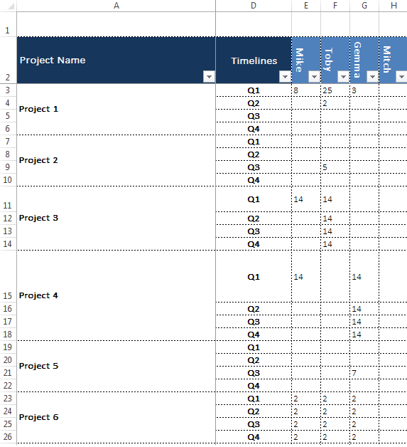
The powers that be are using a spreadsheet which shows project names along with timescales and then allocated hours per resource. The challenge is the resources are not in a column called resources but individual columns with hours underneath. Screenshot below
I presumed the way to go would be to create a separate tablet with the resource names in and link a relationship to the corresponding column but that didn't work.
The goal here is to have a slicer allowing you to select say 'Toby' and it will show the projects he's working on and for how many hours
Hopefully I'm missing something really obvious...
Solved! Go to Solution.
- Mark as New
- Bookmark
- Subscribe
- Mute
- Subscribe to RSS Feed
- Permalink
- Report Inappropriate Content
1) Go to the Query Editor - select both Project Name and Timelines Columns - Transform tab - Unpivot Other Columns
2) Rename Attribute column to Agent/Name (this will be your slicer Column) and Value column to Hours or sth...
3) Home tab - Close & Apply
Hope this helps! ![]()
- Mark as New
- Bookmark
- Subscribe
- Mute
- Subscribe to RSS Feed
- Permalink
- Report Inappropriate Content
Hi Sean. Thanks for your explanation, it solves the problem, but creates another. You cannot use an unpivoted table to generate cross plots and slicer filters will only effectively act on a single measure taken from the tall-skinny data set. How can you solve the problem without destroying this functionality?
- Mark as New
- Bookmark
- Subscribe
- Mute
- Subscribe to RSS Feed
- Permalink
- Report Inappropriate Content
I could kiss you!
- Mark as New
- Bookmark
- Subscribe
- Mute
- Subscribe to RSS Feed
- Permalink
- Report Inappropriate Content
![]()
![]()
![]()
- Mark as New
- Bookmark
- Subscribe
- Mute
- Subscribe to RSS Feed
- Permalink
- Report Inappropriate Content
Hi I need help. My data is as below.
| Function | Advisor 1 | Advisor 2 | Advisor 3 |
| Death | 10 | 20 | 30 |
| Birth | 15 | 25 | 35 |
| Anniversary | 20 | 40 | 50 |
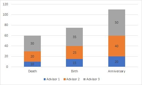
My visual must first look like this
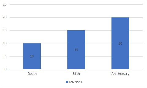
I want a slicer with an option to choose the advisor group. Say I choose advisor group 1, the visual must change as below. Please help me 😞
Helpful resources

Power BI Dataviz World Championships
The Power BI Data Visualization World Championships is back! Get ahead of the game and start preparing now!

| User | Count |
|---|---|
| 41 | |
| 38 | |
| 36 | |
| 30 | |
| 28 |
| User | Count |
|---|---|
| 128 | |
| 88 | |
| 79 | |
| 67 | |
| 62 |


