Join us at FabCon Vienna from September 15-18, 2025
The ultimate Fabric, Power BI, SQL, and AI community-led learning event. Save €200 with code FABCOMM.
Get registered- Power BI forums
- Get Help with Power BI
- Desktop
- Service
- Report Server
- Power Query
- Mobile Apps
- Developer
- DAX Commands and Tips
- Custom Visuals Development Discussion
- Health and Life Sciences
- Power BI Spanish forums
- Translated Spanish Desktop
- Training and Consulting
- Instructor Led Training
- Dashboard in a Day for Women, by Women
- Galleries
- Data Stories Gallery
- Themes Gallery
- Contests Gallery
- Quick Measures Gallery
- Notebook Gallery
- Translytical Task Flow Gallery
- TMDL Gallery
- R Script Showcase
- Webinars and Video Gallery
- Ideas
- Custom Visuals Ideas (read-only)
- Issues
- Issues
- Events
- Upcoming Events
Compete to become Power BI Data Viz World Champion! First round ends August 18th. Get started.
- Power BI forums
- Forums
- Get Help with Power BI
- Desktop
- Re: Unpivot Data/ merge table
- Subscribe to RSS Feed
- Mark Topic as New
- Mark Topic as Read
- Float this Topic for Current User
- Bookmark
- Subscribe
- Printer Friendly Page
- Mark as New
- Bookmark
- Subscribe
- Mute
- Subscribe to RSS Feed
- Permalink
- Report Inappropriate Content
Unpivot Data/ merge table
Hi All,
Still quite new to Power BI myself so looking for assistance with the below. I have the below data set in the following (excel) format which shows change in headcount and cost over time:
| Function | Sub Function | Q1 '2022 | Q2 '2022 | Q3 '2022 | Q4 '2022 | Q1 '2023 | Q2 '2023 | Q3 '2023 | Q4 '2023 | Q1 '2024 | Q2 '2024 | Q3 '2024 | Q4 '2024 | |
| FTE | Technology | BAU and Change | 121 | 118 | 115 | 114 | 165 | 159 | 151 | 135 | 121 | 120 | 120 | 127.0 |
| Technology | Data engineering | - | - | - | - | 22 | 22 | 22 | 22 | 20 | 21 | 21 | 20.0 | |
| Cost | Technology | BAU and Change | 2,386,130 | 2,365,737 | 2,295,337 | 2,277,101 | 3,562,177 | 3,460,835 | 3,328,507 | 2,947,143 | 2,774,830 | 2,774,830 | 2,774,830 | 2,902,492 |
| Technology | Data engineering | 497,738 | 497,738 | 497,738 | 497,738 | 497,738 | 497,738 | 497,738 | 497,738 | 519,379 | 519,379 | 519,379 | 519,379 |
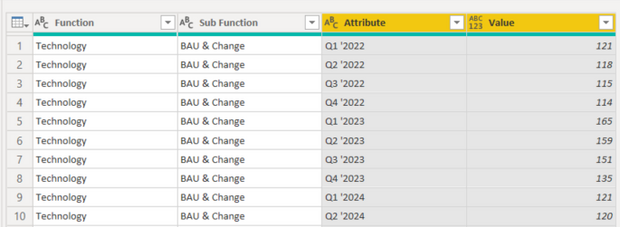
I have unpivoted the dates to give a more suitable format (below):
However my Cost and FTE is now lumped into one column (Value). I am not sure whether to have two tables (Cost and FTE) and merge the tables once I have unpivoted the dates, or whether I am able to unpivot in a way that can separate the cost from the FTE?
Any suggestions would be much appreciated,
Thanks
Solved! Go to Solution.
- Mark as New
- Bookmark
- Subscribe
- Mute
- Subscribe to RSS Feed
- Permalink
- Report Inappropriate Content
Hi again @nholmes12 ,
I was maybe not enough clear in my previous post.
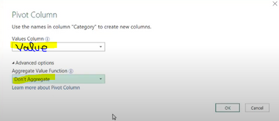
To pivot your data : simply select your column "Value Type" and click on Pivot column. In the windows which pop-up select Value as Values column and in Advanced Options select "Don't Aggregate". It should work.
Please accept it as a solution if it solved your issue.
Best regards
- Mark as New
- Bookmark
- Subscribe
- Mute
- Subscribe to RSS Feed
- Permalink
- Report Inappropriate Content
Thanks for the response. I did try this option and it worked well. My only thought was that it may limit my ability to create charts that can compare cost to FTE change over time as I only have one value field?
When you say pivot the ValueType and value, that doesn't appear to be working for me. I have pivoted both columns by attribute which gives the following:
Then pivoted the Value by the type which gives:
Any idea what I am doing incorrectly here?
Thanks!
- Mark as New
- Bookmark
- Subscribe
- Mute
- Subscribe to RSS Feed
- Permalink
- Report Inappropriate Content
Hi again @nholmes12 ,
I was maybe not enough clear in my previous post.
To pivot your data : simply select your column "Value Type" and click on Pivot column. In the windows which pop-up select Value as Values column and in Advanced Options select "Don't Aggregate". It should work.
Please accept it as a solution if it solved your issue.
Best regards
- Mark as New
- Bookmark
- Subscribe
- Mute
- Subscribe to RSS Feed
- Permalink
- Report Inappropriate Content
Thanks very much!
- Mark as New
- Bookmark
- Subscribe
- Mute
- Subscribe to RSS Feed
- Permalink
- Report Inappropriate Content
Hi @nholmes12
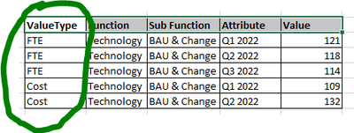
If you have a column ValueType containing the information if it is a data FTE or Cost, it should answer your need. Am I right ? (For that simply create that column before your unpivoted column step). You will be able to work on one of the value type using filter.
If you absolutely want to have the value in two separated column, you just to pivot the columns Value Type and Value.
Please accept it as a solution if it solved your issue


