Join us at FabCon Vienna from September 15-18, 2025
The ultimate Fabric, Power BI, SQL, and AI community-led learning event. Save €200 with code FABCOMM.
Get registered- Power BI forums
- Get Help with Power BI
- Desktop
- Service
- Report Server
- Power Query
- Mobile Apps
- Developer
- DAX Commands and Tips
- Custom Visuals Development Discussion
- Health and Life Sciences
- Power BI Spanish forums
- Translated Spanish Desktop
- Training and Consulting
- Instructor Led Training
- Dashboard in a Day for Women, by Women
- Galleries
- Data Stories Gallery
- Themes Gallery
- Contests Gallery
- Quick Measures Gallery
- Notebook Gallery
- Translytical Task Flow Gallery
- TMDL Gallery
- R Script Showcase
- Webinars and Video Gallery
- Ideas
- Custom Visuals Ideas (read-only)
- Issues
- Issues
- Events
- Upcoming Events
Enhance your career with this limited time 50% discount on Fabric and Power BI exams. Ends August 31st. Request your voucher.
- Power BI forums
- Forums
- Get Help with Power BI
- Desktop
- Re: Two variables average over a bar graph.
- Subscribe to RSS Feed
- Mark Topic as New
- Mark Topic as Read
- Float this Topic for Current User
- Bookmark
- Subscribe
- Printer Friendly Page
- Mark as New
- Bookmark
- Subscribe
- Mute
- Subscribe to RSS Feed
- Permalink
- Report Inappropriate Content
Two variables average over a bar graph.
Hello
I want to add several variables to a bar chart. The variables contain values that are between 0 and 10, and I want the chart show the mean of each variable.
The label of each bar must be the name of the variable or a custom value, and the value must be the average of the values of that varibale.
For example, I have two variables, satisfaction and knowledge, with 300 cases each. And the values they contain are between 0 and 10.
I need a chart that contains two bars, with the mean of each variable and the labels of the bars being the variable title or custom text.
Can it be done?
Thank you.
Solved! Go to Solution.
- Mark as New
- Bookmark
- Subscribe
- Mute
- Subscribe to RSS Feed
- Permalink
- Report Inappropriate Content
Hi @josegovia,
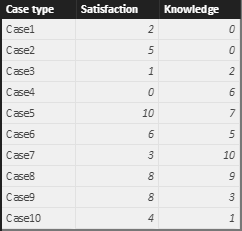
Suppose your source table looks like:
You can use a clustered column chart to show the average values for satisfaction and knowledge. But the limitation is that it is not possible to show the label as the name of the variable or a custom value, data labels can only show the numeric values for each bar.
As a workaround, you can unpivot the table structure first in query editor mode. Select the [Case type] column, then from Transform menu tab, choose 'Unpivot other columns' from the drop down list 'Pivot Column'. Then, you will get a table as below.
Best regards,
Yuliana Gu
If this post helps, then please consider Accept it as the solution to help the other members find it more quickly.
- Mark as New
- Bookmark
- Subscribe
- Mute
- Subscribe to RSS Feed
- Permalink
- Report Inappropriate Content
Hi @josegovia,
To keep the original table structure, you can replicate a new table, then, you can unpivot columns based on this new table.
Best regards,
Yuliana Gu
If this post helps, then please consider Accept it as the solution to help the other members find it more quickly.
- Mark as New
- Bookmark
- Subscribe
- Mute
- Subscribe to RSS Feed
- Permalink
- Report Inappropriate Content
Hi @josegovia,
Suppose your source table looks like:
You can use a clustered column chart to show the average values for satisfaction and knowledge. But the limitation is that it is not possible to show the label as the name of the variable or a custom value, data labels can only show the numeric values for each bar.
As a workaround, you can unpivot the table structure first in query editor mode. Select the [Case type] column, then from Transform menu tab, choose 'Unpivot other columns' from the drop down list 'Pivot Column'. Then, you will get a table as below.
Best regards,
Yuliana Gu
If this post helps, then please consider Accept it as the solution to help the other members find it more quickly.
- Mark as New
- Bookmark
- Subscribe
- Mute
- Subscribe to RSS Feed
- Permalink
- Report Inappropriate Content
Hi,
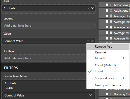
This is the same problem I'm facing. I can't select "Averge of Value". My only two options are "Count" or "Distinct Count" or to create a new quick measure.
Is the average option in the orinigal post no longer available?
Thanks so much!
- Mark as New
- Bookmark
- Subscribe
- Mute
- Subscribe to RSS Feed
- Permalink
- Report Inappropriate Content
Thanks for the solution.
But three things happen to me:
- The first is that the main table disappears and I would like to keep it because I have more varibales in it.
- The second is that if I keep the two tables, I understand that they will have to be related so that if I make a filter in some data affect all the graphs.
- And the third is that I can not select "Average" from the "Value". I only have COUNT and COUNT DISTINT options.
Can you help me with these three questions?
Thank you very much.
José
- Mark as New
- Bookmark
- Subscribe
- Mute
- Subscribe to RSS Feed
- Permalink
- Report Inappropriate Content
Well, I've already solved the first one. I have changed the format of the varibal to "Whole Number".
But I need help with the other two.
Thank you.
- Mark as New
- Bookmark
- Subscribe
- Mute
- Subscribe to RSS Feed
- Permalink
- Report Inappropriate Content
Hi @josegovia,
To keep the original table structure, you can replicate a new table, then, you can unpivot columns based on this new table.
Best regards,
Yuliana Gu
If this post helps, then please consider Accept it as the solution to help the other members find it more quickly.


