Join us at FabCon Vienna from September 15-18, 2025
The ultimate Fabric, Power BI, SQL, and AI community-led learning event. Save €200 with code FABCOMM.
Get registered- Power BI forums
- Get Help with Power BI
- Desktop
- Service
- Report Server
- Power Query
- Mobile Apps
- Developer
- DAX Commands and Tips
- Custom Visuals Development Discussion
- Health and Life Sciences
- Power BI Spanish forums
- Translated Spanish Desktop
- Training and Consulting
- Instructor Led Training
- Dashboard in a Day for Women, by Women
- Galleries
- Data Stories Gallery
- Themes Gallery
- Contests Gallery
- Quick Measures Gallery
- Notebook Gallery
- Translytical Task Flow Gallery
- TMDL Gallery
- R Script Showcase
- Webinars and Video Gallery
- Ideas
- Custom Visuals Ideas (read-only)
- Issues
- Issues
- Events
- Upcoming Events
Compete to become Power BI Data Viz World Champion! First round ends August 18th. Get started.
- Power BI forums
- Forums
- Get Help with Power BI
- Desktop
- Trend graph with empty space
- Subscribe to RSS Feed
- Mark Topic as New
- Mark Topic as Read
- Float this Topic for Current User
- Bookmark
- Subscribe
- Printer Friendly Page
- Mark as New
- Bookmark
- Subscribe
- Mute
- Subscribe to RSS Feed
- Permalink
- Report Inappropriate Content
Trend graph with empty space
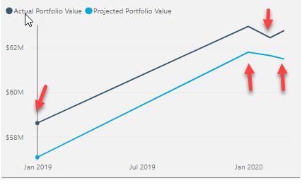
I have a VIZ that is a 2-line chart, tracking a pair of metrics that move in tandem but the calculations are slightly different.
My dataset has datamarts as of 12/31/18, 12/31/19, 1/31/20 and 2/29/20. A stored procedure will generate data as of the end of every month going forward.
However, since this is a trend graph, Power BI is showing all of the months between 12/31/18 (my first datamark) and 2/29/20 (last datamark), so there is a bunch of empty space and what looks like a skewed graph. See snapshot showing graph, with arrows indicating the 4 data points that I have in this graph.
Is there any way to just have it display the 4 datamarks without the "empty" months in a trend graph?
Solved! Go to Solution.
- Mark as New
- Bookmark
- Subscribe
- Mute
- Subscribe to RSS Feed
- Permalink
- Report Inappropriate Content
Hi @Anonymous ,
if you change the x-axis from continous to categorical it will only return the 4 values you need if however you need to show all the dates this need to be adreess in a different way mayb by hidding the line and showing only the markers.
Regards
Miguel Félix
Did I answer your question? Mark my post as a solution!
Proud to be a Super User!
Check out my blog: Power BI em Português- Mark as New
- Bookmark
- Subscribe
- Mute
- Subscribe to RSS Feed
- Permalink
- Report Inappropriate Content
Miguel, your suggestion accomplished exactly what I was trying to do. Thank you!
- Mark as New
- Bookmark
- Subscribe
- Mute
- Subscribe to RSS Feed
- Permalink
- Report Inappropriate Content
Helpful resources
| User | Count |
|---|---|
| 80 | |
| 78 | |
| 37 | |
| 34 | |
| 31 |
| User | Count |
|---|---|
| 93 | |
| 81 | |
| 60 | |
| 49 | |
| 49 |


