Fabric Data Days starts November 4th!
Advance your Data & AI career with 50 days of live learning, dataviz contests, hands-on challenges, study groups & certifications and more!
Get registered- Power BI forums
- Get Help with Power BI
- Desktop
- Service
- Report Server
- Power Query
- Mobile Apps
- Developer
- DAX Commands and Tips
- Custom Visuals Development Discussion
- Health and Life Sciences
- Power BI Spanish forums
- Translated Spanish Desktop
- Training and Consulting
- Instructor Led Training
- Dashboard in a Day for Women, by Women
- Galleries
- Data Stories Gallery
- Themes Gallery
- Contests Gallery
- Quick Measures Gallery
- Visual Calculations Gallery
- Notebook Gallery
- Translytical Task Flow Gallery
- TMDL Gallery
- R Script Showcase
- Webinars and Video Gallery
- Ideas
- Custom Visuals Ideas (read-only)
- Issues
- Issues
- Events
- Upcoming Events
Get Fabric Certified for FREE during Fabric Data Days. Don't miss your chance! Learn more
- Power BI forums
- Forums
- Get Help with Power BI
- Desktop
- Re: Treemap Visual Color differentiation is really...
- Subscribe to RSS Feed
- Mark Topic as New
- Mark Topic as Read
- Float this Topic for Current User
- Bookmark
- Subscribe
- Printer Friendly Page
- Mark as New
- Bookmark
- Subscribe
- Mute
- Subscribe to RSS Feed
- Permalink
- Report Inappropriate Content
Treemap Visual Color differentiation is really hit and miss
All,
I am not asking about color saturation...I am asking about the default colors used for each box that heps the user see them as separate data points.
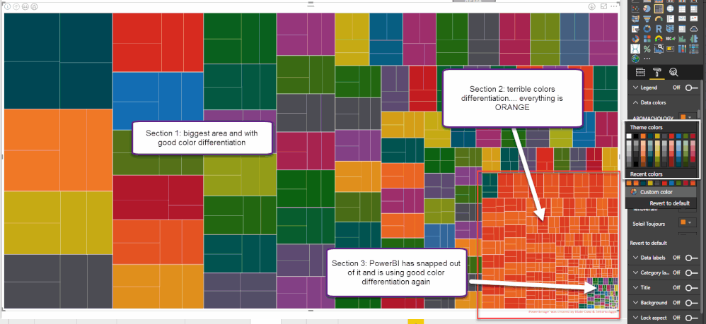
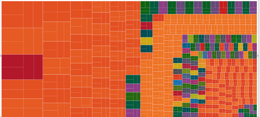
I am encountering an issue with the treemap visual where PowerBI is picking good colors for differentiating initially and then it is doing a terrible job followed by picking good colors again.
I have inserted a 2 screenshots to better describe the issue
1. I am using a json color theme that has a good range of colors--I've clicked on the formatting pane so you can see that it is not due to the theme's colors choices
2. I have not picked any custom colors for any of the data in this visual--they are all on default. I have even delted the page and re-created it and the same color issues happen
3. If you look closely at the picture I have labeled 3 section
Section 1: the largest section with good color differentiation
Section 2: 2nd largest section with terrible color differentiaiton--basically it is all orange
Section 3: smallest section with good color differentiation again.
Thanks in advance for any ideas and I have tried switching color themes but had limited improvements
- Mark as New
- Bookmark
- Subscribe
- Mute
- Subscribe to RSS Feed
- Permalink
- Report Inappropriate Content
Hi @boldwake
Could I ask the question why you want to show down to such a level of detail with the TreeMap visual?
I have found in my experience that typically people are more interested in the top or bottom values, which then would make the TreeMap visual work as expected. I find that when there is that level of details, people do not typically go down to that level.
- Mark as New
- Bookmark
- Subscribe
- Mute
- Subscribe to RSS Feed
- Permalink
- Report Inappropriate Content
Each box in that treemap is a brand that we sell and not in the picture is brand search function, so it is really easy to look at the top brands as they are the big boxes but also easy to search for the smaller ones and not have to adjust the visual
- Mark as New
- Bookmark
- Subscribe
- Mute
- Subscribe to RSS Feed
- Permalink
- Report Inappropriate Content
Hi @boldwake,
From your screenshot, I note that you have same color(Orange) for different categories category , manually set different colors for each Treemap category under Data colors.
Thanks,
Lydia Zhang
- Mark as New
- Bookmark
- Subscribe
- Mute
- Subscribe to RSS Feed
- Permalink
- Report Inappropriate Content
Hi Lydia,
I'm trying to avoid that. While i can pick the colors myself the point of the quersion is more that when everything is set to "DEFAULT", I don't know why it is defaults to SOOOO much orange rather than just repeating the color variations over and over again so that there is a lot more color variation rather than orange.
If i manually pick them then (A) it difficult to change color themes at a later date and (B) it would take FOREVER
Blake
- Mark as New
- Bookmark
- Subscribe
- Mute
- Subscribe to RSS Feed
- Permalink
- Report Inappropriate Content
Hi @boldwake,
You are able to change color theme at a later date with JSON filte.
In addition, would you mind sharing me sample data of your table so that I can reproduce?
Thanks,
Lydia Zhang
Helpful resources

Fabric Data Days
Advance your Data & AI career with 50 days of live learning, contests, hands-on challenges, study groups & certifications and more!

Power BI Monthly Update - October 2025
Check out the October 2025 Power BI update to learn about new features.


