Become a Certified Power BI Data Analyst!
Join us for an expert-led overview of the tools and concepts you'll need to pass exam PL-300. The first session starts on June 11th. See you there!
Get registered- Power BI forums
- Get Help with Power BI
- Desktop
- Service
- Report Server
- Power Query
- Mobile Apps
- Developer
- DAX Commands and Tips
- Custom Visuals Development Discussion
- Health and Life Sciences
- Power BI Spanish forums
- Translated Spanish Desktop
- Training and Consulting
- Instructor Led Training
- Dashboard in a Day for Women, by Women
- Galleries
- Webinars and Video Gallery
- Data Stories Gallery
- Themes Gallery
- Contests Gallery
- Quick Measures Gallery
- Notebook Gallery
- Translytical Task Flow Gallery
- R Script Showcase
- Ideas
- Custom Visuals Ideas (read-only)
- Issues
- Issues
- Events
- Upcoming Events
Power BI is turning 10! Let’s celebrate together with dataviz contests, interactive sessions, and giveaways. Register now.
- Power BI forums
- Forums
- Get Help with Power BI
- Desktop
- Re: Tornado chart not syncing with other visuals w...
- Subscribe to RSS Feed
- Mark Topic as New
- Mark Topic as Read
- Float this Topic for Current User
- Bookmark
- Subscribe
- Printer Friendly Page
- Mark as New
- Bookmark
- Subscribe
- Mute
- Subscribe to RSS Feed
- Permalink
- Report Inappropriate Content
Tornado chart not syncing with other visuals when clicking legend
I am using the Tornado chart, very nice chart. I find the following behaviors to be bugs :
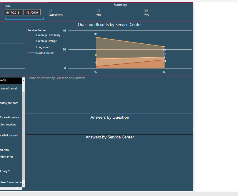
- When you click on the legend of other visuals (like stacked bar chart, area chart, etc.), then all visuals filter accordingly except the Tornado chart.
- If you have more than 1 tornado chart, then they sync between them only when you click on a particular bar, again, if you click on the legend the other tornado doesn't filter.
This is the first time I see such behavior, normally all my visuals sync automatically between them, either by clicking on a value, bar, etc., or on the legend. Weird. This makes the tornado chart useless for many scenarios. Has anyone encoutered the same behavior? I am using Power BI Desktop and Report Server Aug 2018 version.
PS : Is there any other visual that could give me a an output like the Tornado chart?
Solved! Go to Solution.
- Mark as New
- Bookmark
- Subscribe
- Mute
- Subscribe to RSS Feed
- Permalink
- Report Inappropriate Content
Hi @Anonymous,
By my test with the latest verison Power BI Desktop(2.65.5313.1381), it seems that everything works as expected.
Please check if you have installed the latest version of Power BI Desktop.
In addition, you could have a test with my attachment.
If you still need help, could you share a dummy pbix file which can reproduce the scenario, so that we can help further investigate on it? You can upload it to OneDrive and post the link here. Do mask sensitive data before uploading.)
Best Regards,
Cherry
If this post helps, then please consider Accept it as the solution to help the other members find it more quickly.
- Mark as New
- Bookmark
- Subscribe
- Mute
- Subscribe to RSS Feed
- Permalink
- Report Inappropriate Content
We also getting same issue. Please check and let know if any sollution.
- Mark as New
- Bookmark
- Subscribe
- Mute
- Subscribe to RSS Feed
- Permalink
- Report Inappropriate Content
Hi @Anonymous,
By my test with the latest verison Power BI Desktop(2.65.5313.1381), it seems that everything works as expected.
Please check if you have installed the latest version of Power BI Desktop.
In addition, you could have a test with my attachment.
If you still need help, could you share a dummy pbix file which can reproduce the scenario, so that we can help further investigate on it? You can upload it to OneDrive and post the link here. Do mask sensitive data before uploading.)
Best Regards,
Cherry
If this post helps, then please consider Accept it as the solution to help the other members find it more quickly.
- Mark as New
- Bookmark
- Subscribe
- Mute
- Subscribe to RSS Feed
- Permalink
- Report Inappropriate Content
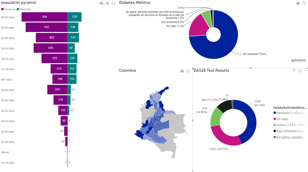
Hi. I'm trying to cross-highlighting between a Tornado Chars and a Pie chart but the visuals just filter eachother and ignores past selections.
What I've tried:
1) to change 'Edit Interantions', but no combination gives me the results I want.
2) to change The Data model but it does't appear to be the cause, simply because the 'shape map' crossfilter well despite having the same data structure of the population pyramid.
Thanks in advance
- Mark as New
- Bookmark
- Subscribe
- Mute
- Subscribe to RSS Feed
- Permalink
- Report Inappropriate Content
I just installed January 2019 RS version and it seems to work OK when viewed in Power BI Desktop RS, but, when published to RS server Jan 2019 version the Tornado chart is blank.
PS : I also tried publishing the sample provided by @v-piga-msft, but the results are the same. Tornado charts that where at least visible in previous Reporting Server version (Aug 2018), are now useless in Jan 2019 version. Way to go Microsoft! 😞

- Mark as New
- Bookmark
- Subscribe
- Mute
- Subscribe to RSS Feed
- Permalink
- Report Inappropriate Content
Ok, cleared Cache on Chrome and restarted. This seems to do the trick.
Helpful resources
| User | Count |
|---|---|
| 84 | |
| 73 | |
| 70 | |
| 42 | |
| 35 |
| User | Count |
|---|---|
| 109 | |
| 56 | |
| 52 | |
| 45 | |
| 43 |


