Get Fabric certified for FREE!
Don't miss your chance to take the Fabric Data Engineer (DP-600) exam for FREE! Find out how by watching the DP-600 session on-demand now through April 28th.
Learn more- Power BI forums
- Get Help with Power BI
- Desktop
- Service
- Report Server
- Power Query
- Mobile Apps
- Developer
- DAX Commands and Tips
- Custom Visuals Development Discussion
- Health and Life Sciences
- Power BI Spanish forums
- Translated Spanish Desktop
- Training and Consulting
- Instructor Led Training
- Dashboard in a Day for Women, by Women
- Galleries
- Data Stories Gallery
- Themes Gallery
- Contests Gallery
- QuickViz Gallery
- Quick Measures Gallery
- Visual Calculations Gallery
- Notebook Gallery
- Translytical Task Flow Gallery
- TMDL Gallery
- R Script Showcase
- Webinars and Video Gallery
- Ideas
- Custom Visuals Ideas (read-only)
- Issues
- Issues
- Events
- Upcoming Events
Join the FabCon + SQLCon recap series. Up next: Power BI, Real-Time Intelligence, IQ and AI, and Data Factory take center stage. All sessions are available on-demand after the live show. Register now
- Power BI forums
- Forums
- Get Help with Power BI
- Desktop
- Timeline Forecasting Matrix
- Subscribe to RSS Feed
- Mark Topic as New
- Mark Topic as Read
- Float this Topic for Current User
- Bookmark
- Subscribe
- Printer Friendly Page
- Mark as New
- Bookmark
- Subscribe
- Mute
- Subscribe to RSS Feed
- Permalink
- Report Inappropriate Content
Timeline Forecasting Matrix Visuals
Hi all
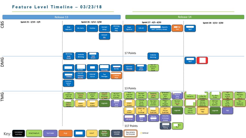
I am looking for a way to represent data from sql similar to the image attached that was done manually. I have yet to see a visiual canned or custom to accomplish this. Here are some of the must haves:
1. Represent text (record in a table from sql) in some short of shape for easy grouping.
2. The visual must allow for color customization based on certain values.
3. The ability to fit a decent amout of text in the visual (so wrapping might be a must).
4. Bascially come as close to the image attached...
5. I have cut out some text for privacy reasons.
- Mark as New
- Bookmark
- Subscribe
- Mute
- Subscribe to RSS Feed
- Permalink
- Report Inappropriate Content
Hi @yourbedhead,
Please submit an idea about this feature here.
Best Regards,
Dale
If this post helps, then please consider Accept it as the solution to help the other members find it more quickly.
- Mark as New
- Bookmark
- Subscribe
- Mute
- Subscribe to RSS Feed
- Permalink
- Report Inappropriate Content
Hi all
I am looking for a way to represent data from sql similar to the image attached that was done manually. I have yet to see a visiual canned or custom to accomplish this. Here are some of the must haves:
1. Represent text (record in a table from sql) in some short of shape for easy grouping.
2. The visual must allow for color customization based on certain values.
3. The ability to fit a decent amout of text in the visual (so wrapping might be a must).
4. Bascially come as close to the image attached...
5. I have cut out some text for privacy reasons.
Helpful resources

Power BI Monthly Update - April 2026
Check out the April 2026 Power BI update to learn about new features.

New to Fabric Survey
If you have recently started exploring Fabric, we'd love to hear how it's going. Your feedback can help with product improvements.

Power BI DataViz World Championships - June 2026
A new Power BI DataViz World Championship is coming this June! Don't miss out on submitting your entry.

| User | Count |
|---|---|
| 48 | |
| 40 | |
| 38 | |
| 20 | |
| 17 |
| User | Count |
|---|---|
| 68 | |
| 65 | |
| 30 | |
| 26 | |
| 25 |

