FabCon is coming to Atlanta
Join us at FabCon Atlanta from March 16 - 20, 2026, for the ultimate Fabric, Power BI, AI and SQL community-led event. Save $200 with code FABCOMM.
Register now!- Power BI forums
- Get Help with Power BI
- Desktop
- Service
- Report Server
- Power Query
- Mobile Apps
- Developer
- DAX Commands and Tips
- Custom Visuals Development Discussion
- Health and Life Sciences
- Power BI Spanish forums
- Translated Spanish Desktop
- Training and Consulting
- Instructor Led Training
- Dashboard in a Day for Women, by Women
- Galleries
- Data Stories Gallery
- Themes Gallery
- Contests Gallery
- Quick Measures Gallery
- Notebook Gallery
- Translytical Task Flow Gallery
- TMDL Gallery
- R Script Showcase
- Webinars and Video Gallery
- Ideas
- Custom Visuals Ideas (read-only)
- Issues
- Issues
- Events
- Upcoming Events
To celebrate FabCon Vienna, we are offering 50% off select exams. Ends October 3rd. Request your discount now.
- Power BI forums
- Forums
- Get Help with Power BI
- Desktop
- TimeChart in PowerBI? Is it possible?
- Subscribe to RSS Feed
- Mark Topic as New
- Mark Topic as Read
- Float this Topic for Current User
- Bookmark
- Subscribe
- Printer Friendly Page
- Mark as New
- Bookmark
- Subscribe
- Mute
- Subscribe to RSS Feed
- Permalink
- Report Inappropriate Content
TimeChart in PowerBI? Is it possible?
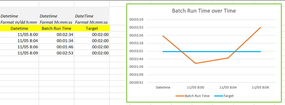
I have created a chart like the following in Excel. I would like to publish this type of data to a PowerBI Dashboard and then allow personnel in my company to see the data through that Dashboard. I can't figure out how to get this chart to work in PowerBI. I've seen other posts that talk about it too...but wanted to provide my context to see if someone can give me an idea how to do it. We are attempting to promote PowerBI in our company and this would help. Thanks.
GOAL: Publish Batch Times from a system in a chart in PowerBI.
Datasource: Azure SQL Server
Currently how it works in Excel: Refresh the query against Azure SQL Server Table, Then the chart updates.
Raw Data if it helps.
| Datetime Format m/dd h:mm | Datetime Format hh:mm:ss | DateTime Format hh:mm:ss |
| Datetime | Batch Run Time | Target |
| 11/05 8:00 | 00:02:34 | 00:02:00 |
| 11/05 8:04 | 00:01:34 | 00:02:00 |
| 11/05 8:06 | 00:01:46 | 00:02:00 |
| 11/05 8:09 | 00:02:53 | 00:02:00 |
Solved! Go to Solution.
- Mark as New
- Bookmark
- Subscribe
- Mute
- Subscribe to RSS Feed
- Permalink
- Report Inappropriate Content
Here's what I ended up doing.
I changed the time calculation to a decimal. So 90 seconds becomes 1.5 minutes. 220 seconds becomes 3.67 s, etc.
Then I plotted the "minutes" as a decimal on the Y-axis. This worked. The value to it as well was that for multiple charts on the same report, I could control the y-axis more easily by just setting the lower and upper bounds by number.
Thanks for your help!
- Mark as New
- Bookmark
- Subscribe
- Mute
- Subscribe to RSS Feed
- Permalink
- Report Inappropriate Content
Hi @thomascampbell ,
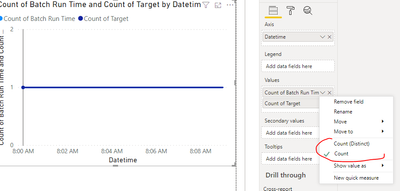
The'Line chart' can not plot time type data.
You need use a custom visual.
Best regards,
Lionel Chen
If this post helps, then please consider Accept it as the solution to help the other members find it more quickly.
- Mark as New
- Bookmark
- Subscribe
- Mute
- Subscribe to RSS Feed
- Permalink
- Report Inappropriate Content
@thomascampbell , I doubt That in power bi you may not be able to plot time on y-axis. You may to convert that to duration
- Mark as New
- Bookmark
- Subscribe
- Mute
- Subscribe to RSS Feed
- Permalink
- Report Inappropriate Content
Do you mean that I should make the batch run times...numeric instead of time and plot that somehow? That would work...but not ideal. It's easy to do in Excel...why an issue in PowerBI?
Helpful resources
| User | Count |
|---|---|
| 98 | |
| 76 | |
| 75 | |
| 49 | |
| 27 |


