Fabric Data Days starts November 4th!
Advance your Data & AI career with 50 days of live learning, dataviz contests, hands-on challenges, study groups & certifications and more!
Get registered- Power BI forums
- Get Help with Power BI
- Desktop
- Service
- Report Server
- Power Query
- Mobile Apps
- Developer
- DAX Commands and Tips
- Custom Visuals Development Discussion
- Health and Life Sciences
- Power BI Spanish forums
- Translated Spanish Desktop
- Training and Consulting
- Instructor Led Training
- Dashboard in a Day for Women, by Women
- Galleries
- Data Stories Gallery
- Themes Gallery
- Contests Gallery
- QuickViz Gallery
- Quick Measures Gallery
- Visual Calculations Gallery
- Notebook Gallery
- Translytical Task Flow Gallery
- TMDL Gallery
- R Script Showcase
- Webinars and Video Gallery
- Ideas
- Custom Visuals Ideas (read-only)
- Issues
- Issues
- Events
- Upcoming Events
Get Fabric Certified for FREE during Fabric Data Days. Don't miss your chance! Request now
- Power BI forums
- Forums
- Get Help with Power BI
- Desktop
- Time cannot be set to 24 hour format in Continuous...
- Subscribe to RSS Feed
- Mark Topic as New
- Mark Topic as Read
- Float this Topic for Current User
- Bookmark
- Subscribe
- Printer Friendly Page
- Mark as New
- Bookmark
- Subscribe
- Mute
- Subscribe to RSS Feed
- Permalink
- Report Inappropriate Content
Time cannot be set to 24 hour format in Continuous X Axis
Hi,
I've got a column which is in "Time" data type.
It is used as X-axis in an Area Chart, continous.
What I've found is that in Desktop it is showing as 24 hour format whereas it will be showing AM/PM no matter how I configure the format in column tool.
Actually the format function only works when I set this axis as categorical.
Could you please help me out?
Screenshots in desktop:
The "Hour" column is set as h:nn in desktop:
Still showing AM/PM in the portal:
Solved! Go to Solution.
- Mark as New
- Bookmark
- Subscribe
- Mute
- Subscribe to RSS Feed
- Permalink
- Report Inappropriate Content
Hi @GlobalFever ,
If it is not a table visual, it will indeed automatically become the twelve hour format.
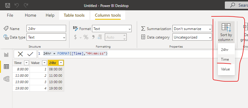
Here's the workaround, you can turn the time field to text.
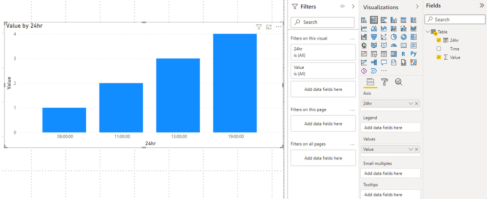
24hr = FORMAT([Time],"HH:mm:ss")Then you need to sort the 24hr column by the time column.
Now you can get the time in 24-hour format.
Best Regards,
Stephen Tao
If this post helps, then please consider Accept it as the solution to help the other members find it more quickly.
- Mark as New
- Bookmark
- Subscribe
- Mute
- Subscribe to RSS Feed
- Permalink
- Report Inappropriate Content
That does not solve the problem if you're looking across a 24 hour time period. I work in the aviation field for the goverment and this has been a plaguing issue that would be great if it was solved.
- Mark as New
- Bookmark
- Subscribe
- Mute
- Subscribe to RSS Feed
- Permalink
- Report Inappropriate Content
Please provide sample data that covers your issue or question completely, in a usable format (not as a screenshot).
Do not include sensitive information. Do not include anything that is unrelated to the issue or question.
Please show the expected outcome based on the sample data you provided.
Need help uploading data? https://community.fabric.microsoft.com/t5/Community-Blog/How-to-provide-sample-data-in-the-Power-BI-...
Want faster answers? https://community.fabric.microsoft.com/t5/Desktop/How-to-Get-Your-Question-Answered-Quickly/m-p/1447...
- Mark as New
- Bookmark
- Subscribe
- Mute
- Subscribe to RSS Feed
- Permalink
- Report Inappropriate Content
Hi Stephen,
Thanks for replying.
Yes by using text format time value, we can show them in 12h or 24h as we want.
But in this case the time value will be categorically,
which means the X axis must be showing every hour point, and the X axis gridlines will be lost.
- Mark as New
- Bookmark
- Subscribe
- Mute
- Subscribe to RSS Feed
- Permalink
- Report Inappropriate Content
Have you figured out this problem? I have been having the same issue plague me for a couple years now.
- Mark as New
- Bookmark
- Subscribe
- Mute
- Subscribe to RSS Feed
- Permalink
- Report Inappropriate Content
Is the locale of your browser set to en-us?
Helpful resources

Fabric Data Days
Advance your Data & AI career with 50 days of live learning, contests, hands-on challenges, study groups & certifications and more!

Power BI Monthly Update - October 2025
Check out the October 2025 Power BI update to learn about new features.


