Huge last-minute discounts for FabCon Vienna from September 15-18, 2025
Supplies are limited. Contact info@espc.tech right away to save your spot before the conference sells out.
Get your discount- Power BI forums
- Get Help with Power BI
- Desktop
- Service
- Report Server
- Power Query
- Mobile Apps
- Developer
- DAX Commands and Tips
- Custom Visuals Development Discussion
- Health and Life Sciences
- Power BI Spanish forums
- Translated Spanish Desktop
- Training and Consulting
- Instructor Led Training
- Dashboard in a Day for Women, by Women
- Galleries
- Data Stories Gallery
- Themes Gallery
- Contests Gallery
- Quick Measures Gallery
- Notebook Gallery
- Translytical Task Flow Gallery
- TMDL Gallery
- R Script Showcase
- Webinars and Video Gallery
- Ideas
- Custom Visuals Ideas (read-only)
- Issues
- Issues
- Events
- Upcoming Events
Score big with last-minute savings on the final tickets to FabCon Vienna. Secure your discount
- Power BI forums
- Forums
- Get Help with Power BI
- Desktop
- Re: Time and date on x axis chart
- Subscribe to RSS Feed
- Mark Topic as New
- Mark Topic as Read
- Float this Topic for Current User
- Bookmark
- Subscribe
- Printer Friendly Page
- Mark as New
- Bookmark
- Subscribe
- Mute
- Subscribe to RSS Feed
- Permalink
- Report Inappropriate Content
Time and date on x axis chart
Hi,
In the scenario below i have a date, time and temperature column.
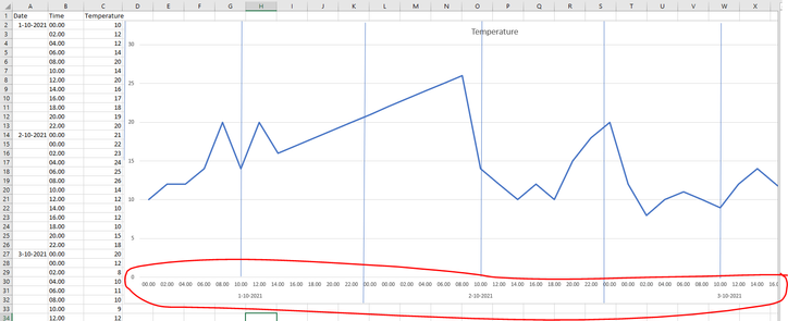
What we are trying to visualize in a chart is on the x axis the time and date like the Excel example below.
Who can help me visualise this?
Thanks,
Stefan
Solved! Go to Solution.
- Mark as New
- Bookmark
- Subscribe
- Mute
- Subscribe to RSS Feed
- Permalink
- Report Inappropriate Content
Hello there @Stefanve ! You can implement a similar solution to the one proposed in the following link. THe only difference is that you will have to add the "Time" field to the date hierarchy.
Hope this answer solves your problem!
If you need any additional help please @ me in your reply.
If my reply provided you with a solution, please consider marking it as a solution ✔️ or giving it a kudoe 👍
Thanks!
You can also check out my LinkedIn!
Best regards,
Gonçalo Geraldes
- Mark as New
- Bookmark
- Subscribe
- Mute
- Subscribe to RSS Feed
- Permalink
- Report Inappropriate Content
Hi @Stefanve ,
See the below ,the following result is what you want .
Base data:
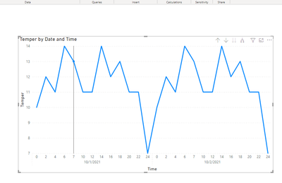
Result:
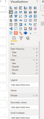
create a new hierarchy ,use date and time.
Then create visual:
Final get:
Did I answer your question? Mark my post as a solution!
Best Regards
Lucien
- Mark as New
- Bookmark
- Subscribe
- Mute
- Subscribe to RSS Feed
- Permalink
- Report Inappropriate Content
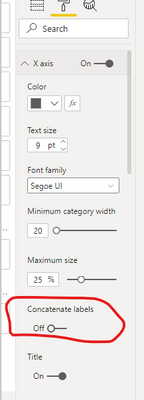
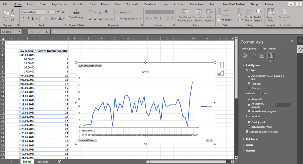
I'm trying to do what you described here. I managed to create the pivot table and the hierarchy, but I don't know where to find the "Concatenate labels" option. How do you get there?
After I got the Pivot Table, I created a Pivot Chart, but I don't know what's next.
Here is how it looks like:
Thanks in advanced
Best regards
Josef
- Mark as New
- Bookmark
- Subscribe
- Mute
- Subscribe to RSS Feed
- Permalink
- Report Inappropriate Content
You're using Microsoft Excel, whereas the post you're replying to was using Microsoft PowerBI for Desktop.
You cannot follow his instructions in Excel.
- Mark as New
- Bookmark
- Subscribe
- Mute
- Subscribe to RSS Feed
- Permalink
- Report Inappropriate Content
Hello there @Stefanve ! You can implement a similar solution to the one proposed in the following link. THe only difference is that you will have to add the "Time" field to the date hierarchy.
Hope this answer solves your problem!
If you need any additional help please @ me in your reply.
If my reply provided you with a solution, please consider marking it as a solution ✔️ or giving it a kudoe 👍
Thanks!
You can also check out my LinkedIn!
Best regards,
Gonçalo Geraldes
