Join us at FabCon Vienna from September 15-18, 2025
The ultimate Fabric, Power BI, SQL, and AI community-led learning event. Save €200 with code FABCOMM.
Get registered- Power BI forums
- Get Help with Power BI
- Desktop
- Service
- Report Server
- Power Query
- Mobile Apps
- Developer
- DAX Commands and Tips
- Custom Visuals Development Discussion
- Health and Life Sciences
- Power BI Spanish forums
- Translated Spanish Desktop
- Training and Consulting
- Instructor Led Training
- Dashboard in a Day for Women, by Women
- Galleries
- Data Stories Gallery
- Themes Gallery
- Contests Gallery
- Quick Measures Gallery
- Notebook Gallery
- Translytical Task Flow Gallery
- TMDL Gallery
- R Script Showcase
- Webinars and Video Gallery
- Ideas
- Custom Visuals Ideas (read-only)
- Issues
- Issues
- Events
- Upcoming Events
Enhance your career with this limited time 50% discount on Fabric and Power BI exams. Ends August 31st. Request your voucher.
- Power BI forums
- Forums
- Get Help with Power BI
- Desktop
- Time and Duration Help
- Subscribe to RSS Feed
- Mark Topic as New
- Mark Topic as Read
- Float this Topic for Current User
- Bookmark
- Subscribe
- Printer Friendly Page
- Mark as New
- Bookmark
- Subscribe
- Mute
- Subscribe to RSS Feed
- Permalink
- Report Inappropriate Content
Time and Duration Help
Hello,
I have a data set where I have duration in seconds, which I'm looking to convert to a format to show days, hours, minutes and seconds. Once converted, I'm then hoping it's possible to put the information on a graph where I can show average duration on the y-axis and the month on the x-axis based on my other column called Closed Date.
I could not figure out how to use query editor to convert the duration from seconds to the format I am requiring. I've also never seen graphs in Power BI where the y-axis is time.
Below is a sample excel of my data and a pbix
Any help would be really appreciated.
Solved! Go to Solution.
- Mark as New
- Bookmark
- Subscribe
- Mute
- Subscribe to RSS Feed
- Permalink
- Report Inappropriate Content
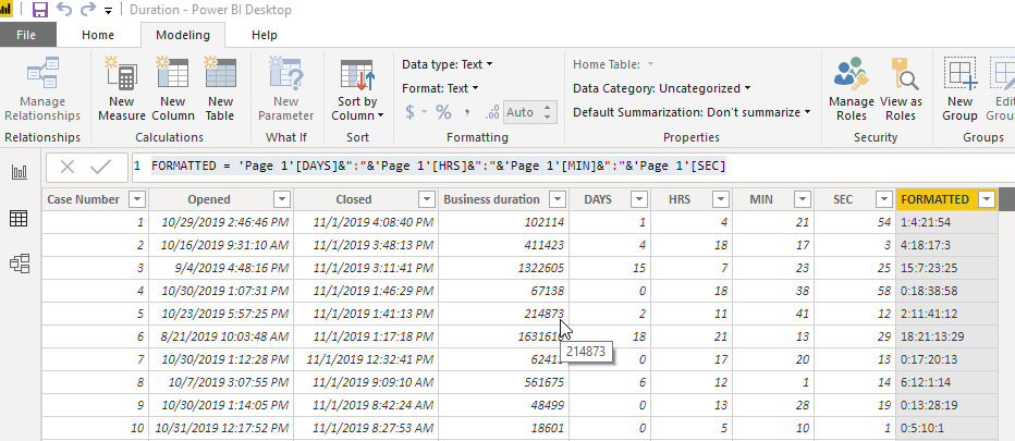
What if you generate these columns:
DAYS = TRUNC([Business Duration]/86400)

- Mark as New
- Bookmark
- Subscribe
- Mute
- Subscribe to RSS Feed
- Permalink
- Report Inappropriate Content
I had this issue and I found out that Power BI doesn't support showing Y Axis duration data as time in that DD:HH:MM:SS format. I had a data set that calculates an average duration in minutes, and I made a line graph to show that average duration vs day. I created measures:
Line chart attached showing tooltip.
- Mark as New
- Bookmark
- Subscribe
- Mute
- Subscribe to RSS Feed
- Permalink
- Report Inappropriate Content
@Anonymous
Thank you for responding and providing some insight into your data. It's too bad it cannot graph the data as required.
I'm in need to graph the average duration (once converted to dd:hh:mm:ss) monthly to show the trend that is occurring.
Have you had to do similar reporting over that time instead of looking at it vs day?
- Mark as New
- Bookmark
- Subscribe
- Mute
- Subscribe to RSS Feed
- Permalink
- Report Inappropriate Content
What if you generate these columns:
DAYS = TRUNC([Business Duration]/86400)

- Mark as New
- Bookmark
- Subscribe
- Mute
- Subscribe to RSS Feed
- Permalink
- Report Inappropriate Content
@Anonymous
This is great, I'll be able to work with this. Appreciate you helping me out!


