Get Fabric or SQL Certified for Free.
Get certified for free when you join Fabric Data Days 2026 and dive into Fabric, Power BI, SQL, AI, and other essential data skills.
Join now- Power BI forums
- Get Help with Power BI
- Desktop
- Service
- Report Server
- Power Query
- Mobile Apps
- Developer
- DAX Commands and Tips
- Custom Visuals Development Discussion
- Health and Life Sciences
- Power BI Spanish forums
- Translated Spanish Desktop
- Training and Consulting
- Instructor Led Training
- Dashboard in a Day for Women, by Women
- Galleries
- Data Stories Gallery
- Themes Gallery
- Contests Gallery
- QuickViz Gallery
- Quick Measures Gallery
- Visual Calculations Gallery
- Notebook Gallery
- Translytical Task Flow Gallery
- TMDL Gallery
- R Script Showcase
- Webinars and Video Gallery
- Ideas
- Custom Visuals Ideas (read-only)
- Issues
- Issues
- Events
- Upcoming Events
July 7 - July 17 | Round 2 of the Power BI Dataviz World Championships. Don't miss your chance! Learn more
- Power BI forums
- Forums
- Get Help with Power BI
- Desktop
- Re: This Should be Simple - Line Graph
- Subscribe to RSS Feed
- Mark Topic as New
- Mark Topic as Read
- Float this Topic for Current User
- Bookmark
- Subscribe
- Printer Friendly Page


- Mark as New
- Bookmark
- Subscribe
- Mute
- Subscribe to RSS Feed
- Permalink
- Report Inappropriate Content
This Should be Simple - Line Graph
I'm not sure why this is not working, hopinh someone here will be able to assist.
I am attempting to create a graph that will show 'Stock Levels' for certain products by date within a Line Graph.
I have created a "Stock Level" for each SKU and have assigned those values with a scale 0-3 - 'Stock Level Value'.
- Out of Stock = 0
- Low Stock = 1
- Nearing Low Stock = 2
- Stocked = 3
Everyday, as stock levels chance their stock level values ,ay change as well. I want to review this data within a line graph and then hopefully compliment a sales report. However, even though I have the table with accurate data, the line graph is not calculating the values as I would like. See the Below -

In the 'Value' field I have entered a measure that I created which is simply SUM (Stock Value).
I would expect to see a line graph that displays Out of Stock (Value 0) from 12/09/2019 - 12/10/2019, then 3 days of Low Stock indicated by a Value 1.
Why is this not working? 😥
Please help!
Solved! Go to Solution.


- Mark as New
- Bookmark
- Subscribe
- Mute
- Subscribe to RSS Feed
- Permalink
- Report Inappropriate Content
Hi @AlexAlberga727 ,
If the Stock Value is a calculated column, we can just use it in the value field as following to meet your requirement:
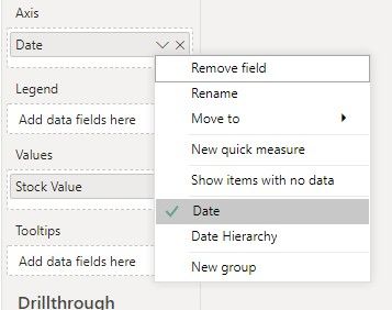

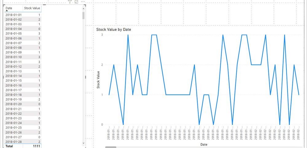
Best regards,
If this post helps, then please consider Accept it as the solution to help the other members find it more quickly.

- Mark as New
- Bookmark
- Subscribe
- Mute
- Subscribe to RSS Feed
- Permalink
- Report Inappropriate Content
Try this, select "stock value" on your "fields" ( all the way to the right). and go to modeling tab, then select "don't summarize". Hope that will solve your issue. If it does, please give me a kudos!!
- Mark as New
- Bookmark
- Subscribe
- Mute
- Subscribe to RSS Feed
- Permalink
- Report Inappropriate Content
@Anonymous Thanks for replying.
This was initially what I thought the issue was. However, the option to not summerize wasn't available. The only options were to SUM, MIN/MAX, AVG - but no option to not summerize. I then created a measure that was simply =SUM(Stock Value). Thinking this would SUM the date's stock value for the selected SKU, and not ask for a type of summerization.
- Mark as New
- Bookmark
- Subscribe
- Mute
- Subscribe to RSS Feed
- Permalink
- Report Inappropriate Content
Hi @AlexAlberga727 ,
If the Stock Value is a calculated column, we can just use it in the value field as following to meet your requirement:
Best regards,
If this post helps, then please consider Accept it as the solution to help the other members find it more quickly.
- Mark as New
- Bookmark
- Subscribe
- Mute
- Subscribe to RSS Feed
- Permalink
- Report Inappropriate Content
@v-lid-msft Thanks for helping. This solution worked. Implemented a calculated column utilizing the =RELATED DAX. Same values are being populated, but now the visualization works as expected.
Thanks again!
- Mark as New
- Bookmark
- Subscribe
- Mute
- Subscribe to RSS Feed
- Permalink
- Report Inappropriate Content
This is something I did toggle, and saw no impact. I just attempted again to confirm, and no - unfortunately this doesn't solve the issue.
I'm not sure why I am seeing a value of 6 across all dates, when the table on the left indicates all the dates I have within my table, and the associated stock level.
I also have created a date table and have marked it as the 'Date table'. I would expect to only see results for the data that has been populated which is only from 12/9/2019 - present. Values range from 0-3, for this particular SKU only 2 values - 0 and 1. Yet the graph shows 6... for all dates. Fairly frustrating. I feel like this should be very simple.
- Mark as New
- Bookmark
- Subscribe
- Mute
- Subscribe to RSS Feed
- Permalink
- Report Inappropriate Content
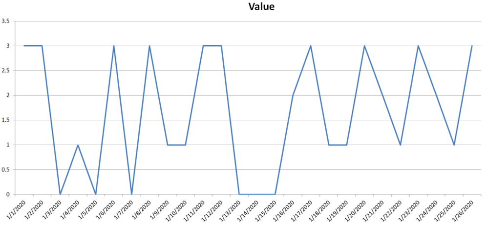
I simply need a graph that looks like the following - Plotting values 0-3.


- Mark as New
- Bookmark
- Subscribe
- Mute
- Subscribe to RSS Feed
- Permalink
- Report Inappropriate Content
Perhaps try changing your x-axis to be categorical instead of continuous.
Follow on LinkedIn
@ me in replies or I'll lose your thread!!!
Instead of a Kudo, please vote for this idea
Become an expert!: Enterprise DNA
External Tools: MSHGQM
YouTube Channel!: Microsoft Hates Greg
Latest book!: DAX For Humans
DAX is easy, CALCULATE makes DAX hard...
Helpful resources

FabCon & SQLCon – Barcelona 2026
Join us in Barcelona for FabCon and SQLCon, the Fabric, Power BI, SQL, and AI community event. Save €200 with code FABCMTY200.

Data Days 2026
Join Data Days 2026: 60 days of free live/on-demand sessions, challenges, study groups, and certification opportunities.

Power BI DataViz World Championships - June 2026
A new Power BI DataViz World Championship is coming this June! Don't miss out on submitting your entry.

| User | Count |
|---|---|
| 29 | |
| 27 | |
| 26 | |
| 24 | |
| 16 |


| User | Count |
|---|---|
| 54 | |
| 47 | |
| 41 | |
| 31 | |
| 21 |


