FabCon is coming to Atlanta
Join us at FabCon Atlanta from March 16 - 20, 2026, for the ultimate Fabric, Power BI, AI and SQL community-led event. Save $200 with code FABCOMM.
Register now!- Power BI forums
- Get Help with Power BI
- Desktop
- Service
- Report Server
- Power Query
- Mobile Apps
- Developer
- DAX Commands and Tips
- Custom Visuals Development Discussion
- Health and Life Sciences
- Power BI Spanish forums
- Translated Spanish Desktop
- Training and Consulting
- Instructor Led Training
- Dashboard in a Day for Women, by Women
- Galleries
- Data Stories Gallery
- Themes Gallery
- Contests Gallery
- QuickViz Gallery
- Quick Measures Gallery
- Visual Calculations Gallery
- Notebook Gallery
- Translytical Task Flow Gallery
- TMDL Gallery
- R Script Showcase
- Webinars and Video Gallery
- Ideas
- Custom Visuals Ideas (read-only)
- Issues
- Issues
- Events
- Upcoming Events
The Power BI Data Visualization World Championships is back! Get ahead of the game and start preparing now! Learn more
- Power BI forums
- Forums
- Get Help with Power BI
- Desktop
- Re: Target Values Column chart
- Subscribe to RSS Feed
- Mark Topic as New
- Mark Topic as Read
- Float this Topic for Current User
- Bookmark
- Subscribe
- Printer Friendly Page
- Mark as New
- Bookmark
- Subscribe
- Mute
- Subscribe to RSS Feed
- Permalink
- Report Inappropriate Content
Target Values Column chart
Hello,
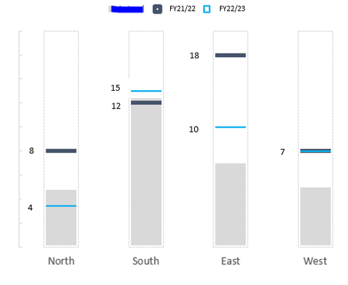
I am trying to figure out a way to create a simple chart showing target duration changes from the last fiscal year to this current fiscal year. There are five categories for these target durations that I'd like to place on my x axis. My goal is to show the change in target durations with markers only, e.g. +1 day, -4 days, etc. I have columns for target durations for FY21/22 and FY22/23. I would love my chart to look somewhat like the below, is there any idea on how I can achieve this in PowerBI?
- This isn't my chart and I wouldn't need the grey spaces shown on the column chart, this is just the best picture I could find online to give an example.
Thank you!
Solved! Go to Solution.
- Mark as New
- Bookmark
- Subscribe
- Mute
- Subscribe to RSS Feed
- Permalink
- Report Inappropriate Content
@Anonymous , Check if a bullet chart can help
https://appsource.microsoft.com/en-us/product/power-bi-visuals/wa104380755?tab=overview
- Mark as New
- Bookmark
- Subscribe
- Mute
- Subscribe to RSS Feed
- Permalink
- Report Inappropriate Content
I explored a bullet graph, but I don't need to show the actual performance measure, rather the single comparative measures for each category and the change from previous fiscal year to the current fiscal year.
- Mark as New
- Bookmark
- Subscribe
- Mute
- Subscribe to RSS Feed
- Permalink
- Report Inappropriate Content
@Anonymous , Check if a bullet chart can help
https://appsource.microsoft.com/en-us/product/power-bi-visuals/wa104380755?tab=overview
Helpful resources

Power BI Dataviz World Championships
The Power BI Data Visualization World Championships is back! Get ahead of the game and start preparing now!

| User | Count |
|---|---|
| 39 | |
| 37 | |
| 35 | |
| 34 | |
| 27 |
| User | Count |
|---|---|
| 137 | |
| 97 | |
| 74 | |
| 66 | |
| 65 |


