Get Fabric certified for FREE!
Don't miss your chance to take the Fabric Data Engineer (DP-600) exam for FREE! Find out how by attending the DP-600 session on April 23rd (pacific time), live or on-demand.
Learn more- Power BI forums
- Get Help with Power BI
- Desktop
- Service
- Report Server
- Power Query
- Mobile Apps
- Developer
- DAX Commands and Tips
- Custom Visuals Development Discussion
- Health and Life Sciences
- Power BI Spanish forums
- Translated Spanish Desktop
- Training and Consulting
- Instructor Led Training
- Dashboard in a Day for Women, by Women
- Galleries
- Data Stories Gallery
- Themes Gallery
- Contests Gallery
- QuickViz Gallery
- Quick Measures Gallery
- Visual Calculations Gallery
- Notebook Gallery
- Translytical Task Flow Gallery
- TMDL Gallery
- R Script Showcase
- Webinars and Video Gallery
- Ideas
- Custom Visuals Ideas (read-only)
- Issues
- Issues
- Events
- Upcoming Events
Next up in the FabCon + SQLCon recap series: The roadmap for Microsoft SQL and Maximizing Developer experiences in Fabric. All sessions are available on-demand after the live show. Register now
- Power BI forums
- Forums
- Get Help with Power BI
- Desktop
- Tachometer Visual Question
- Subscribe to RSS Feed
- Mark Topic as New
- Mark Topic as Read
- Float this Topic for Current User
- Bookmark
- Subscribe
- Printer Friendly Page
- Mark as New
- Bookmark
- Subscribe
- Mute
- Subscribe to RSS Feed
- Permalink
- Report Inappropriate Content
Tachometer Visual Question
I was wondering what the best way to fix this visual would be.
My table in excel to create this visual is as follows (the 3rd and 4th column are actual values I just wrote them like that for the purposes of showing what I'm doing here)
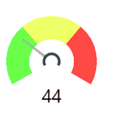
And my tachometer is like this
In this case, the left side is green because the less requests, the better.
When I showed my boss, he said he would rather have only green and red areas, and that he wanted them switched.
So how would I make my table/format this visual to have red (bad/high # requests) on the left side and green (good/low # requests) on the right? I know you can switch the colors in each range but I still don't really know how to manipulate the data to get what he wants in a way that will still show 44 on the bottom.
Thank you! I hope that made sense!
Solved! Go to Solution.
- Mark as New
- Bookmark
- Subscribe
- Mute
- Subscribe to RSS Feed
- Permalink
- Report Inappropriate Content
Hi @sy898661
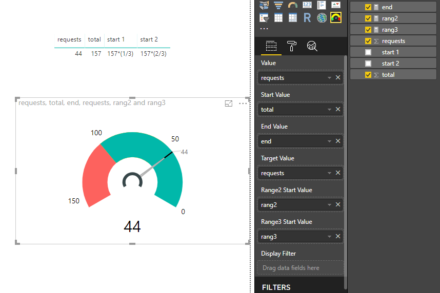
Create measures
end = 0

rang2 = 157*(1/3)

rang3 = 157*(2/3)
Drag columns and measures to the following fields
And change colors for rang1 to rang3
Best Regards
Maggie
- Mark as New
- Bookmark
- Subscribe
- Mute
- Subscribe to RSS Feed
- Permalink
- Report Inappropriate Content
Hi @sy898661
Create measures
end = 0

rang2 = 157*(1/3)

rang3 = 157*(2/3)
Drag columns and measures to the following fields
And change colors for rang1 to rang3
Best Regards
Maggie
- Mark as New
- Bookmark
- Subscribe
- Mute
- Subscribe to RSS Feed
- Permalink
- Report Inappropriate Content
Thank you Maggie!
Helpful resources

New to Fabric Survey
If you have recently started exploring Fabric, we'd love to hear how it's going. Your feedback can help with product improvements.

Power BI DataViz World Championships - June 2026
A new Power BI DataViz World Championship is coming this June! Don't miss out on submitting your entry.

Join our Fabric User Panel
Share feedback directly with Fabric product managers, participate in targeted research studies and influence the Fabric roadmap.

| User | Count |
|---|---|
| 48 | |
| 45 | |
| 41 | |
| 20 | |
| 17 |
| User | Count |
|---|---|
| 69 | |
| 64 | |
| 32 | |
| 31 | |
| 27 |


