FabCon is coming to Atlanta
Join us at FabCon Atlanta from March 16 - 20, 2026, for the ultimate Fabric, Power BI, AI and SQL community-led event. Save $200 with code FABCOMM.
Register now!- Power BI forums
- Get Help with Power BI
- Desktop
- Service
- Report Server
- Power Query
- Mobile Apps
- Developer
- DAX Commands and Tips
- Custom Visuals Development Discussion
- Health and Life Sciences
- Power BI Spanish forums
- Translated Spanish Desktop
- Training and Consulting
- Instructor Led Training
- Dashboard in a Day for Women, by Women
- Galleries
- Data Stories Gallery
- Themes Gallery
- Contests Gallery
- QuickViz Gallery
- Quick Measures Gallery
- Visual Calculations Gallery
- Notebook Gallery
- Translytical Task Flow Gallery
- TMDL Gallery
- R Script Showcase
- Webinars and Video Gallery
- Ideas
- Custom Visuals Ideas (read-only)
- Issues
- Issues
- Events
- Upcoming Events
The Power BI Data Visualization World Championships is back! Get ahead of the game and start preparing now! Learn more
- Power BI forums
- Forums
- Get Help with Power BI
- Desktop
- Re: Table visualisation with percentage of row abo...
- Subscribe to RSS Feed
- Mark Topic as New
- Mark Topic as Read
- Float this Topic for Current User
- Bookmark
- Subscribe
- Printer Friendly Page
- Mark as New
- Bookmark
- Subscribe
- Mute
- Subscribe to RSS Feed
- Permalink
- Report Inappropriate Content
Table visualisation with percentage of row above
Hi,
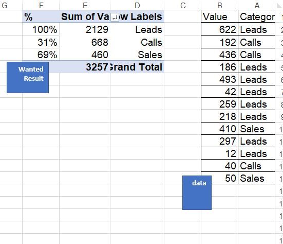
I need to create the logic of the Funnel Chart on the table,
to show category, value an %, in a way that the first row is 100% and others are the percentage of the row above like on the picture I attached. is there is a way to make it happen dynamically?
Link to Pbix sample fiile
Solved! Go to Solution.
- Mark as New
- Bookmark
- Subscribe
- Mute
- Subscribe to RSS Feed
- Permalink
- Report Inappropriate Content
Hi @Ritaf ,
I updated your sample pbix file(see attachment), please check whether that is what you want.
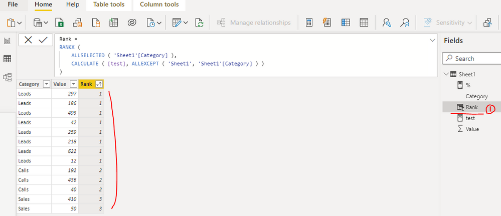
1. Create a calculated column as below to get the rank base on the sum of values group by category
Rank =
RANKX (
    ALLSELECTED ( 'Sheet1'[Category] ),
    CALCULATE ( [test], ALLEXCEPT ( 'Sheet1', 'Sheet1'[Category] ) )
)
2. Create a measure as below to get the percentage
% =
VAR _selcat =
    SELECTEDVALUE ( 'Sheet1'[Category] )
VAR _selindex =
    SELECTEDVALUE ( 'Sheet1'[Rank] )
VAR _prerank =
    CALCULATE (
        MAX ( 'Sheet1'[Rank] ),
        FILTER ( ALLSELECTED ( 'Sheet1' ), 'Sheet1'[Rank] < _selindex )
    )
VAR _pretest =
    SUMX ( FILTER ( ALLSELECTED ( 'Sheet1' ), 'Sheet1'[Rank] = _prerank ), [test] )
RETURN
    IF ( _selindex = 1, 1, DIVIDE ( [test], _pretest ) )
Best Regards
- Mark as New
- Bookmark
- Subscribe
- Mute
- Subscribe to RSS Feed
- Permalink
- Report Inappropriate Content
Power BI has no concept of "Row Above" - you need to help it by providing indexes, or by hard coding the logic (for example "Sales as percentage of Calls".
If you paste the sample data into a table in your post or use one of the file services it will be easier to work with.
- Mark as New
- Bookmark
- Subscribe
- Mute
- Subscribe to RSS Feed
- Permalink
- Report Inappropriate Content
Hi,
Thank you for your response I know that Power BI has no concept of "Row Above", not in visualization at less, and have no doubt that this isn't standard logic.
There is a link for the sample file:https://drive.google.com/file/d/15dHsxNWd7Fh1Q-dhIaG9uh28r89cmFwr/view
I hope somebody has an idea how to solve it dynamically without measure for each category and "Switch" games.
- Mark as New
- Bookmark
- Subscribe
- Mute
- Subscribe to RSS Feed
- Permalink
- Report Inappropriate Content
Hi @Ritaf ,
I updated your sample pbix file(see attachment), please check whether that is what you want.
1. Create a calculated column as below to get the rank base on the sum of values group by category
Rank =
RANKX (
    ALLSELECTED ( 'Sheet1'[Category] ),
    CALCULATE ( [test], ALLEXCEPT ( 'Sheet1', 'Sheet1'[Category] ) )
)
2. Create a measure as below to get the percentage
% =
VAR _selcat =
    SELECTEDVALUE ( 'Sheet1'[Category] )
VAR _selindex =
    SELECTEDVALUE ( 'Sheet1'[Rank] )
VAR _prerank =
    CALCULATE (
        MAX ( 'Sheet1'[Rank] ),
        FILTER ( ALLSELECTED ( 'Sheet1' ), 'Sheet1'[Rank] < _selindex )
    )
VAR _pretest =
    SUMX ( FILTER ( ALLSELECTED ( 'Sheet1' ), 'Sheet1'[Rank] = _prerank ), [test] )
RETURN
    IF ( _selindex = 1, 1, DIVIDE ( [test], _pretest ) )
Best Regards
Helpful resources

Power BI Dataviz World Championships
The Power BI Data Visualization World Championships is back! Get ahead of the game and start preparing now!

Power BI Monthly Update - November 2025
Check out the November 2025 Power BI update to learn about new features.

| User | Count |
|---|---|
| 59 | |
| 46 | |
| 42 | |
| 23 | |
| 18 |
| User | Count |
|---|---|
| 193 | |
| 124 | |
| 101 | |
| 67 | |
| 49 |


