Get Fabric certified for FREE!
Don't miss your chance to take the Fabric Data Engineer (DP-600) exam for FREE! Find out how by watching the DP-600 session on-demand now through April 28th.
Learn more- Power BI forums
- Get Help with Power BI
- Desktop
- Service
- Report Server
- Power Query
- Mobile Apps
- Developer
- DAX Commands and Tips
- Custom Visuals Development Discussion
- Health and Life Sciences
- Power BI Spanish forums
- Translated Spanish Desktop
- Training and Consulting
- Instructor Led Training
- Dashboard in a Day for Women, by Women
- Galleries
- Data Stories Gallery
- Themes Gallery
- Contests Gallery
- QuickViz Gallery
- Quick Measures Gallery
- Visual Calculations Gallery
- Notebook Gallery
- Translytical Task Flow Gallery
- TMDL Gallery
- R Script Showcase
- Webinars and Video Gallery
- Ideas
- Custom Visuals Ideas (read-only)
- Issues
- Issues
- Events
- Upcoming Events
Join the FabCon + SQLCon recap series. Up next: Power BI, Real-Time Intelligence, IQ and AI, and Data Factory take center stage. All sessions are available on-demand after the live show. Register now
- Power BI forums
- Forums
- Get Help with Power BI
- Desktop
- Re: Table Visualization
- Subscribe to RSS Feed
- Mark Topic as New
- Mark Topic as Read
- Float this Topic for Current User
- Bookmark
- Subscribe
- Printer Friendly Page
- Mark as New
- Bookmark
- Subscribe
- Mute
- Subscribe to RSS Feed
- Permalink
- Report Inappropriate Content
Table Visualization
Hi,
I have a little problem and I hope someboday can helb me.
I need the following sheet
Year 2017 Year 2018
Costs | Sales | EBIT || Costs | Sales | EBIT ||
Product No 1 | Name 1 |
Product No 2 | Name 2 |
My problem is when I use the visual "tabel" , then I see only the Product No or the name, but no both. And the visual "matrix" don't help too.
Thank for your help
Solved! Go to Solution.
- Mark as New
- Bookmark
- Subscribe
- Mute
- Subscribe to RSS Feed
- Permalink
- Report Inappropriate Content
Hi @snoopyine,
It seems that matrix is the visualization what you want. I made some data to create the visual below.
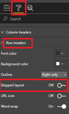
To create the visualization above, you should put your fields in the places highlighted in red and do drill down. You also should turn off the Stepped layout in Row headers like below.
In addition, you could refer to my test pbix file.
Best Regards,
Cherry
If this post helps, then please consider Accept it as the solution to help the other members find it more quickly.
- Mark as New
- Bookmark
- Subscribe
- Mute
- Subscribe to RSS Feed
- Permalink
- Report Inappropriate Content
- Mark as New
- Bookmark
- Subscribe
- Mute
- Subscribe to RSS Feed
- Permalink
- Report Inappropriate Content
Hello,
I have a datatable with client number, date, balance etc. What I want to do is make a table with Rows as Client Number, Data, Balance.
Like
ClientNumber X
Date 1/1/1900
Balance $230
but while using visualization - Table, it puts values as Client Number, Date, Balance as column and I can't change it.
Like:
ClientNumber Date Balance
X 1/1/1900 $230
Matrix doesn't help. Why is it so hard in Power BI to swap Rows and Columns in table? I don't want to unpivot the data in query editor. This is visualization thing. Any suggestion? explanation?
- Mark as New
- Bookmark
- Subscribe
- Mute
- Subscribe to RSS Feed
- Permalink
- Report Inappropriate Content
Hi @snoopyine,
It seems that matrix is the visualization what you want. I made some data to create the visual below.
To create the visualization above, you should put your fields in the places highlighted in red and do drill down. You also should turn off the Stepped layout in Row headers like below.
In addition, you could refer to my test pbix file.
Best Regards,
Cherry
If this post helps, then please consider Accept it as the solution to help the other members find it more quickly.
- Mark as New
- Bookmark
- Subscribe
- Mute
- Subscribe to RSS Feed
- Permalink
- Report Inappropriate Content
Thanks 🙂
I don't turn off the Stepped layout in Row headers 😕
- Mark as New
- Bookmark
- Subscribe
- Mute
- Subscribe to RSS Feed
- Permalink
- Report Inappropriate Content
The matrix sounds like what you want, you just need to put your various fields in the right places and then drill down until you get to see it in the format you want
Helpful resources

Power BI Monthly Update - April 2026
Check out the April 2026 Power BI update to learn about new features.

New to Fabric Survey
If you have recently started exploring Fabric, we'd love to hear how it's going. Your feedback can help with product improvements.

Power BI DataViz World Championships - June 2026
A new Power BI DataViz World Championship is coming this June! Don't miss out on submitting your entry.

| User | Count |
|---|---|
| 43 | |
| 37 | |
| 34 | |
| 21 | |
| 16 |
| User | Count |
|---|---|
| 65 | |
| 64 | |
| 31 | |
| 26 | |
| 25 |


