FabCon is coming to Atlanta
Join us at FabCon Atlanta from March 16 - 20, 2026, for the ultimate Fabric, Power BI, AI and SQL community-led event. Save $200 with code FABCOMM.
Register now!- Power BI forums
- Get Help with Power BI
- Desktop
- Service
- Report Server
- Power Query
- Mobile Apps
- Developer
- DAX Commands and Tips
- Custom Visuals Development Discussion
- Health and Life Sciences
- Power BI Spanish forums
- Translated Spanish Desktop
- Training and Consulting
- Instructor Led Training
- Dashboard in a Day for Women, by Women
- Galleries
- Data Stories Gallery
- Themes Gallery
- Contests Gallery
- QuickViz Gallery
- Quick Measures Gallery
- Visual Calculations Gallery
- Notebook Gallery
- Translytical Task Flow Gallery
- TMDL Gallery
- R Script Showcase
- Webinars and Video Gallery
- Ideas
- Custom Visuals Ideas (read-only)
- Issues
- Issues
- Events
- Upcoming Events
The Power BI Data Visualization World Championships is back! Get ahead of the game and start preparing now! Learn more
- Power BI forums
- Forums
- Get Help with Power BI
- Desktop
- Re: Table Slicer looks for matching items based on...
- Subscribe to RSS Feed
- Mark Topic as New
- Mark Topic as Read
- Float this Topic for Current User
- Bookmark
- Subscribe
- Printer Friendly Page
- Mark as New
- Bookmark
- Subscribe
- Mute
- Subscribe to RSS Feed
- Permalink
- Report Inappropriate Content
Table Slicer looks for matching items based on another column in table
I cant figure out how to achieve the following - any help would be great!
My data format is something like this:
I have a slicer added on the report for the 'Name' column.
When a user chooses e.g 'title 1' from the slicer i want to generate a bar chart.
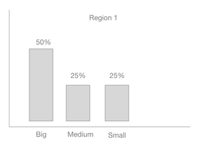
What i want is to get all the items from the whole table that match the 'title 1' 's region - i.e 'Region 1' , then create a bar chart that shows the percentages of each Size of the matching items for that Region.
Something like this:
I just cant figure out how to do this. anyone ?
Thanks
Mark
- Mark as New
- Bookmark
- Subscribe
- Mute
- Subscribe to RSS Feed
- Permalink
- Report Inappropriate Content
What if you try this:
Count = COUNTROWS( Table2 )

Count of all Selected = CALCULATE( [Count], ALLSELECTED(Table2))

% of Selected = DIVIDE( [Count], [Count of all Selected])

Region Selected = SELECTEDVALUE( Table2[Region] )
Region Selected is only if you want to use it in Card that you can put on top of the chart instead of adding Region to the legend
- Mark as New
- Bookmark
- Subscribe
- Mute
- Subscribe to RSS Feed
- Permalink
- Report Inappropriate Content
Thx Nick - can u share the .pbix ?
- Mark as New
- Bookmark
- Subscribe
- Mute
- Subscribe to RSS Feed
- Permalink
- Report Inappropriate Content
- Mark as New
- Bookmark
- Subscribe
- Mute
- Subscribe to RSS Feed
- Permalink
- Report Inappropriate Content
Appreciate the support - that really helped to understand the methodology.
i have given it a try myself on a different data set - but for some reason i cant get it right :
1. everytime is select an item in the slicer it filters the dataset to show only the selected item not the returning all the matching 'regions'.
2. I cant the title added to the chart as u did.
I'v uploaded my attempt on page 2 (using a different table) of the following powerbi file:
https://drive.google.com/file/d/1p-sxgQhTzurotsGv4L73Z2MIYP8n7v15/view?usp=sharing
regards
Mark
- Mark as New
- Bookmark
- Subscribe
- Mute
- Subscribe to RSS Feed
- Permalink
- Report Inappropriate Content
Mark,
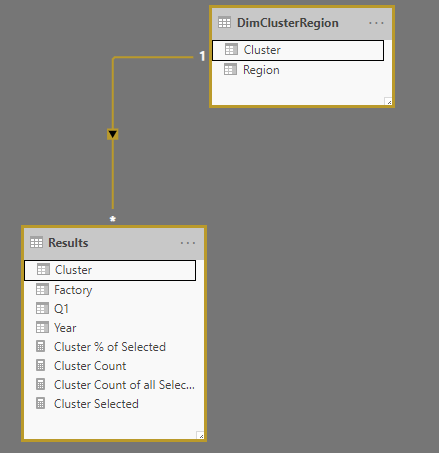
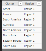
Took a quick look, and here's what I got. Region (which looks like is coming from Table1) has no relationship to the Results table, so a filter on Region will not propagate to Table1, which is why nothing happens. You would need to either add a column to the Results table indicating what region, or create a new Dimension table that would have Cluster in one Column and Region in another column:

Then you can add the Region Column from the new DimClusterRegion table as a filter and change the measure from selected region from table to
Region Selected = SELECTEDVALUE( DimClusterRegion[Region], "Multiple Regions")
That should filter, hopefully, like you expect. I have attached the pbix below for you to mess around with.
And regarding the chart title, what is actually happening there is I'm using the Region Selected Measure in a Card Visualization and just puting at the top of the chart. Maybe there's a better way, but that way works for me.
Hope that helps
File:
- Mark as New
- Bookmark
- Subscribe
- Mute
- Subscribe to RSS Feed
- Permalink
- Report Inappropriate Content
in my example i am not trying to use the 'region' anymore but rather created a completely new table 'Results'.
Then i am trying to do exactly as we did before:
1. Use the slicer to select a 'Factory'
2. The selected 'Factory has a corresponding column in its row for 'Cluster' - e.g Factory=Name15 's matching cluster is 'Australia'
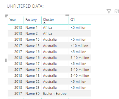
3. i then want to take the Cluster for that selected factory ('Australia') and go get all the rows in the 'Results' table that have a matching 'Cluster' (there are 9 rows that have a cluster = "Australia").
4. Once i have those i am then creating the chart/table as you did for region in the previous example. i.e look at the percentages for each answer for Q1 based on the the returned matching clusters rows. ( <5million = 5/9 ; 5-10million = 3/9 ; >10 million = 1/9
sorry if confusing.
rgds + thx so much for the help.
Mark
- Mark as New
- Bookmark
- Subscribe
- Mute
- Subscribe to RSS Feed
- Permalink
- Report Inappropriate Content
I think I maybe some-what understood ![]()
Here's the table I get when I use Factory = Name 15 and Year = 2018
Here's the code :
 Total Clusters =
 CALCULATE(
     [Cluster Count],
     CALCULATETABLE(
         FILTER( ALL( Results),
         VALUES(Results[Cluster]) = [Cluster Selected])
        )
)

Cluster % of Selected = DIVIDE( [Cluster Count], [Total Clusters])

Cluster Count = COUNTROWS( Results )
Maybe what you had in mind, or maybe at least close?
- Mark as New
- Bookmark
- Subscribe
- Mute
- Subscribe to RSS Feed
- Permalink
- Report Inappropriate Content
i think we getting closer.
The result for Factory: Name 15 and year 2018 should be:
The seleted cluster is 'australia'
<5 million - 5 - 9 ( there are 5 factorys in cluster Australia with this value)
5-10 million - 3 - 9 ( there are 3 factorys in cluster Australia with this value)
>10 million - 1 - 9 ( there is 1 factory in cluster Australia with this value)
i think your example code is having the same issue i couldnt crack - that it is filtering by the Name15 factory and hence only showing the <5 million option in your table - when it should be showing the results of all factories that are in that cluster 'australia'.
I'll keep trying - let me know if you come up with a solution.
Helpful resources

Power BI Dataviz World Championships
The Power BI Data Visualization World Championships is back! Get ahead of the game and start preparing now!

| User | Count |
|---|---|
| 63 | |
| 55 | |
| 42 | |
| 41 | |
| 23 |
| User | Count |
|---|---|
| 167 | |
| 135 | |
| 120 | |
| 79 | |
| 53 |


