FabCon is coming to Atlanta
Join us at FabCon Atlanta from March 16 - 20, 2026, for the ultimate Fabric, Power BI, AI and SQL community-led event. Save $200 with code FABCOMM.
Register now!- Power BI forums
- Get Help with Power BI
- Desktop
- Service
- Report Server
- Power Query
- Mobile Apps
- Developer
- DAX Commands and Tips
- Custom Visuals Development Discussion
- Health and Life Sciences
- Power BI Spanish forums
- Translated Spanish Desktop
- Training and Consulting
- Instructor Led Training
- Dashboard in a Day for Women, by Women
- Galleries
- Data Stories Gallery
- Themes Gallery
- Contests Gallery
- QuickViz Gallery
- Quick Measures Gallery
- Visual Calculations Gallery
- Notebook Gallery
- Translytical Task Flow Gallery
- TMDL Gallery
- R Script Showcase
- Webinars and Video Gallery
- Ideas
- Custom Visuals Ideas (read-only)
- Issues
- Issues
- Events
- Upcoming Events
Vote for your favorite vizzies from the Power BI Dataviz World Championship submissions. Vote now!
- Power BI forums
- Forums
- Get Help with Power BI
- Desktop
- TOPN in graphs/Dynamic
- Subscribe to RSS Feed
- Mark Topic as New
- Mark Topic as Read
- Float this Topic for Current User
- Bookmark
- Subscribe
- Printer Friendly Page
- Mark as New
- Bookmark
- Subscribe
- Mute
- Subscribe to RSS Feed
- Permalink
- Report Inappropriate Content
TOPN in graphs/Dynamic
Hi all,
I would like to display a bar graph only with top 5 values. I am using the advance filtering to show only the top values, but then when I filter in a different graph to show the top 5 values by region, the graph still shows the same top ones as before and it shouldn´t. Is there a way to make it work?
Many thanks
Regards
Estefania
Solved! Go to Solution.
- Mark as New
- Bookmark
- Subscribe
- Mute
- Subscribe to RSS Feed
- Permalink
- Report Inappropriate Content
Hey,
here you will find a pbix file.
I changed the DAX of the measure that ranks the customer (guess this is what you call Payer) to
GroupRank =
RANKX(
	ALLSELECTED(Table1[Customer])
	,CALCULATE(SUM(Table1[Amount]))
)
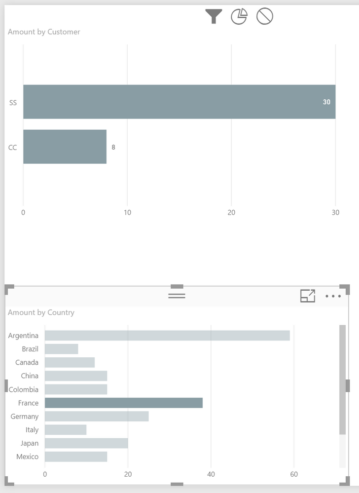
And I also changed the Interaction Setting of the chart showing the Top 5 Customer to filter
Mark the Chart showing the countries: Menu Format, Toggle: Edit Interactions, Switch the Customer chart from Highligh to Filter, Toggle: Edit Interactions
Hope this is what you are looking for
Regards
Tom
Did I answer your question? Mark my post as a solution, this will help others!
Proud to be a Super User!
I accept Kudos 😉
Hamburg, Germany
- Mark as New
- Bookmark
- Subscribe
- Mute
- Subscribe to RSS Feed
- Permalink
- Report Inappropriate Content
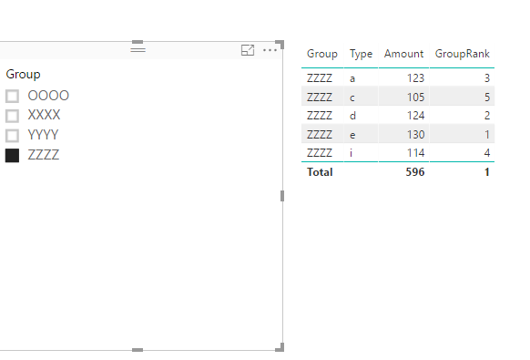
As CahabaData said, you need to have a measure to rank your values, and then add this rank to your visual filter.
Create two measures.
TotalAmount = SUM(Table1[Amount])
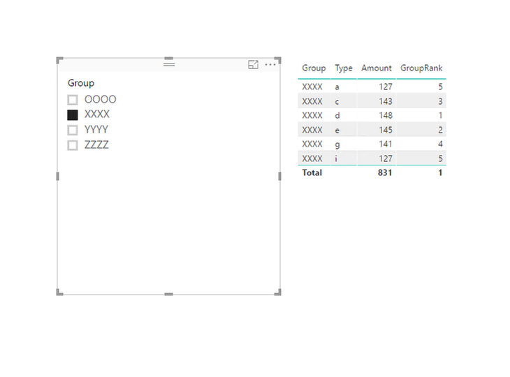
GroupRank = RANKX(ALLEXCEPT(Table1,Table1[Group]),Table1[TotalAmount])
Regards,
Charlie Liao
- Mark as New
- Bookmark
- Subscribe
- Mute
- Subscribe to RSS Feed
- Permalink
- Report Inappropriate Content
Thanks for your reply. Unfortunattely; I can´t make it work.
I have two columns, one of them is Payer and the other one is the amount. I would like to see on a bar chart the top 5 payers by highest amount, I also would like that when I filter by date or Region, this graph is updated. &
I tried the formula you mentioned.
TotalAmount = Sum(MyTable[Amount])
GroupRank = RANKX(ALLEXCEPT(MyTable,MyTable[Payer Name]),sum(MyTable[TotalAmount]))
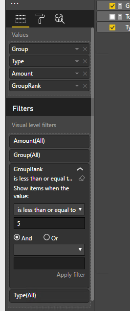
Then I filtered on the graph GroupRank less or equal to 5 but when I filter by Region the bar chart doesn´t get updated.
Please see data set sample below:
| Region | Country | Customer | Amount |
| EMEA | Germany | AA | 5 |
| EMEA | Italy | BB | 10 |
| EMEA | France | CC | 8 |
| EMEA | Germany | DD | 20 |
| LATAM | Brazil | AA | 5 |
| LATAM | Argentina | BB | 9 |
| LATAM | Mexico | CC | 15 |
| LATAM | Brazil | DD | 3 |
| LATAM | Colombia | EE | 5 |
| LATAM | Colombia | AA | 10 |
| NA | US | FF | 15 |
| NA | Canada | CC | 12 |
| NA | US | HH | 15 |
| NA | US | EE | 32 |
| AP | China | AA | 15 |
| AP | Japan | JJ | 20 |
| AP | Vietnam | UU | 27 |
| EMEA | France | SS | 30 |
| LATAM | Argentina | EE | 50 |
| AP | Vietnam | BB | 5 |
| AP | Thailand | JJ | 2 |
| AP | Vietnam | UU | 7 |
Thanks in advance for your assitance,
Regards,
Estefania
- Mark as New
- Bookmark
- Subscribe
- Mute
- Subscribe to RSS Feed
- Permalink
- Report Inappropriate Content
- Mark as New
- Bookmark
- Subscribe
- Mute
- Subscribe to RSS Feed
- Permalink
- Report Inappropriate Content
Hey,
here you will find a pbix file.
I changed the DAX of the measure that ranks the customer (guess this is what you call Payer) to
GroupRank =
RANKX(
	ALLSELECTED(Table1[Customer])
	,CALCULATE(SUM(Table1[Amount]))
)
And I also changed the Interaction Setting of the chart showing the Top 5 Customer to filter
Mark the Chart showing the countries: Menu Format, Toggle: Edit Interactions, Switch the Customer chart from Highligh to Filter, Toggle: Edit Interactions
Hope this is what you are looking for
Regards
Tom
Did I answer your question? Mark my post as a solution, this will help others!
Proud to be a Super User!
I accept Kudos 😉
Hamburg, Germany
- Mark as New
- Bookmark
- Subscribe
- Mute
- Subscribe to RSS Feed
- Permalink
- Report Inappropriate Content
Hello Sir,
I am using year based slicer and expected result would be Last 5 year sales based on Year slicer selected value. Since I am using tabular model so i have limitation ; i can't use some date like SELECTEDVALUE, etc in my solution.
Please help me
- Mark as New
- Bookmark
- Subscribe
- Mute
- Subscribe to RSS Feed
- Permalink
- Report Inappropriate Content

Is there a way I can only show top 10 Supplier Numbers (Y Axis) in the graph based on the % Grand Total Count of System Customer Number? Basically I just want to see top 10 bars in this graph. I am not able to use top N filter in Y axis value inside visual filters because it's changing the % values on the graph.
- Mark as New
- Bookmark
- Subscribe
- Mute
- Subscribe to RSS Feed
- Permalink
- Report Inappropriate Content
Hi,
Create a RANK measure and then drag that measure in the visual filter with a condition of <=10.
Regards,
Ashish Mathur
http://www.ashishmathur.com
https://www.linkedin.com/in/excelenthusiasts/
- Mark as New
- Bookmark
- Subscribe
- Mute
- Subscribe to RSS Feed
- Permalink
- Report Inappropriate Content
Hey @Ashish_Mathur,
Can you please help me with the rank formula syntax? Because the values on the charts are added based on unique supplier/parts/dealer number and day groups.
formula is like= for each supplier number, count (>14)/ Grand total (>14) + count (8-14)/ Grand total (8-14) + count (2-7)/ Grand total (2-7) + count (0-1)/ Grand total (0-1)
Thanks
- Mark as New
- Bookmark
- Subscribe
- Mute
- Subscribe to RSS Feed
- Permalink
- Report Inappropriate Content
Hi,
Share the link from where i can download your file. In a simple Table, also show the expected result.
Regards,
Ashish Mathur
http://www.ashishmathur.com
https://www.linkedin.com/in/excelenthusiasts/
- Mark as New
- Bookmark
- Subscribe
- Mute
- Subscribe to RSS Feed
- Permalink
- Report Inappropriate Content
Hey Ashish,
Sorry for the delay. I am attaching the link herehttps://drive.google.com/open?id=0B3RVPzvmX8RMa3FiTXVodXhyMDVyMVExNGczZG83MFpfcmUw. What I need is, instead of the stacked bar charts showing all the parts/supplier/dealer numbers, I just want top 10 of them to show based on the Percentage Grand total Count of Customer Order ID. This same parameter: %GT Count of System_CustomerReferenceOrderID is used as a value in all the stacked charts.
- Mark as New
- Bookmark
- Subscribe
- Mute
- Subscribe to RSS Feed
- Permalink
- Report Inappropriate Content
Hi,
I cannot download the file from there. I get an access denied message.
Regards,
Ashish Mathur
http://www.ashishmathur.com
https://www.linkedin.com/in/excelenthusiasts/
- Mark as New
- Bookmark
- Subscribe
- Mute
- Subscribe to RSS Feed
- Permalink
- Report Inappropriate Content
You can download the files from here. https://drive.google.com/file/d/1VHreQui0vYx-qhM48QgQZBNEoO9DomGt/view?usp=sharing
Thanks
- Mark as New
- Bookmark
- Subscribe
- Mute
- Subscribe to RSS Feed
- Permalink
- Report Inappropriate Content

Is there a way I can only show top 10 Supplier Numbers (Y Axis) in the graph based on the % Grand Total Count of System Customer Number? Basically I just want to see top 10 bars in this graph. I am not able to use top N filter in Y axis value inside visual filters because it's changing the % values on the graph.
- Mark as New
- Bookmark
- Subscribe
- Mute
- Subscribe to RSS Feed
- Permalink
- Report Inappropriate Content
Many thanks Tom!! It works now!!
- Mark as New
- Bookmark
- Subscribe
- Mute
- Subscribe to RSS Feed
- Permalink
- Report Inappropriate Content
Do you have a measure using the RANKX function?
If not, that is probably what you need - if I understand your post. There are some good tutorials & Q/A on this function.
If you need further assist, provide a short sample of your table.
Helpful resources

Power BI Dataviz World Championships
Vote for your favorite vizzies from the Power BI World Championship submissions!

Join our Community Sticker Challenge 2026
If you love stickers, then you will definitely want to check out our Community Sticker Challenge!

Power BI Monthly Update - January 2026
Check out the January 2026 Power BI update to learn about new features.

| User | Count |
|---|---|
| 62 | |
| 53 | |
| 42 | |
| 20 | |
| 17 |
| User | Count |
|---|---|
| 123 | |
| 105 | |
| 45 | |
| 32 | |
| 24 |
