FabCon is coming to Atlanta
Join us at FabCon Atlanta from March 16 - 20, 2026, for the ultimate Fabric, Power BI, AI and SQL community-led event. Save $200 with code FABCOMM.
Register now!- Power BI forums
- Get Help with Power BI
- Desktop
- Service
- Report Server
- Power Query
- Mobile Apps
- Developer
- DAX Commands and Tips
- Custom Visuals Development Discussion
- Health and Life Sciences
- Power BI Spanish forums
- Translated Spanish Desktop
- Training and Consulting
- Instructor Led Training
- Dashboard in a Day for Women, by Women
- Galleries
- Data Stories Gallery
- Themes Gallery
- Contests Gallery
- QuickViz Gallery
- Quick Measures Gallery
- Visual Calculations Gallery
- Notebook Gallery
- Translytical Task Flow Gallery
- TMDL Gallery
- R Script Showcase
- Webinars and Video Gallery
- Ideas
- Custom Visuals Ideas (read-only)
- Issues
- Issues
- Events
- Upcoming Events
The Power BI Data Visualization World Championships is back! Get ahead of the game and start preparing now! Learn more
- Power BI forums
- Forums
- Get Help with Power BI
- Desktop
- Re: Synoptic Panel by OKviz - Conditional Formatti...
- Subscribe to RSS Feed
- Mark Topic as New
- Mark Topic as Read
- Float this Topic for Current User
- Bookmark
- Subscribe
- Printer Friendly Page
- Mark as New
- Bookmark
- Subscribe
- Mute
- Subscribe to RSS Feed
- Permalink
- Report Inappropriate Content
Synoptic Panel by OKviz - Conditional Formatting
Hi everyone,
I am trying to follow the official OKviz guide on setting the conditional formating for the visual: https://okviz.com/blog/states-in-custom-visuals/
However, am struggling with understanding all the steps.
Essentially, I would like to create a Green to Red gradient where the the target will be top value on the map, hence dynamically changing.
10% below highest value will be Green, 20% below will be Amber and anything below Red.
Is this something possible to create with the Synoptic Panel? If so, what would the best approach in setting up states and measures?
Thank you in advance.
Solved! Go to Solution.
- Mark as New
- Bookmark
- Subscribe
- Mute
- Subscribe to RSS Feed
- Permalink
- Report Inappropriate Content
Hi, @Anonymous
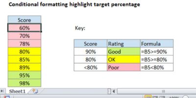
If I understand you correctly, you can directly create three measures then apply them to the 'States' section of 'Fields' panel.
Good =0.9 * [heighest value]
Ok=0.8*[heighest value]Poor=0*[heighest value]Then need to set the 'Comparison' of 'State' section in ’Format‘ panel to '>=' and set the color of each state.
Best Regards,
Community Support Team _ Eason
- Mark as New
- Bookmark
- Subscribe
- Mute
- Subscribe to RSS Feed
- Permalink
- Report Inappropriate Content
Hi @v-easonf-msft ,
That's exactly what I was looking for! Ended up being such a simple solution, thank you.
Currently trying to figure out a way of using a slider to choose between two external .svg URL maps. Do you know any easy tips with this one?
Thanks
- Mark as New
- Bookmark
- Subscribe
- Mute
- Subscribe to RSS Feed
- Permalink
- Report Inappropriate Content
Hi, @Anonymous
If I understand you correctly, you can directly create three measures then apply them to the 'States' section of 'Fields' panel.
Good =0.9 * [heighest value]
Ok=0.8*[heighest value]Poor=0*[heighest value]Then need to set the 'Comparison' of 'State' section in ’Format‘ panel to '>=' and set the color of each state.
Best Regards,
Community Support Team _ Eason
Helpful resources

Power BI Dataviz World Championships
The Power BI Data Visualization World Championships is back! Get ahead of the game and start preparing now!

Power BI Monthly Update - November 2025
Check out the November 2025 Power BI update to learn about new features.

| User | Count |
|---|---|
| 59 | |
| 46 | |
| 42 | |
| 23 | |
| 18 |
| User | Count |
|---|---|
| 193 | |
| 124 | |
| 101 | |
| 67 | |
| 49 |


