A new Data Days event is coming soon!
This time we’re going bigger than ever. Fabric, Power BI, SQL, AI and more. We're covering it all. You won't want to miss it.
Learn more- Power BI forums
- Get Help with Power BI
- Desktop
- Service
- Report Server
- Power Query
- Mobile Apps
- Developer
- DAX Commands and Tips
- Custom Visuals Development Discussion
- Health and Life Sciences
- Power BI Spanish forums
- Translated Spanish Desktop
- Training and Consulting
- Instructor Led Training
- Dashboard in a Day for Women, by Women
- Galleries
- Data Stories Gallery
- Themes Gallery
- Contests Gallery
- QuickViz Gallery
- Quick Measures Gallery
- Visual Calculations Gallery
- Notebook Gallery
- Translytical Task Flow Gallery
- TMDL Gallery
- R Script Showcase
- Webinars and Video Gallery
- Ideas
- Custom Visuals Ideas (read-only)
- Issues
- Issues
- Events
- Upcoming Events
Did you hear? There's a new SQL AI Developer certification (DP-800). Start preparing now and be one of the first to get certified. Register now
- Power BI forums
- Forums
- Get Help with Power BI
- Desktop
- Re: Switch a visual between two different dates
- Subscribe to RSS Feed
- Mark Topic as New
- Mark Topic as Read
- Float this Topic for Current User
- Bookmark
- Subscribe
- Printer Friendly Page
- Mark as New
- Bookmark
- Subscribe
- Mute
- Subscribe to RSS Feed
- Permalink
- Report Inappropriate Content
Switch a visual between two different dates
Hi there,
i have a visual whitch shows me the starting date of manufacturing order. Is it possible to add a button (f.e. a data cut) to change between the starting date and the end date of these orders?
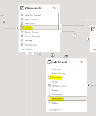
Actually i can see only the starting date cause my table with the prod. orders is linked with my date table and only one link can be activated at the same time.
Hope my explanation is comprehensible. Thanks in advance for any hint!
Solved! Go to Solution.
- Mark as New
- Bookmark
- Subscribe
- Mute
- Subscribe to RSS Feed
- Permalink
- Report Inappropriate Content
Hi @Pfandgiraffe ,
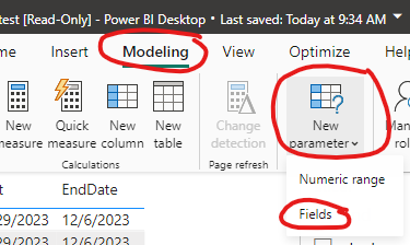
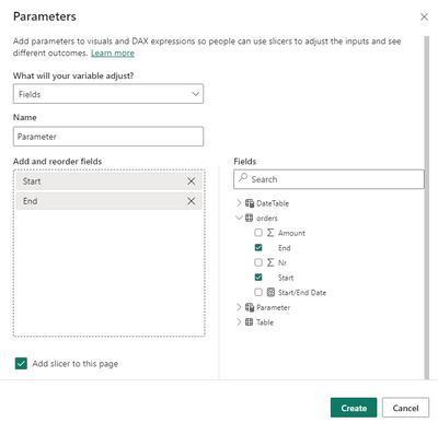
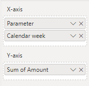
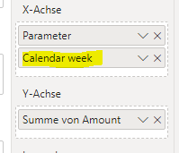
You can create a parameter to be placed in the x-axis coordinates:
The effect is shown below:
Best Regards,
Dino Tao
If this post helps, then please consider Accept it as the solution to help the other members find it more quickly.
- Mark as New
- Bookmark
- Subscribe
- Mute
- Subscribe to RSS Feed
- Permalink
- Report Inappropriate Content
Hi @Anonymous ,
thanks - that was what im looking for! 🙂 Thanks for this easy solution.
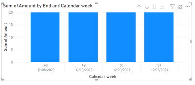
One little thing: Did you have an idea why the calendar week dissapear after using the Parameter?
Before:
After:
...When i remove and add the cw parameter again to the x-axis everything working well till i use the new parameter again.
kind regards!
- Mark as New
- Bookmark
- Subscribe
- Mute
- Subscribe to RSS Feed
- Permalink
- Report Inappropriate Content
Hi @Pfandgiraffe ,
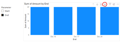
Because there is a hierarchical relationship between calendar week and the start and end dates, the visual object applies drill-down functionality.
After switching, you only need to click this button to see the details:
Best Regards,
Dino Tao
- Mark as New
- Bookmark
- Subscribe
- Mute
- Subscribe to RSS Feed
- Permalink
- Report Inappropriate Content
Thanks for quick reply!
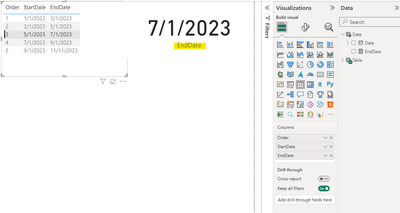
I have tested it but it won't work this way cause i cant put this meassure into my visual. (don't know why) The dax meassure itself looks okay cause it will work within a simple table chart visual. But not within a column chart.
I have build a simple test .pbix and a excel data table:
https://drive.google.com/drive/folders/1tMbJKSdsryf4cdam-n0MkY6-pdx6T4O8?usp=sharing
kind regards
- Mark as New
- Bookmark
- Subscribe
- Mute
- Subscribe to RSS Feed
- Permalink
- Report Inappropriate Content
Hi @Pfandgiraffe,
You can try to create an inactive relationship between these 2 tables on EndDate.
And then you should be able to extract the end date by using USERELATIONSHIP() in your formula.
Please see below example.
EndDate = CALCULATE(MAX('Table'[EndDate]), USERELATIONSHIP('Date'[Date], 'Table'[EndDate]))
If it not fits in your case, please share more dummy data and your expected results.
Best Regards,
Joyce
Helpful resources

Power BI Monthly Update - April 2026
Check out the April 2026 Power BI update to learn about new features.

Data Days 2026 coming soon!
Sign up to receive a private message when registration opens and key events begin.

New to Fabric Survey
If you have recently started exploring Fabric, we'd love to hear how it's going. Your feedback can help with product improvements.

| User | Count |
|---|---|
| 34 | |
| 31 | |
| 30 | |
| 21 | |
| 16 |
| User | Count |
|---|---|
| 65 | |
| 53 | |
| 31 | |
| 23 | |
| 23 |
